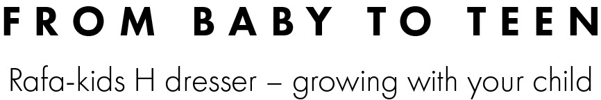
A Visual Language That Grows With a Child
Illustration-Led Brand Communication with Identity Enhancement
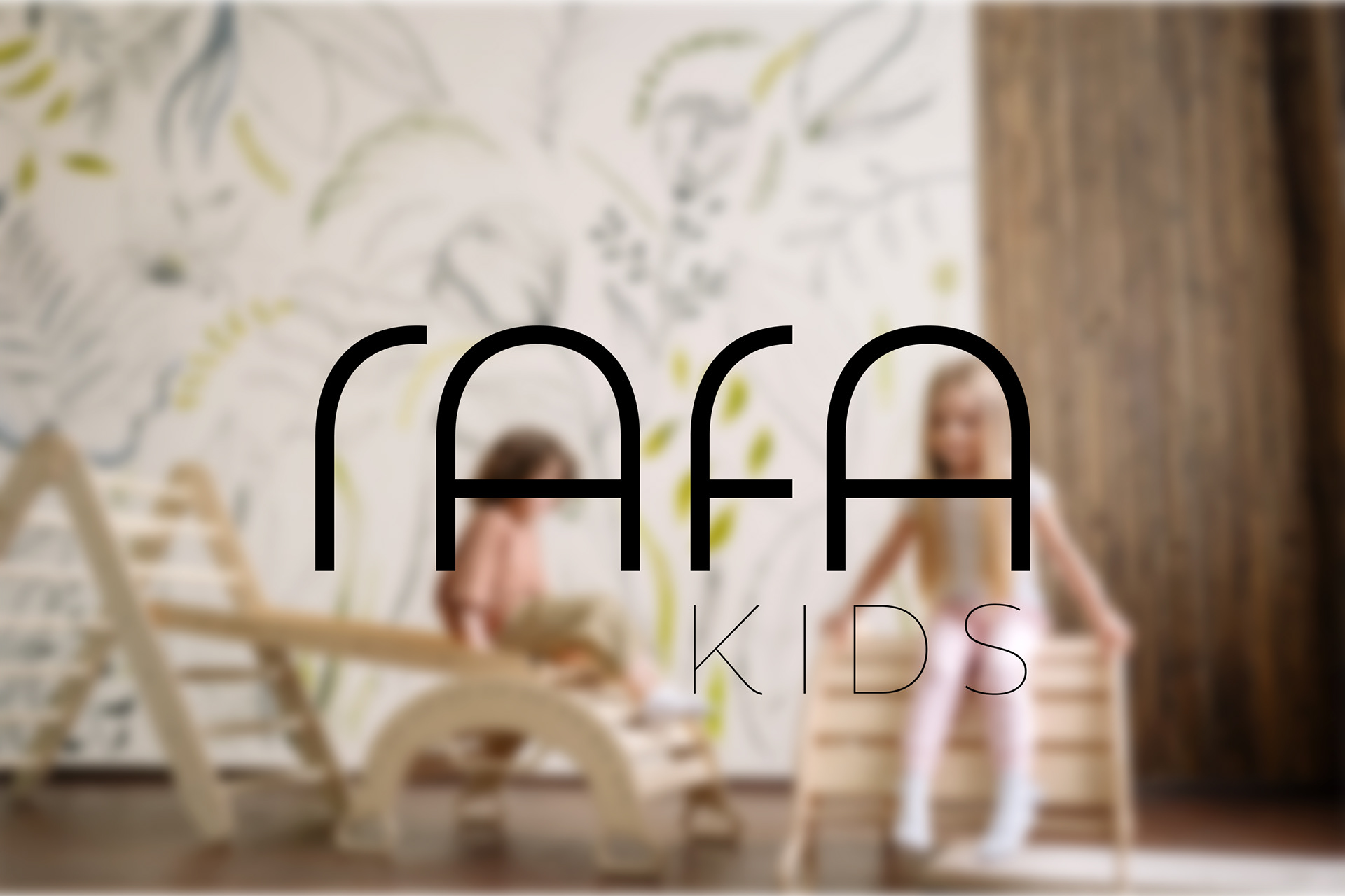
RAFA
Illustration-Led System for Brand Communication with Identity Enhancement
Role & Scope: Visual identity enhancement · Illustration system for brand communication · Illustration-led newsletter design · Packaging concepts · Brand documentation · Spatial & touchpoint proposals
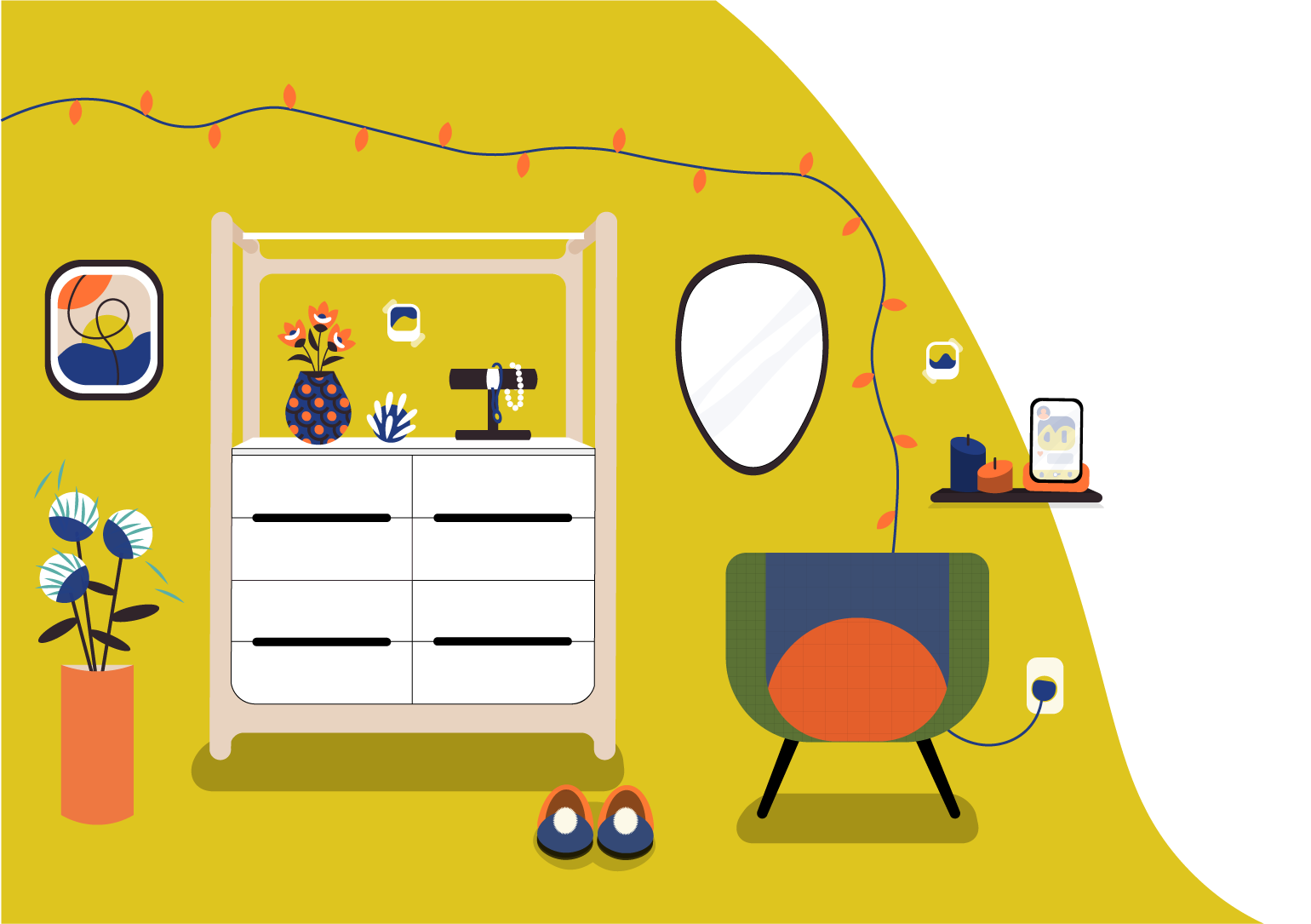
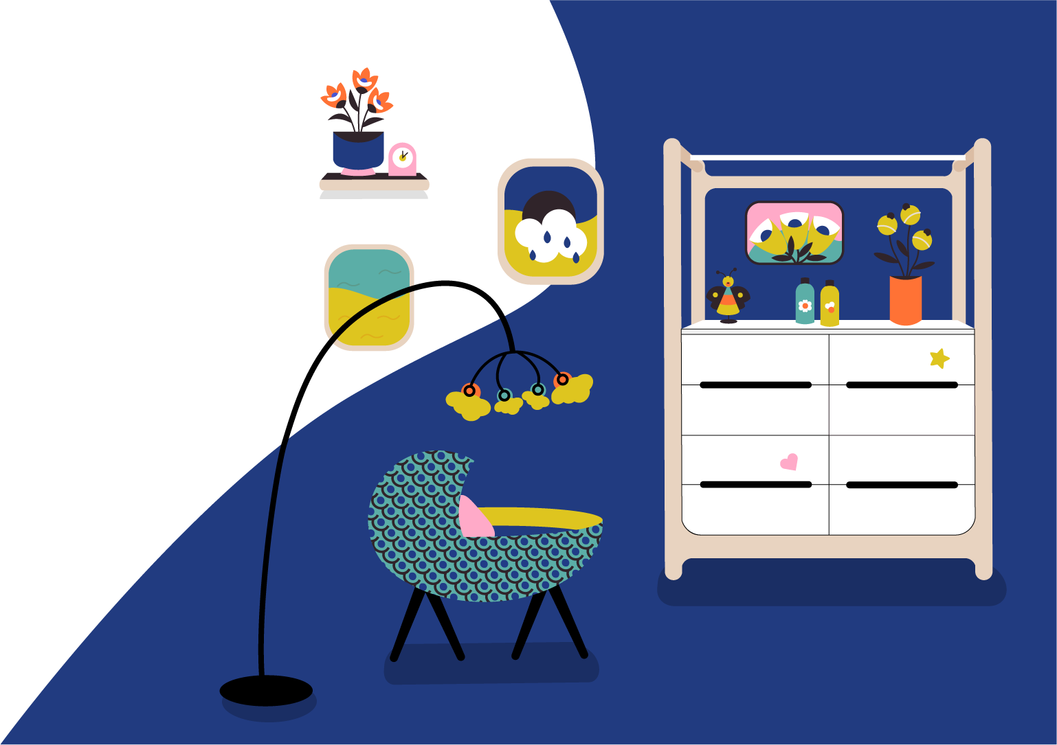
A children’s furniture brand supported by a scalable illustration-led communication system, designed to work seamlessly across digital, print and physical touchpoints, with a refined visual identity developed as a portfolio-led enhancement.

Design Direction

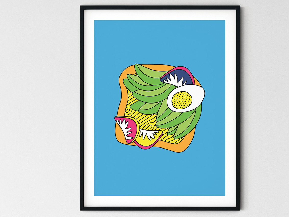
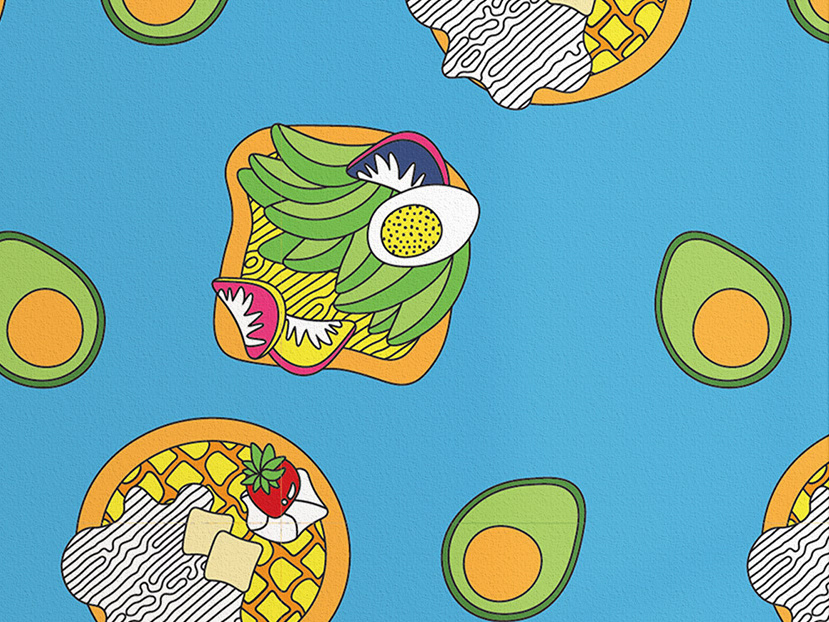
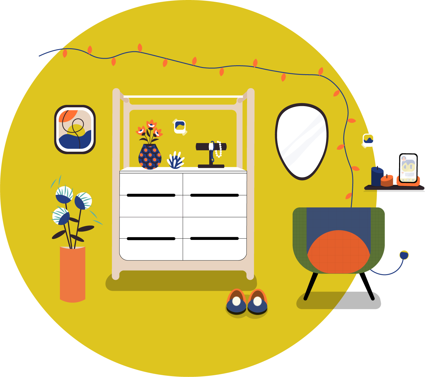
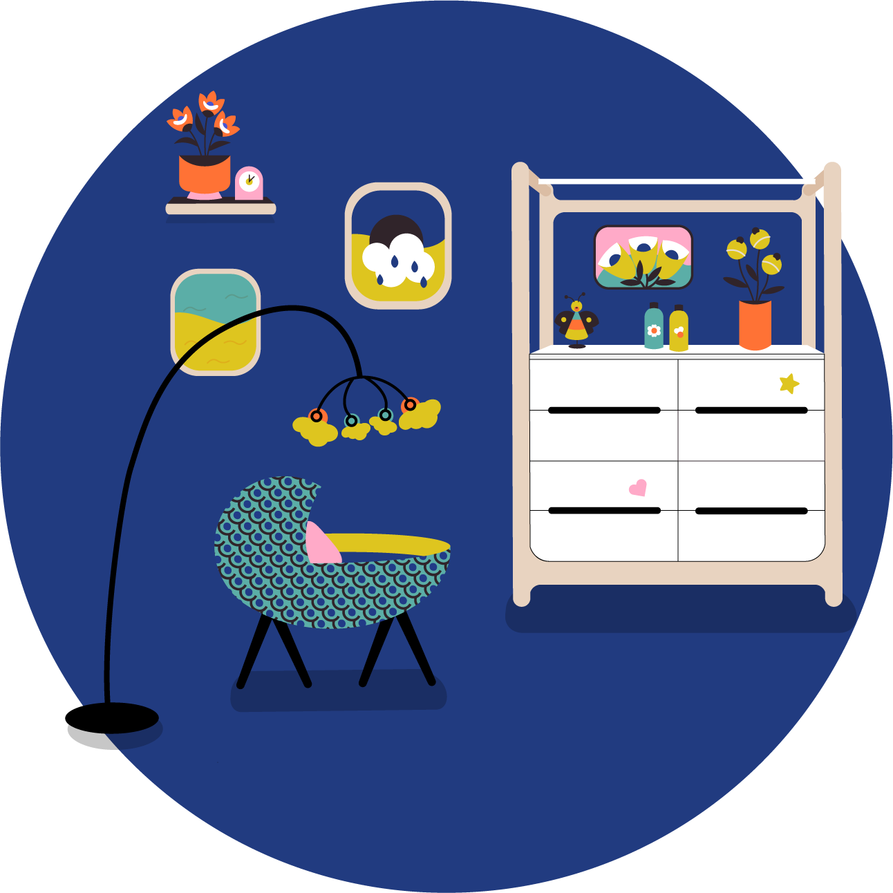
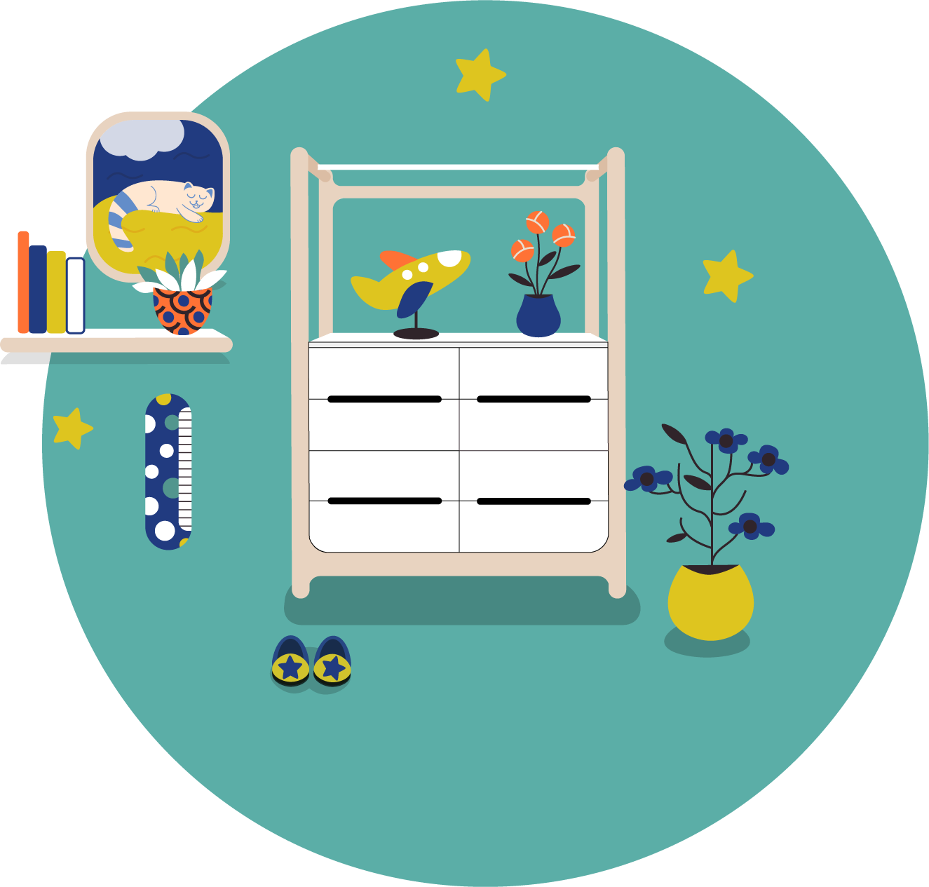
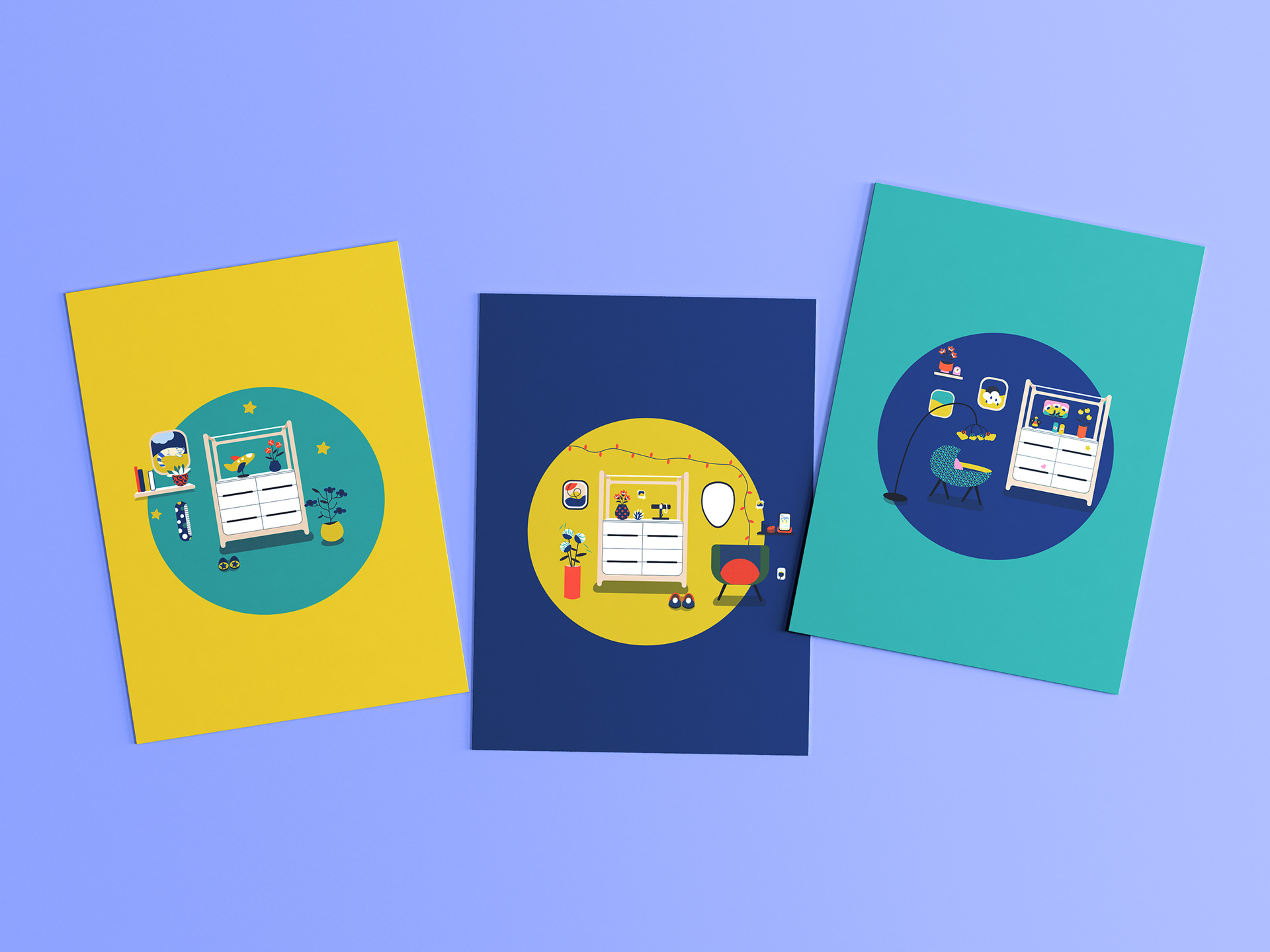
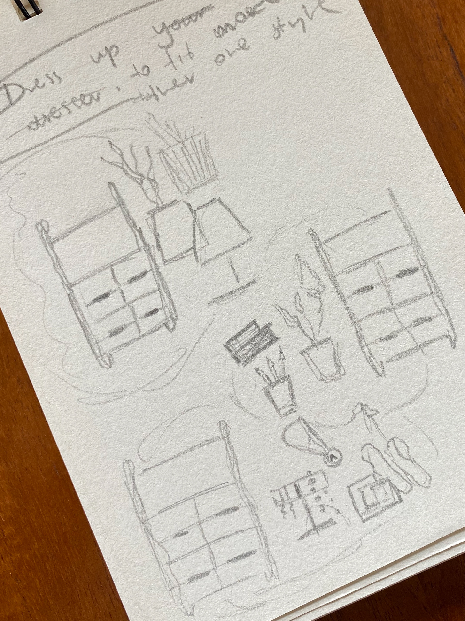
Scalable Illustrations System
Illustrations featured in the newsletter are not confined to its pages alone; they extend throughout other assortments designed for Rafa Kids, including stationery and other brand collateral, accompanied by catchy slogans. Promoting brand values with every client interaction and internal communication within the company.
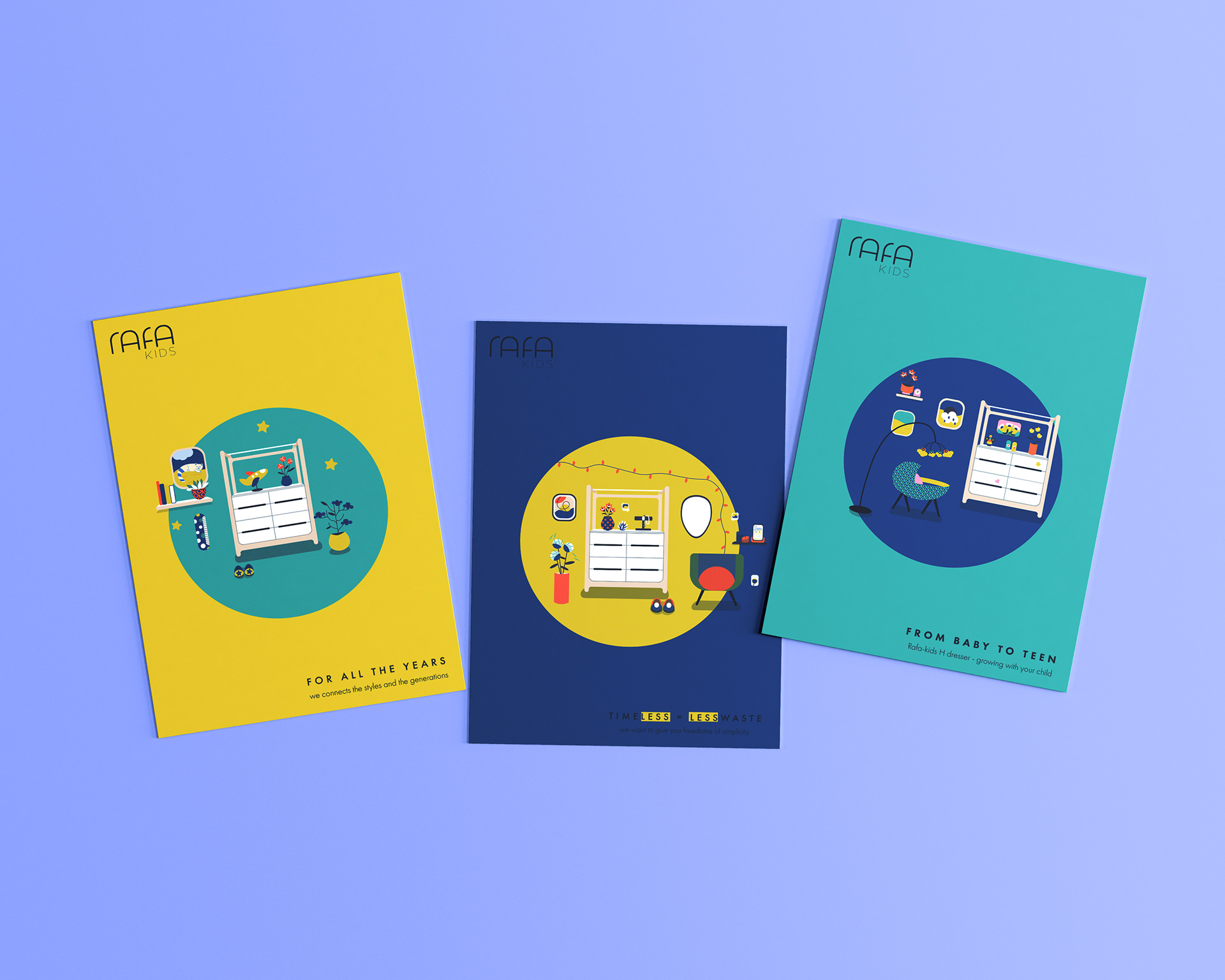

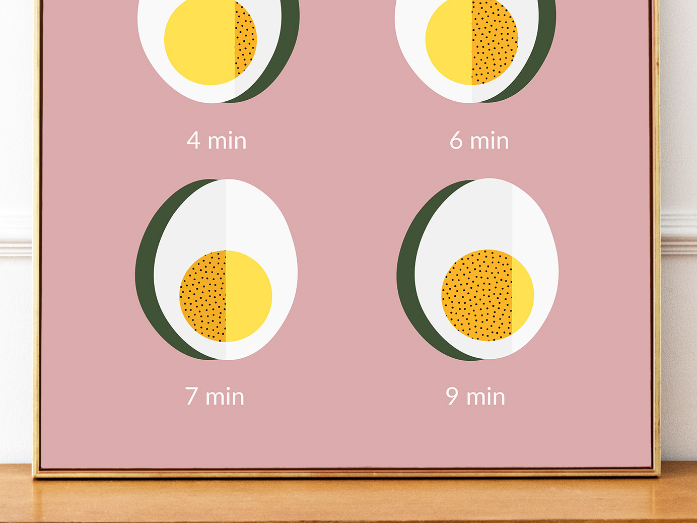
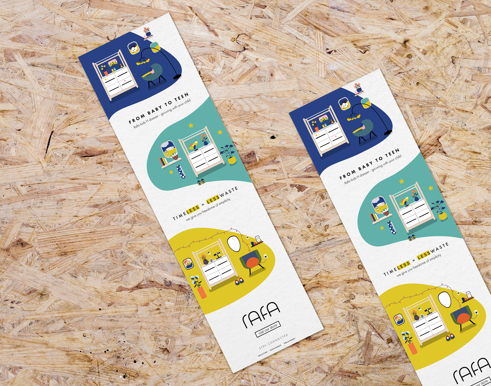
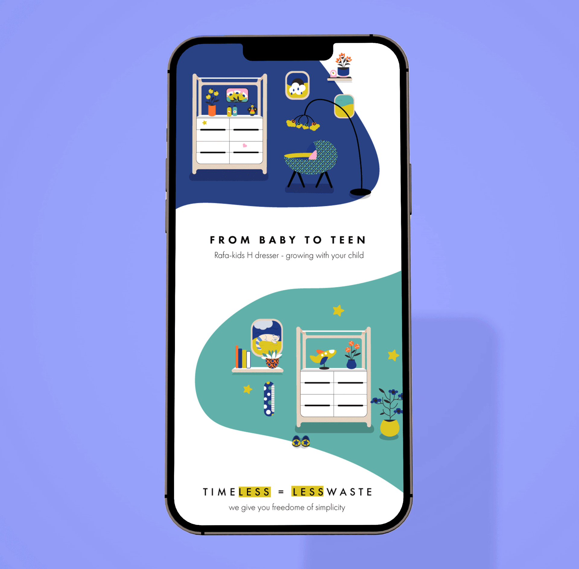
Newsletter Design
Designed to feel welcoming and intuitive, the newsletter follows a consistent, user-friendly and responsive layout. Lively illustrations and a strong focus on colour drive engagement while reflecting the brand’s playful and modern character. The design balances function and emotion, connecting generations and reinforcing Rafa’s commitment to sustainability.
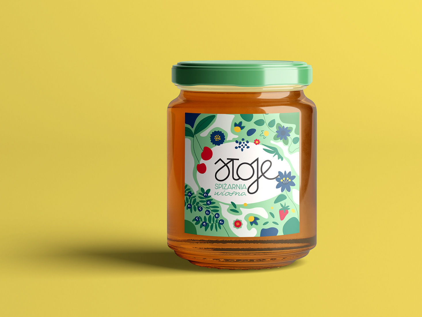
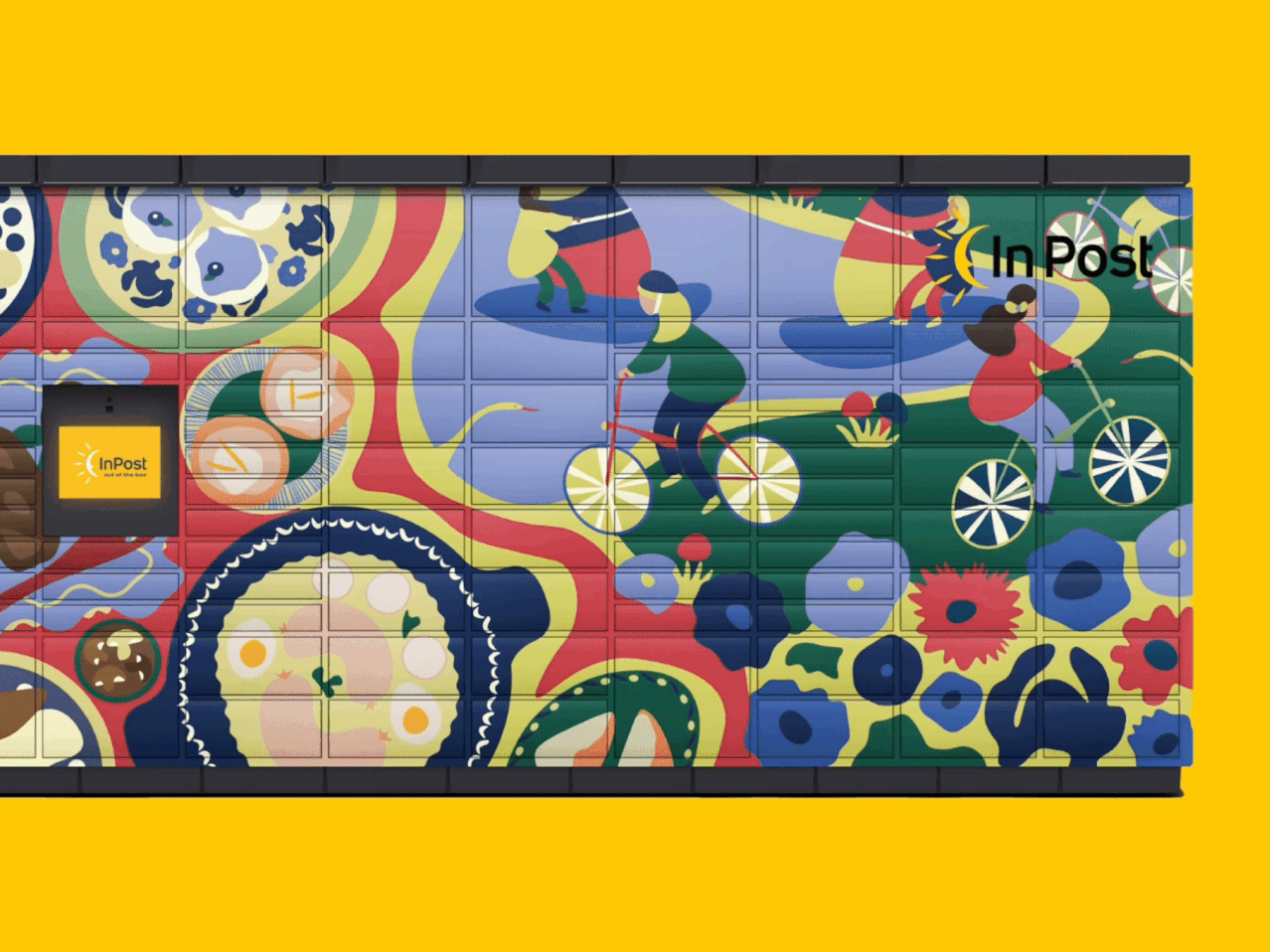
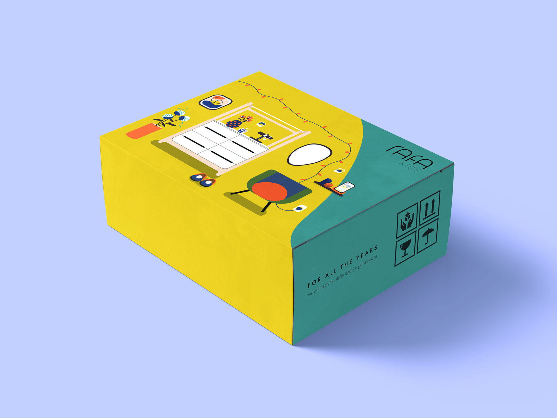
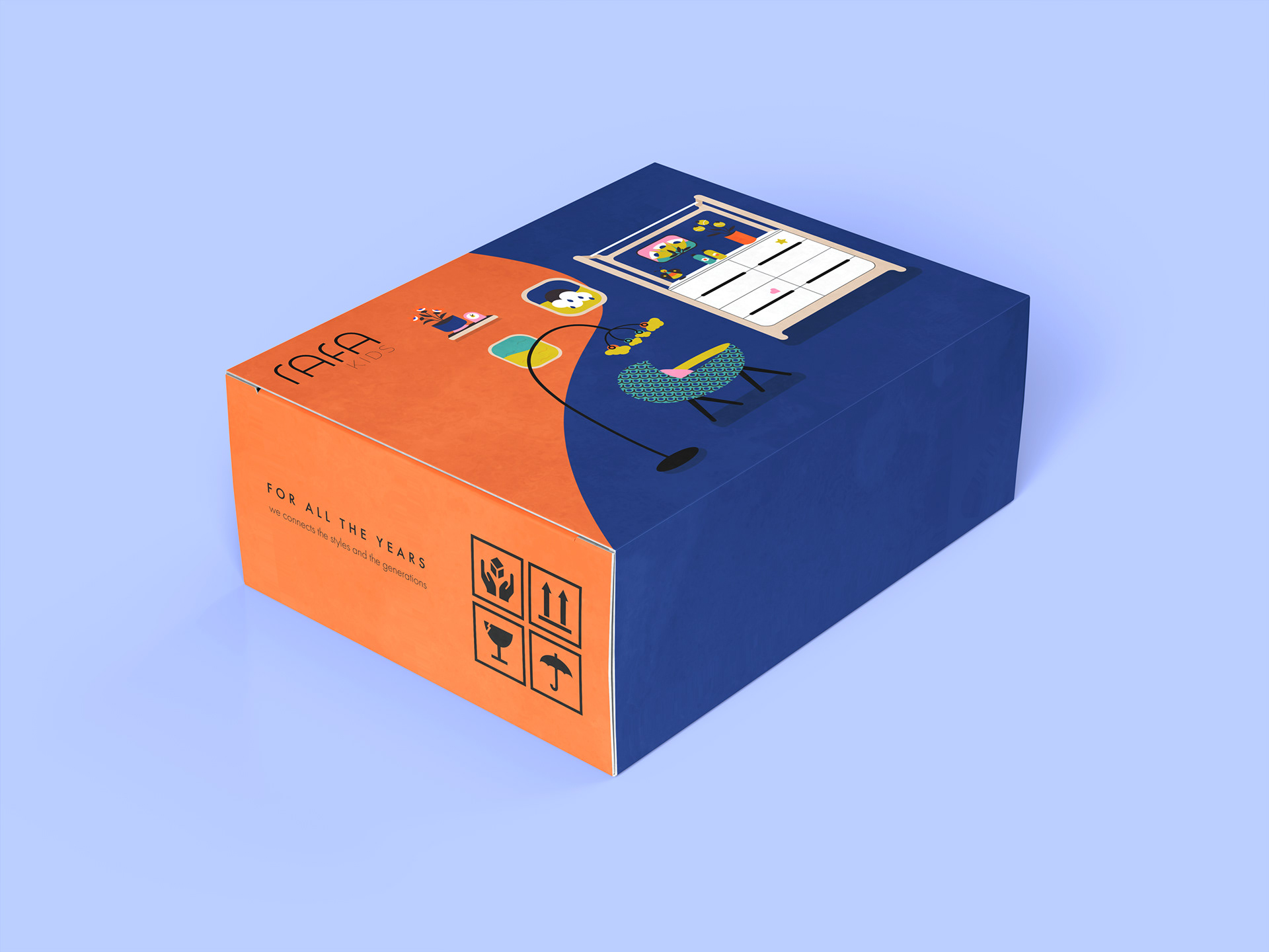
Packaging Design
The goal was to create packaging that not only safeguards Rafa products but also brings delight to those who encounter it. The design aimed to blend playful illustrations with a simple, secure structure, reflecting the essence of the brand. Every detail, from color selection to element arrangement, was meant to evoke joy and provide reassurance for Rafa's customers.


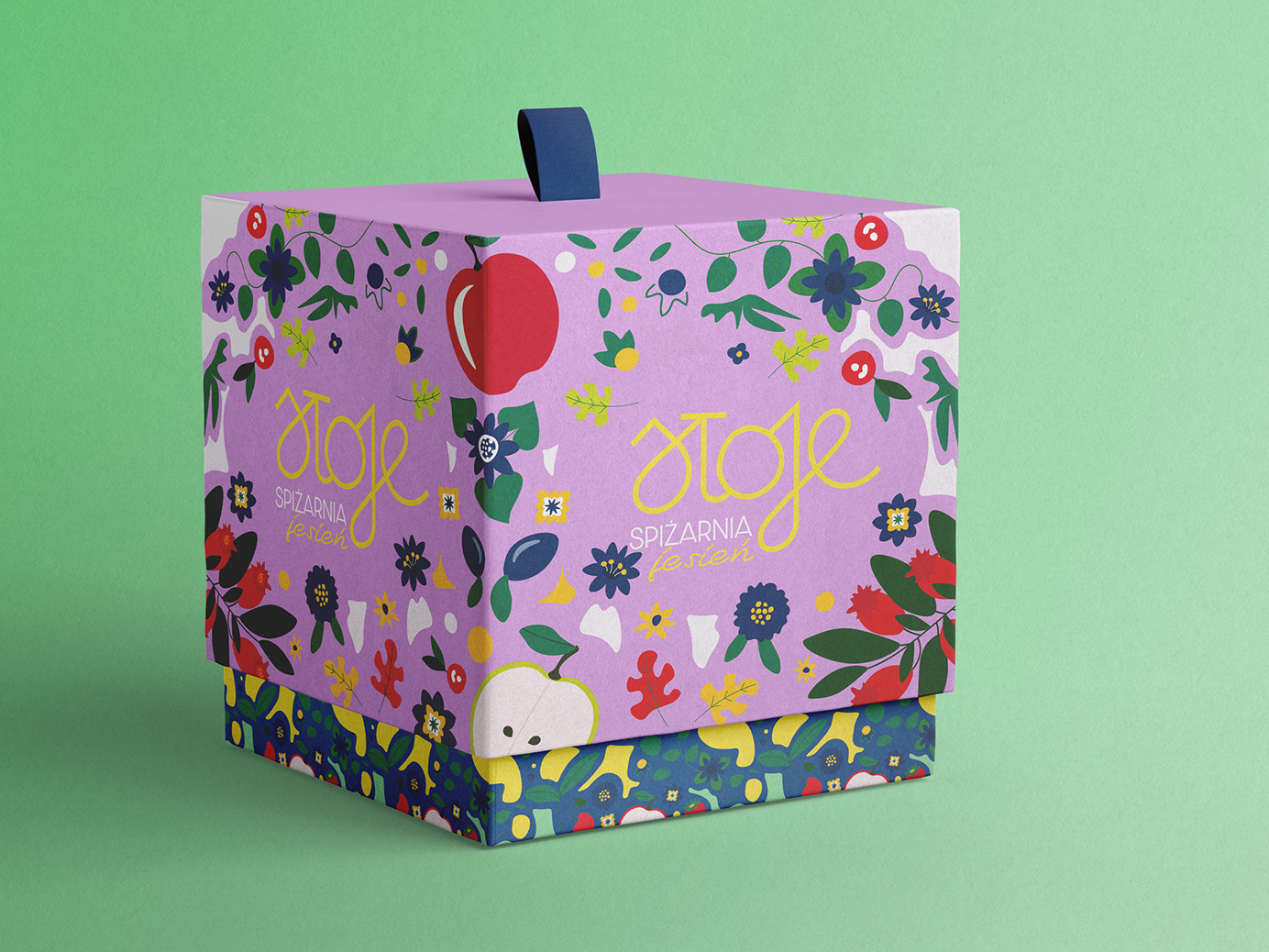
Aesthetic Functionality
The illustration-led system was applied to sturdy cardboard structures, where form, material, and graphic language work together to ensure product safety while reinforcing brand recognition and consistency across touchpoints.
The illustration-led system was applied to sturdy cardboard structures, where form, material, and graphic language work together to ensure product safety while reinforcing brand recognition and consistency across touchpoints.
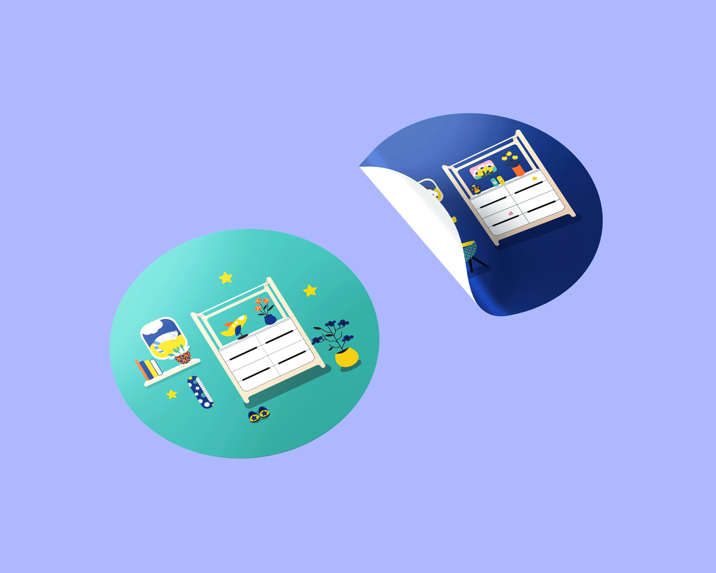
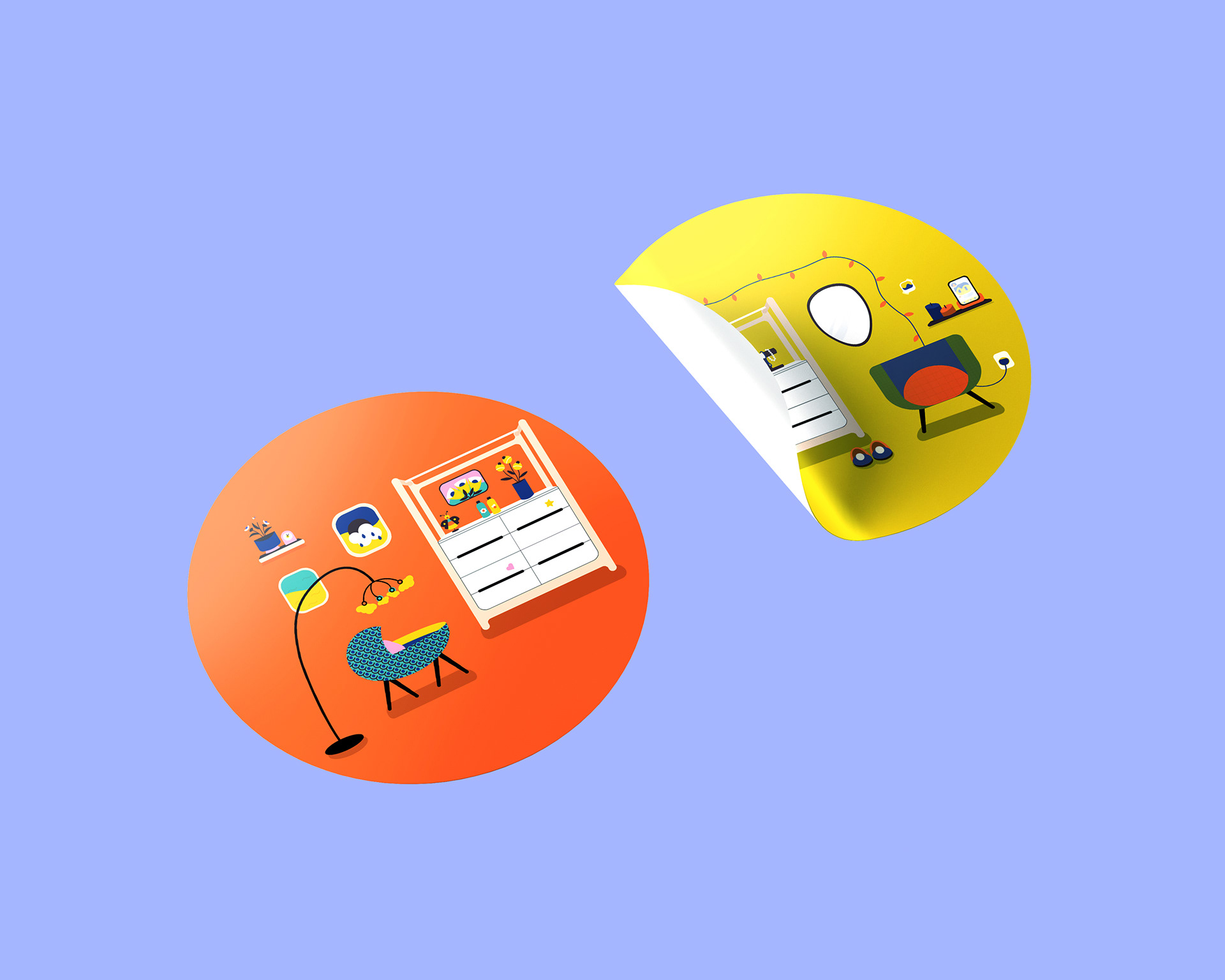
Cute Stickers ❤︎
Cute stickers were meant to bring a smile and spread a little joy wherever they go!
Providing both packaging security and delight.
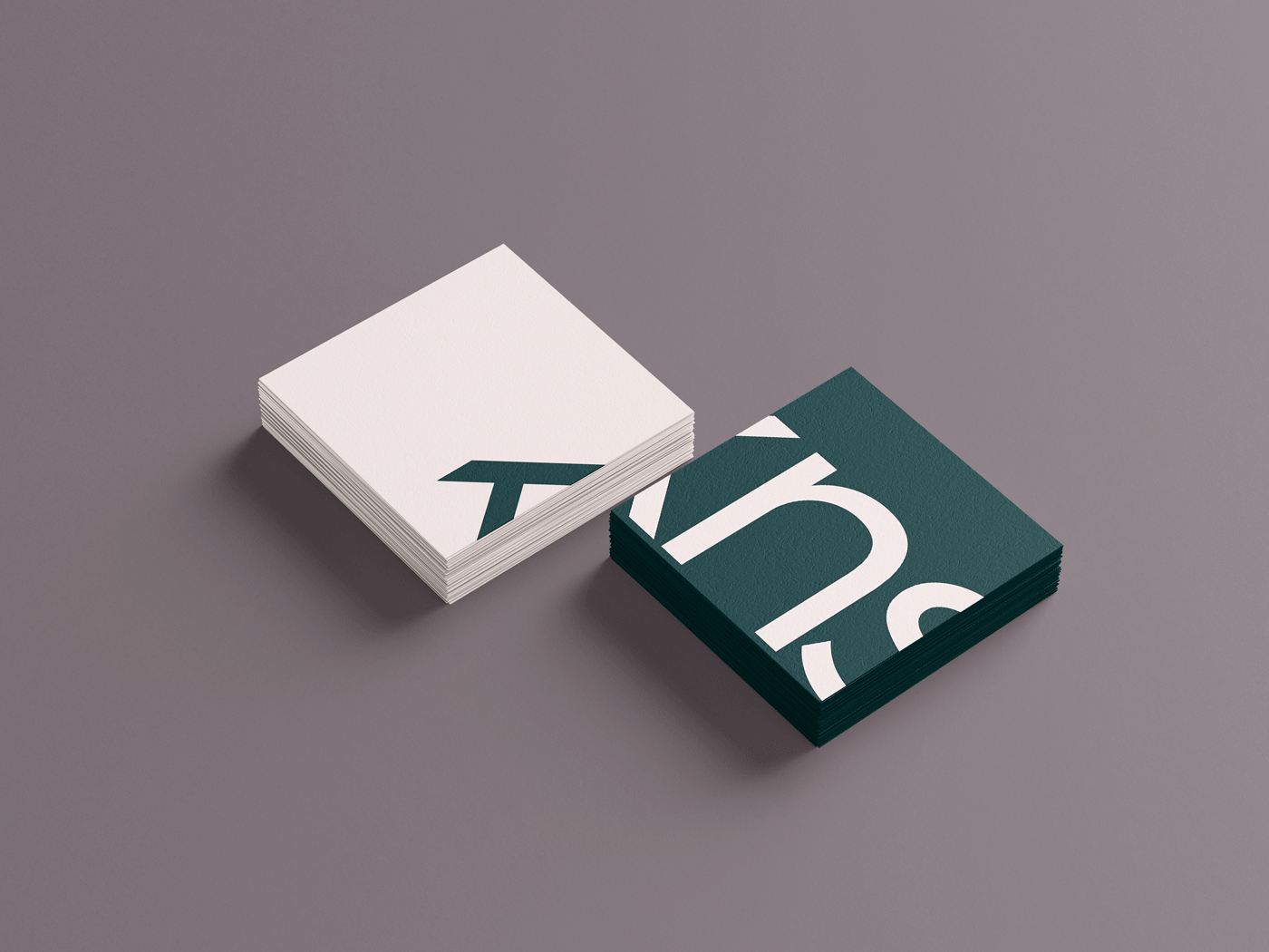
Printed Assets
Business cards and printed materials were designed as practical tools for connection. In Rafa’s industry, they support clear communication and strong relationships with clients, suppliers, and stakeholders.
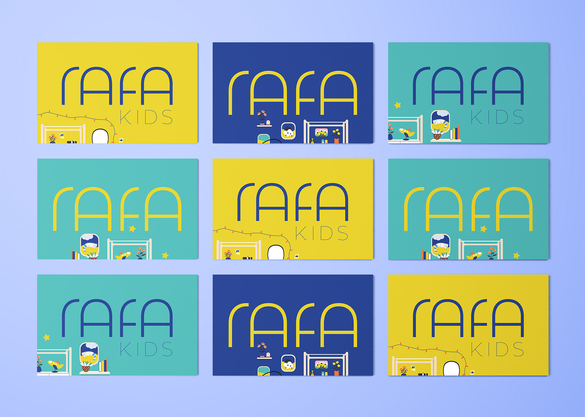

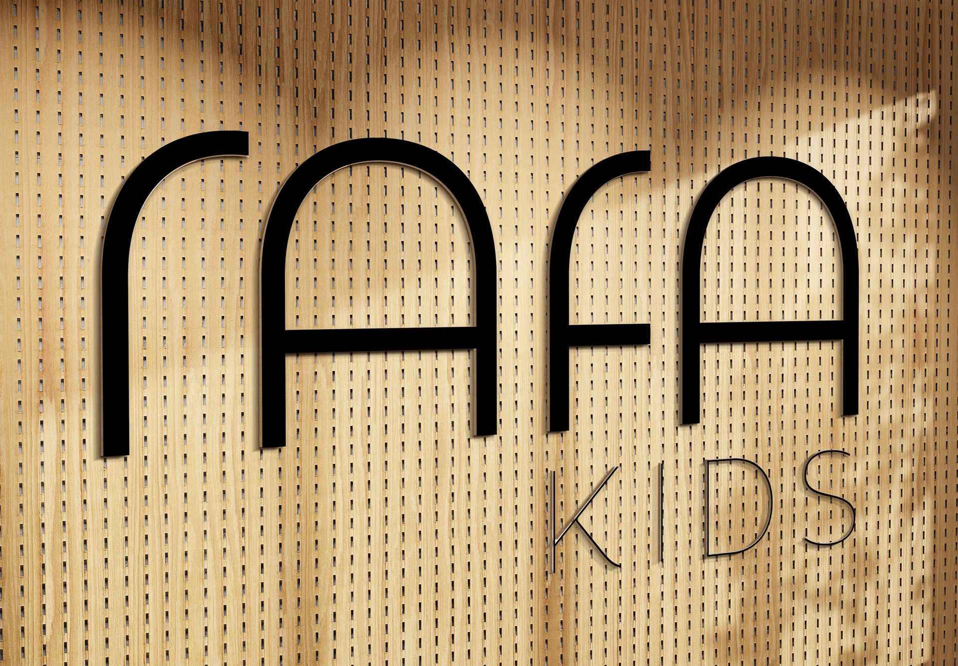
Visual Identity Redesign
The refreshed visual identity introduces distinctive arch shapes within the logotype, forming a recognisable brand device. Rooted in simplicity and timelessness, the arches express intergenerational connection and provide a scalable foundation for Rafa’s visual and illustration-led communication system.
The refreshed visual identity introduces distinctive arch shapes within the logotype, forming a recognisable brand device. Rooted in simplicity and timelessness, the arches express intergenerational connection and provide a scalable foundation for Rafa’s visual and illustration-led communication system.

✦ Thank you