Bold Identity for Unapologetic Self-Expression
Brand Strategy, Identity System and Experience-Led Design
Swhat
Brand Strategy, Identity System & Experience-Led Design
Role & Scope: Brand strategy & positioning · Visual identity system & language (logo, typography, colour, illustrations, graphic elements) · Social & launch framework · Packaging range & retail application · Print & digital production
A bold, personality-driven brand developed from strategy into a flexible identity system, designed to express confidence, playfulness and self-expression across digital and physical touchpoints.
Vibrant Communication of Diversity, Empowerment & Playfulness
SWHAT is built around self-expression, individuality and inclusivity. The brand strategy translates these values into an experience-led visual identity system — a vibrant, modular language that celebrates diversity, empowers individuality and invites play. Each touchpoint is designed to reflect the audience’s unique tastes and personalities, creating a cohesive yet expressive brand experience.
SWHAT is built around self-expression, individuality and inclusivity. The brand strategy translates these values into an experience-led visual identity system — a vibrant, modular language that celebrates diversity, empowers individuality and invites play. Each touchpoint is designed to reflect the audience’s unique tastes and personalities, creating a cohesive yet expressive brand experience.
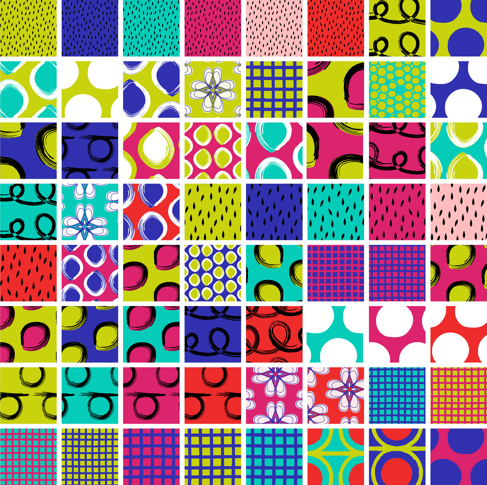
A System That Celebrates Uniqueness
Each element of the identity system is designed to express the brand’s commitment to inclusivity and self-expression. Vibrant colours, dynamic shapes and playful compositions invite customers to embrace individuality and imperfection. Whimsical details add emotional character, while the strategic use of contrast strengthens visual impact and ensures strong shelf presence across retail environments.
Each element of the identity system is designed to express the brand’s commitment to inclusivity and self-expression. Vibrant colours, dynamic shapes and playful compositions invite customers to embrace individuality and imperfection. Whimsical details add emotional character, while the strategic use of contrast strengthens visual impact and ensures strong shelf presence across retail environments.
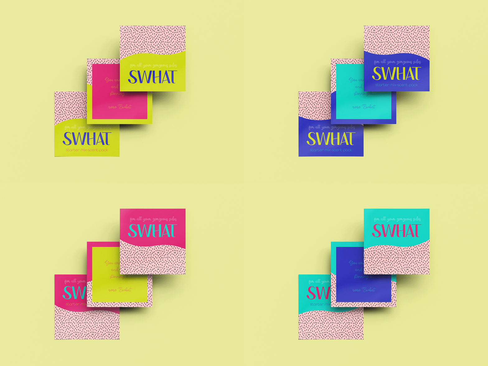
Messaging That Inspires Confidence
SWHAT’s messaging is designed to inspire confidence and encourage self-expression. A strategic interplay of language and visual cues across brand touchpoints communicates the brand’s values and purpose with clarity and consistency. This cohesive approach builds emotional connection, nurtures a sense of belonging and supports the growth of an engaged brand community.
Dynamic Visual Communication Across Brand Environments
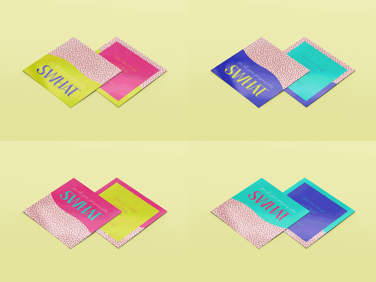
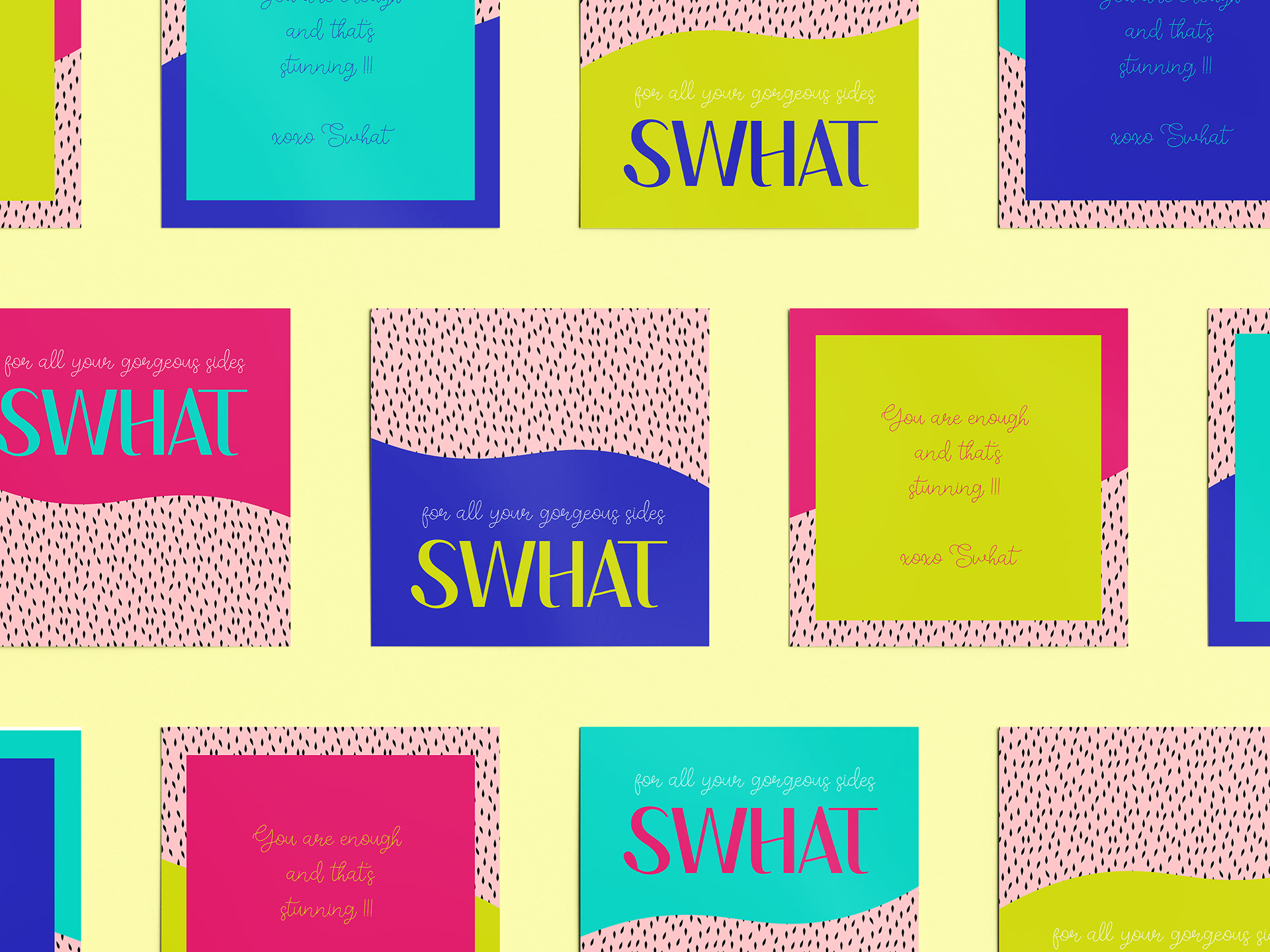
The design language captures the brand’s empowering spirit, encouraging unapologetic individuality. Bold, mix-and-match patterns express SWHAT’s joyful essence while ensuring strong visibility and recognition across digital, print and physical touchpoints.
The design language captures the brand’s empowering spirit, encouraging unapologetic individuality. Bold, mix-and-match patterns express SWHAT’s joyful essence while ensuring strong visibility and recognition across digital, print and physical touchpoints.
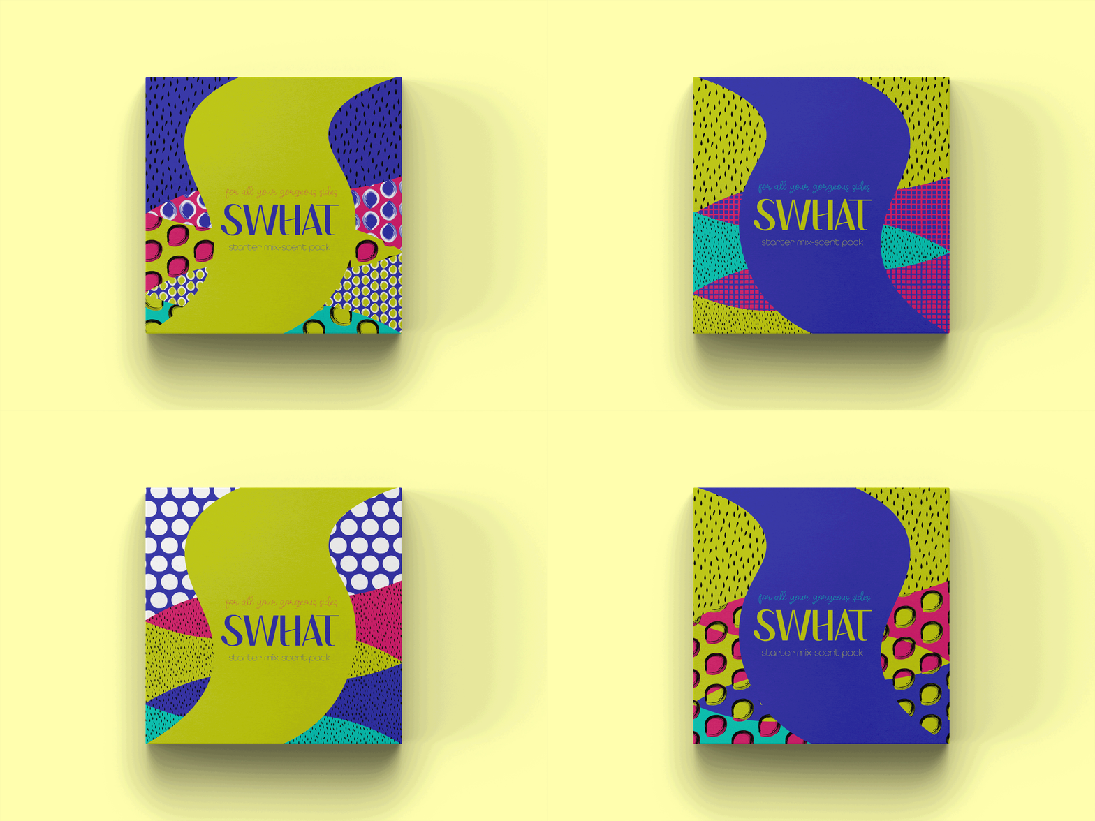
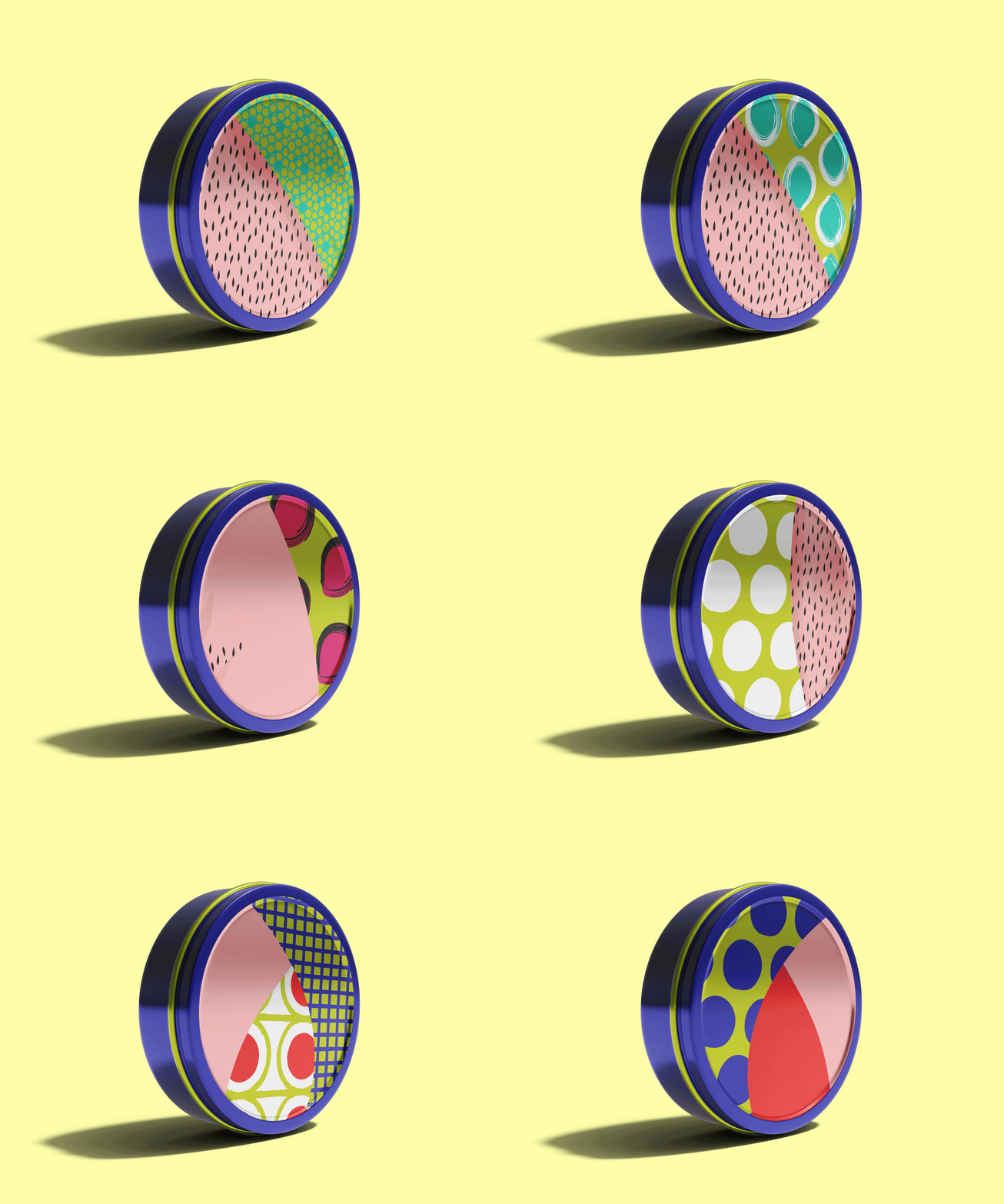
System of Illustrations Echoes Self-Confidence Across All Branded Products
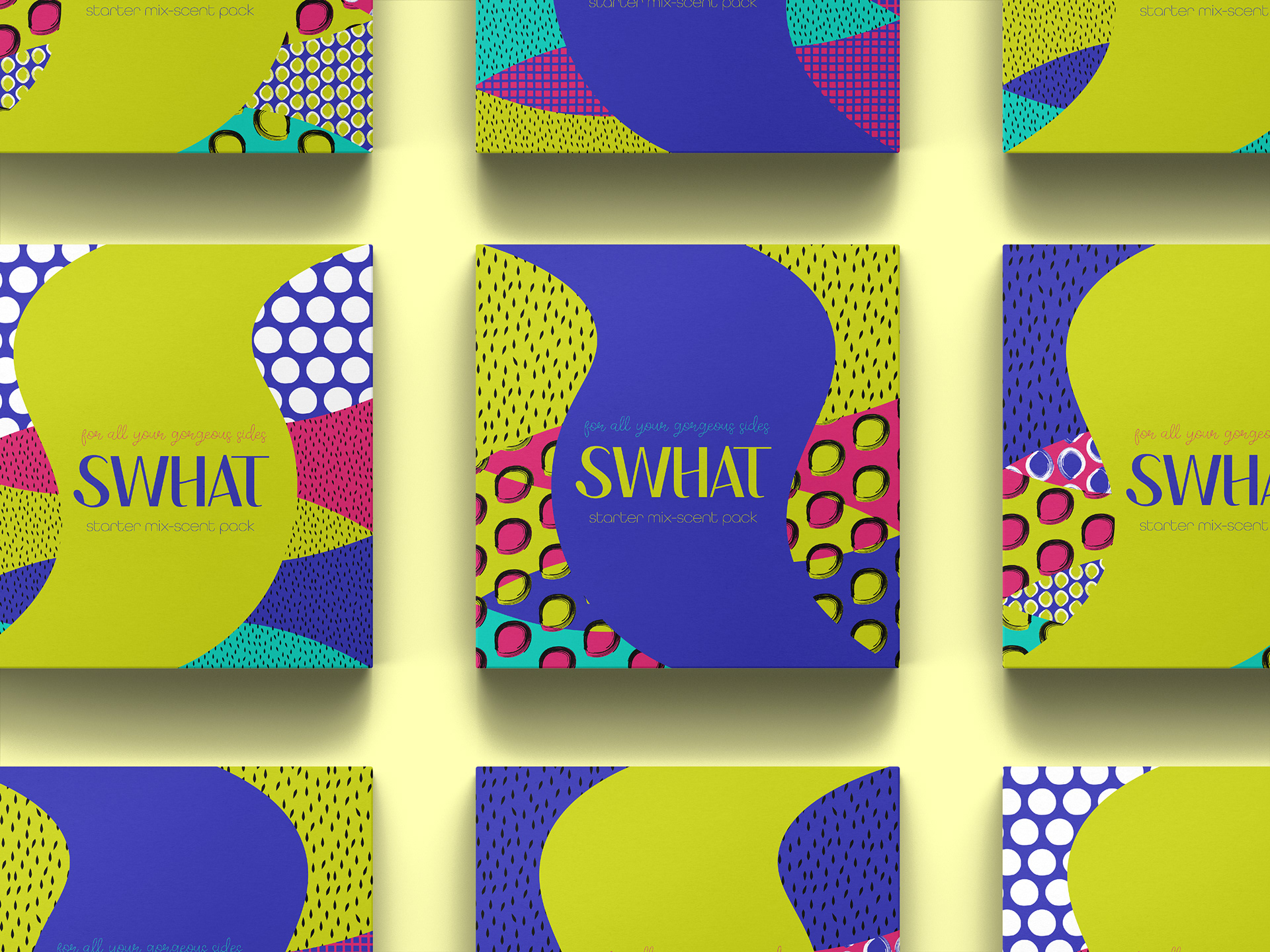
The visuals represent diverse voices, inspiring confidence and self-expression across brand's range. Bold colors and contrasts highlight the brand’s commitment to uniqueness. It's a visual expression of joy and self-confidence.
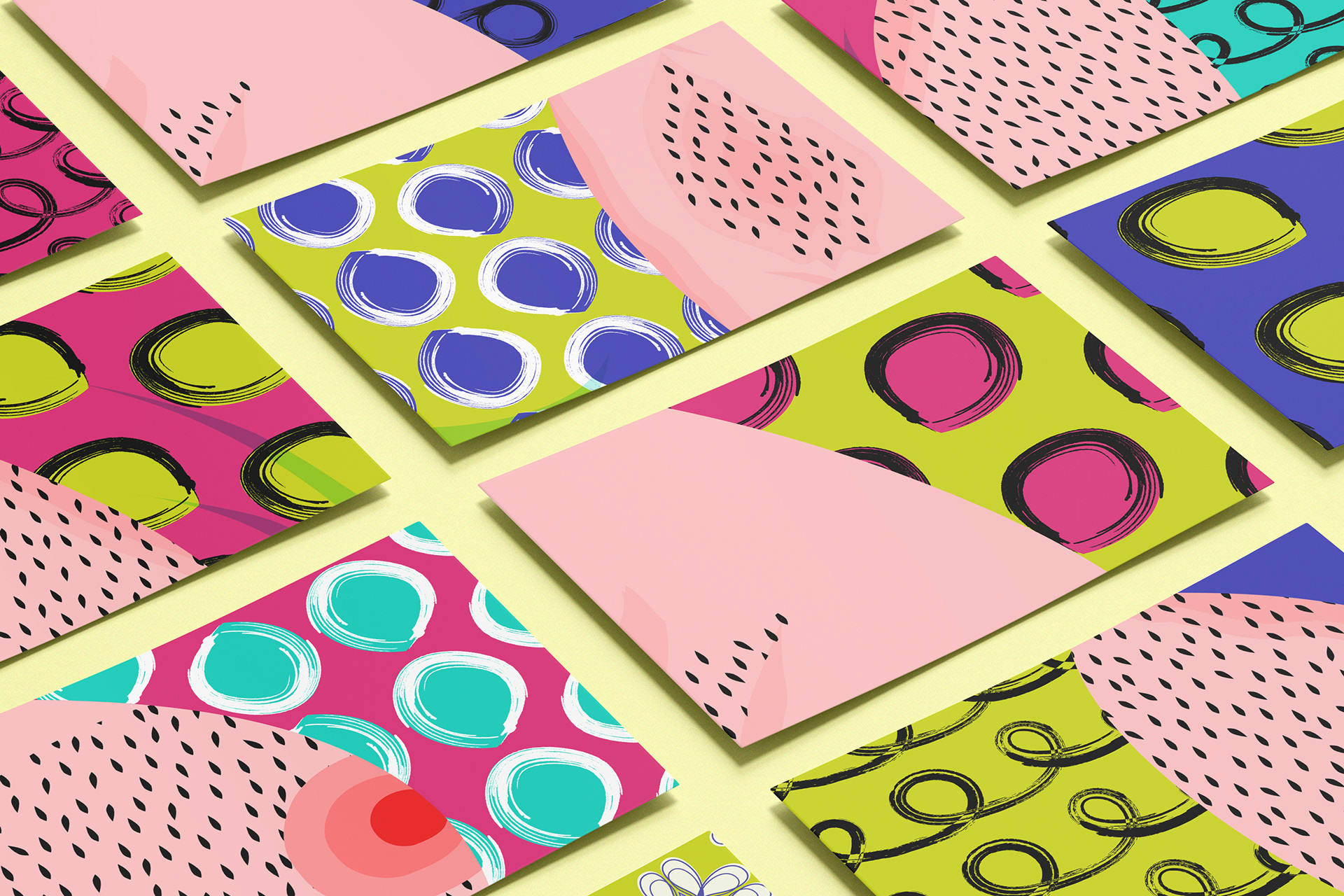
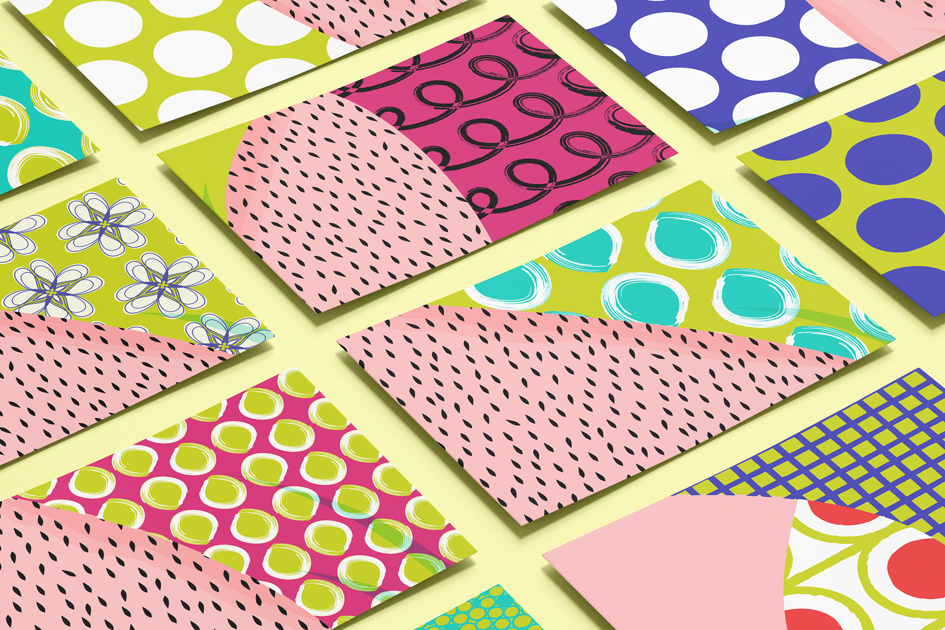
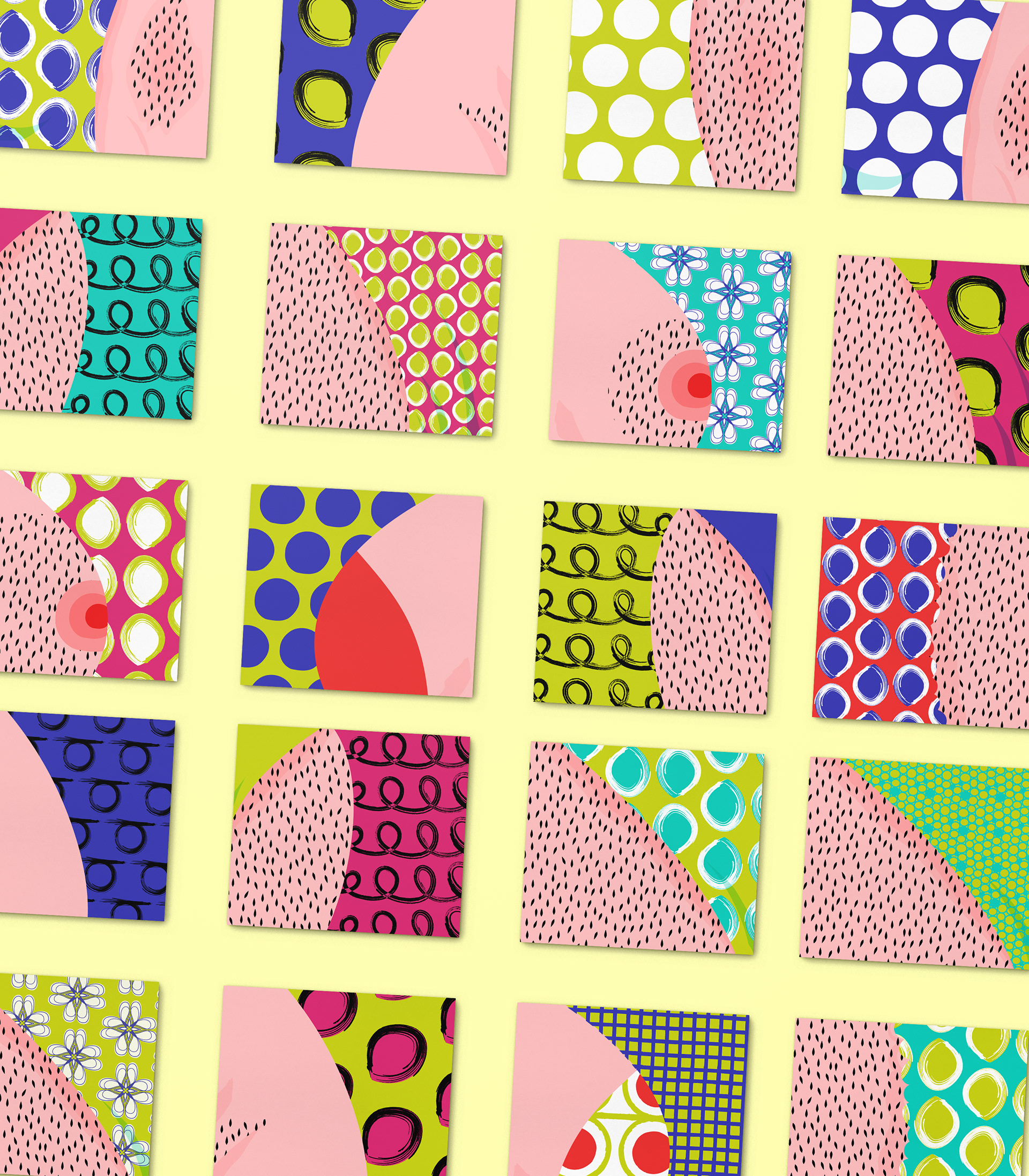
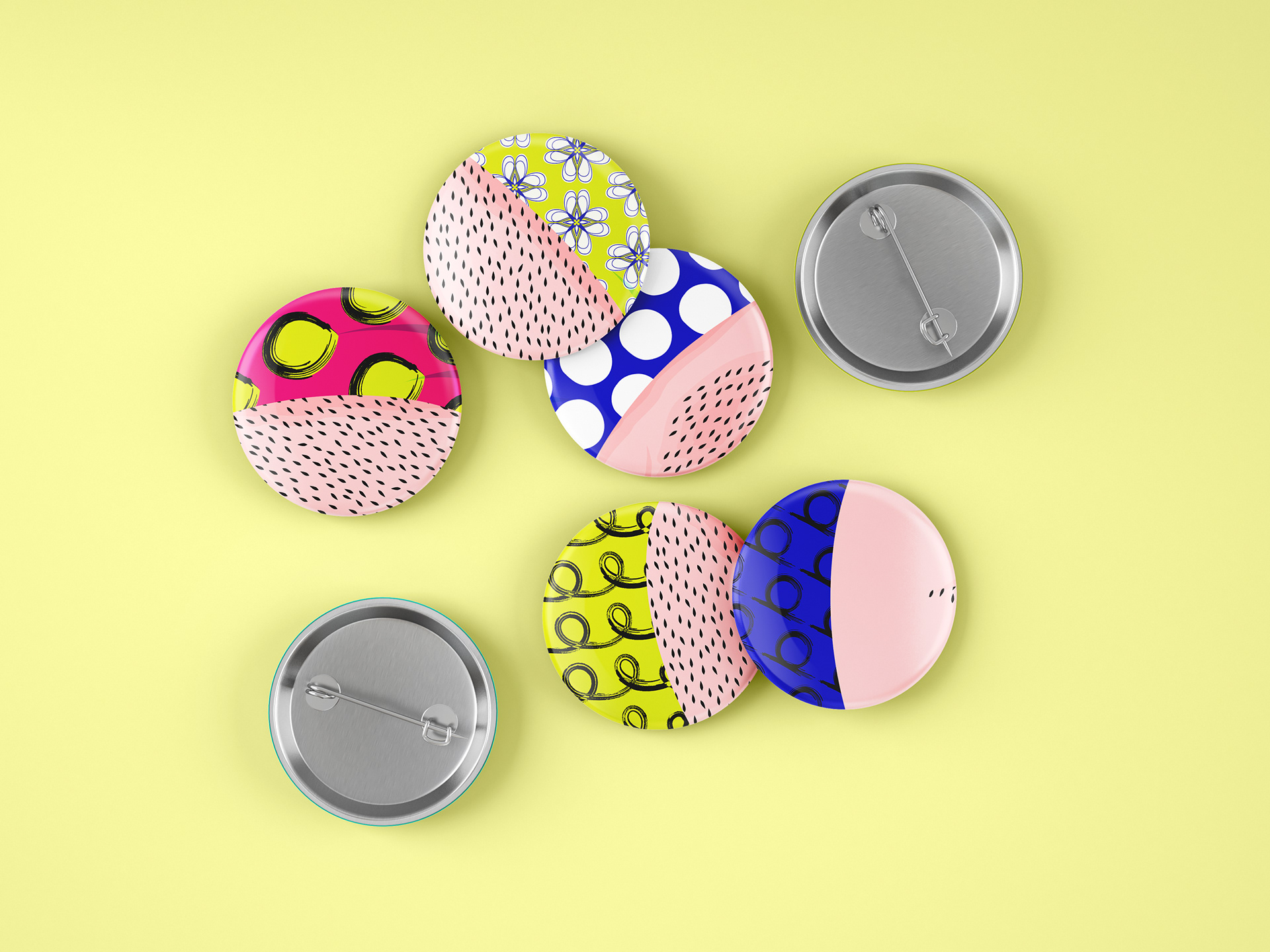
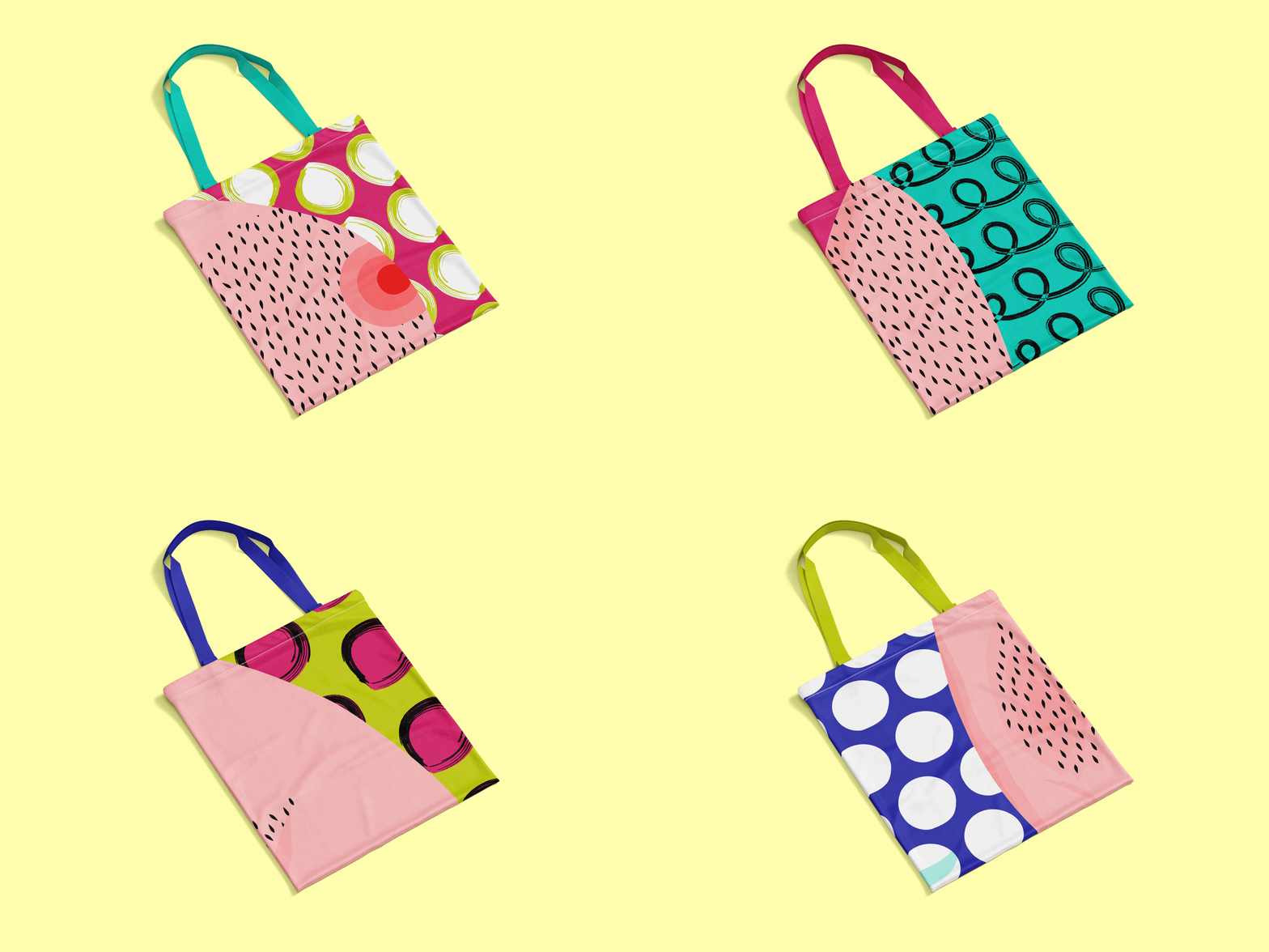
Creativity Embraced in Merchandise Design
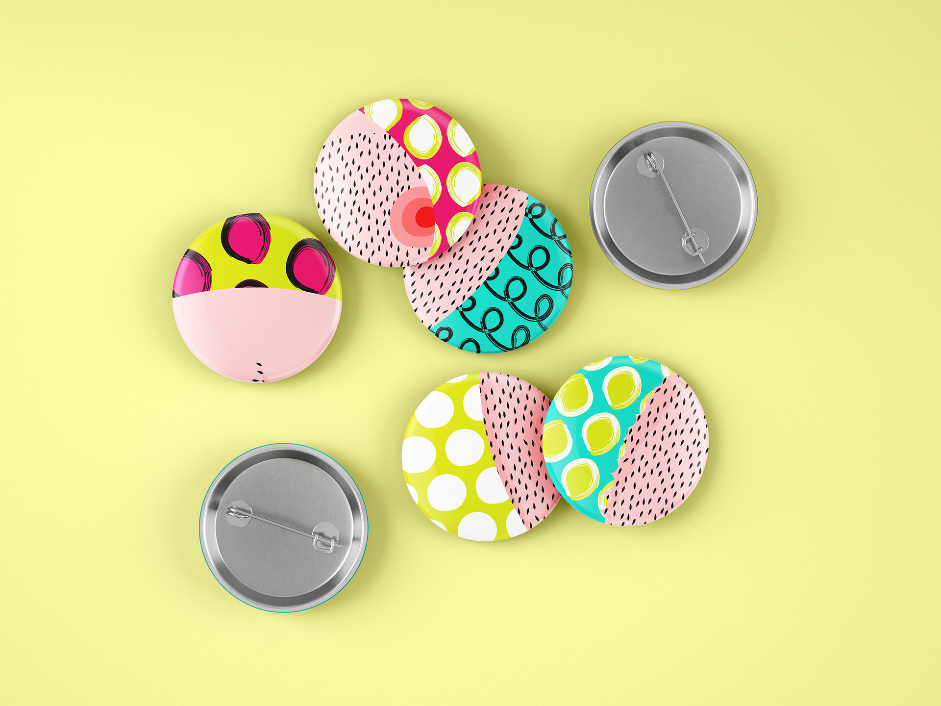
Illustrations extends onto SWHAT’s merchandise to celebrate diversity and empowerment, breaking
free from conventional norms and embracing boundless creativity and self-expression.
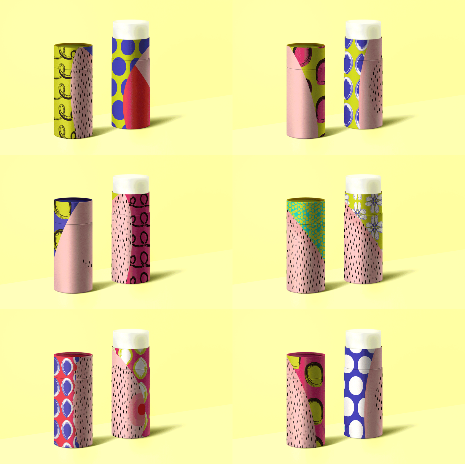
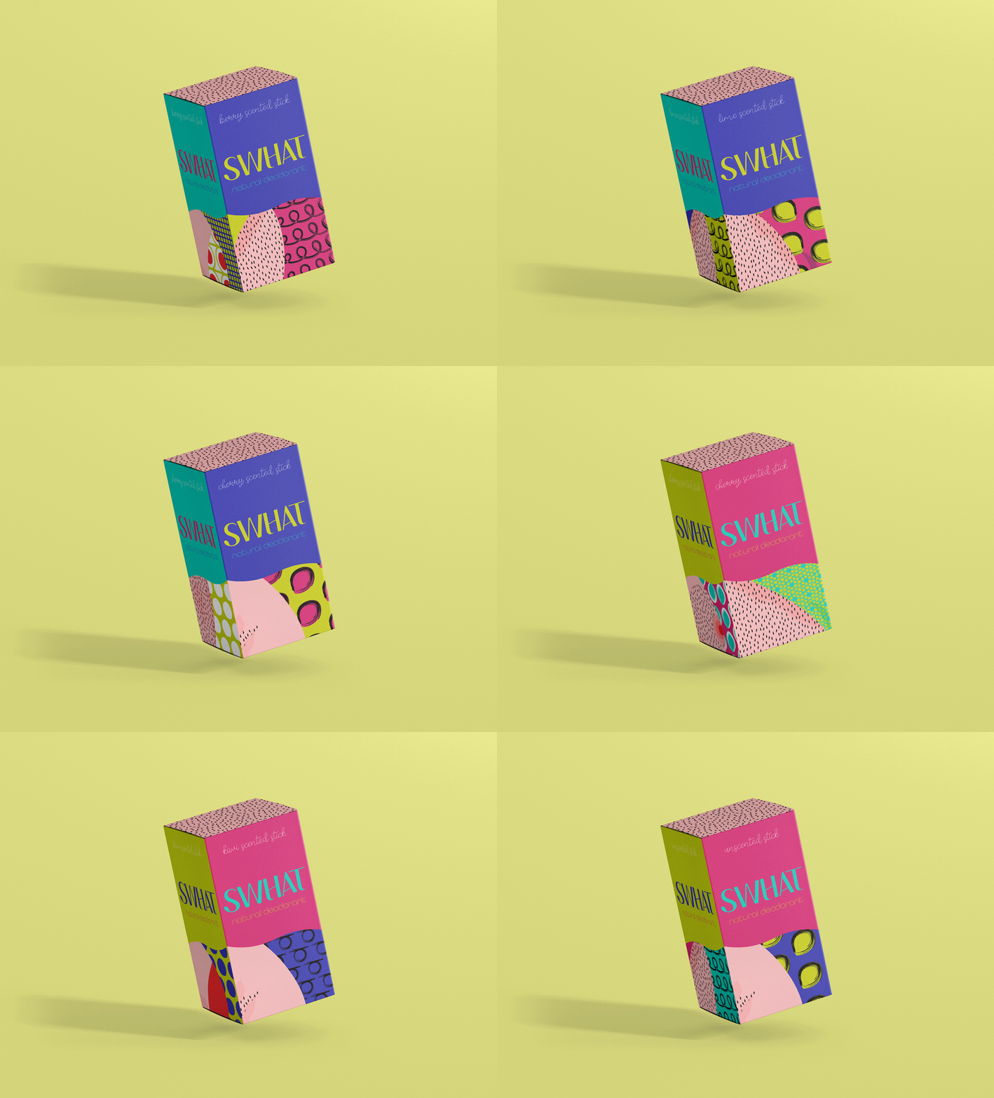
Whimsicality Infused onto Broad Packaging Range
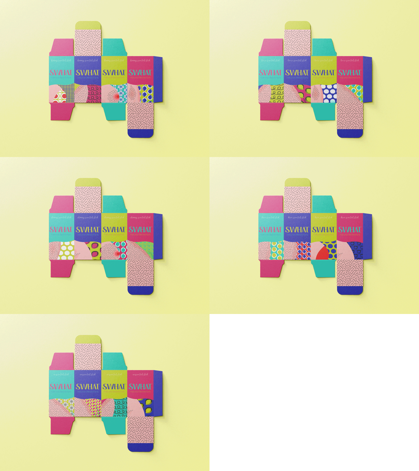
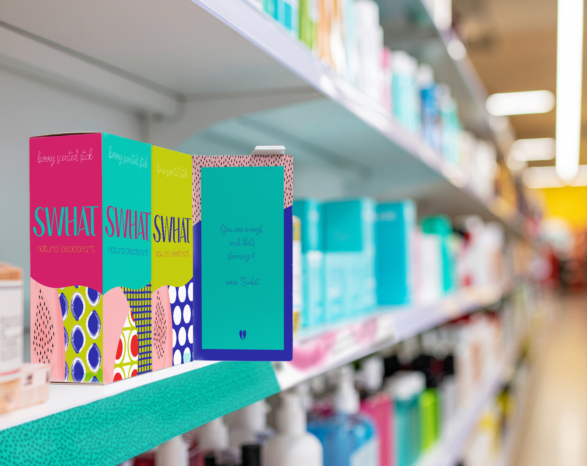
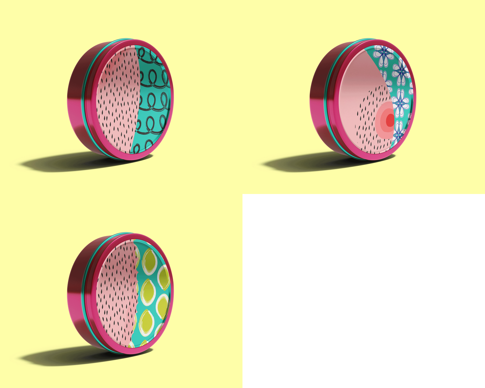
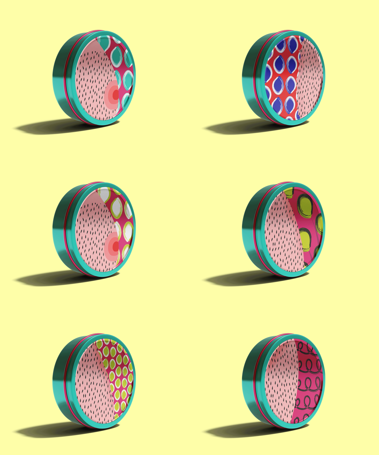
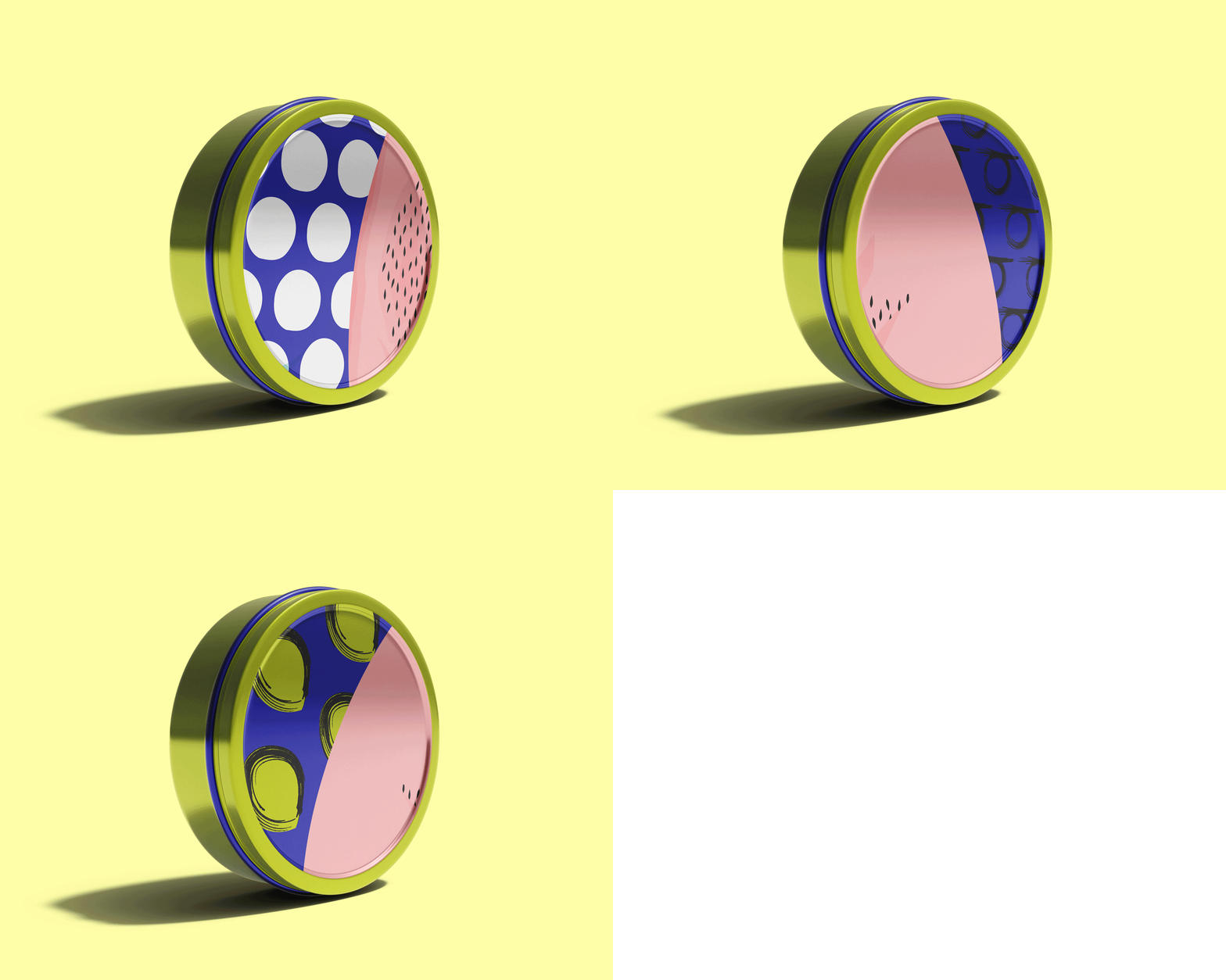
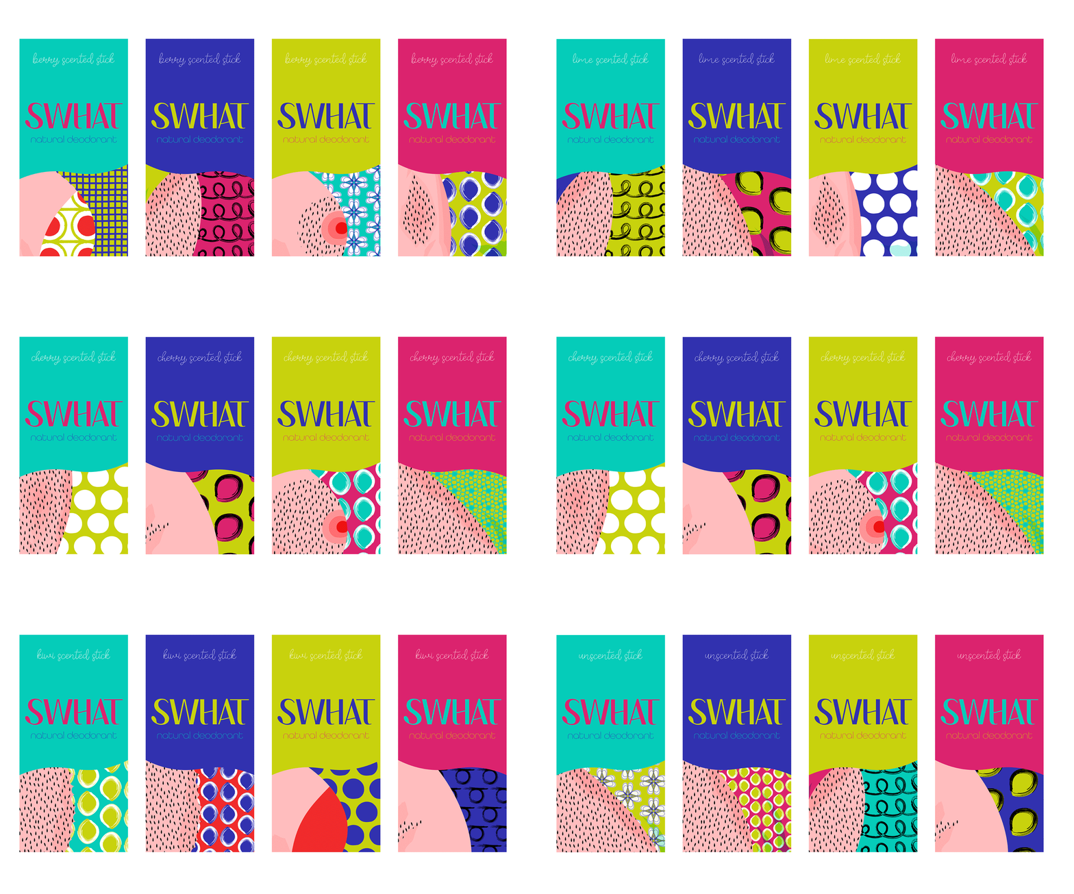
Packaging is covered with wibrant, cartoony-style illustrations to infuse joy and relatability. Attracts attention and make each product visually distinct. Celebrates body positivity by embracing all shapes and sizes, promoting comfort and confidence.
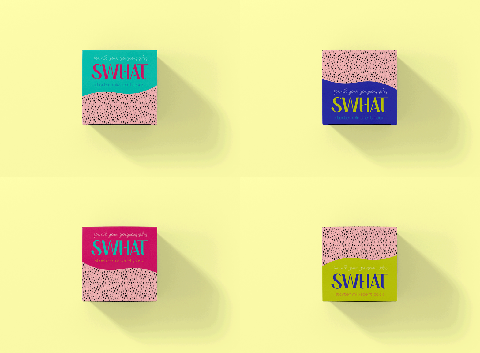
Sustainable Packaging Solutions
Reusable materials were chosen to minimize waste. Eco-conscious packaging prioritize sustainability, using renewable and recyclable materials whenever possible.
The Heart of the Visual Identity System
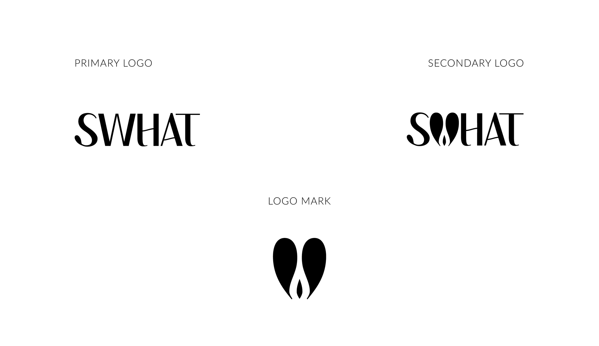
At the core of SWHAT’s identity sits a literal heart, a symbol of connection, boldness and playfulness designed for instant recognition. As a central system element, it anchors the visual language, while whimsical key visuals and playful accents inject energy and creativity, reinforcing the brand’s commitment to self-expression and individuality.
At the core of SWHAT’s identity sits a literal heart, a symbol of connection, boldness and playfulness designed for instant recognition. As a central system element, it anchors the visual language, while whimsical key visuals and playful accents inject energy and creativity, reinforcing the brand’s commitment to self-expression and individuality.
Playful Typeface Reinforces Brand Spirit
The modern, playful font reflects SWHAT’s joyful and energetic spirit. Rounded, friendly letterforms foster warmth and inclusivity, making the brand feel open and accessible.

Dynamic Social Media Expression
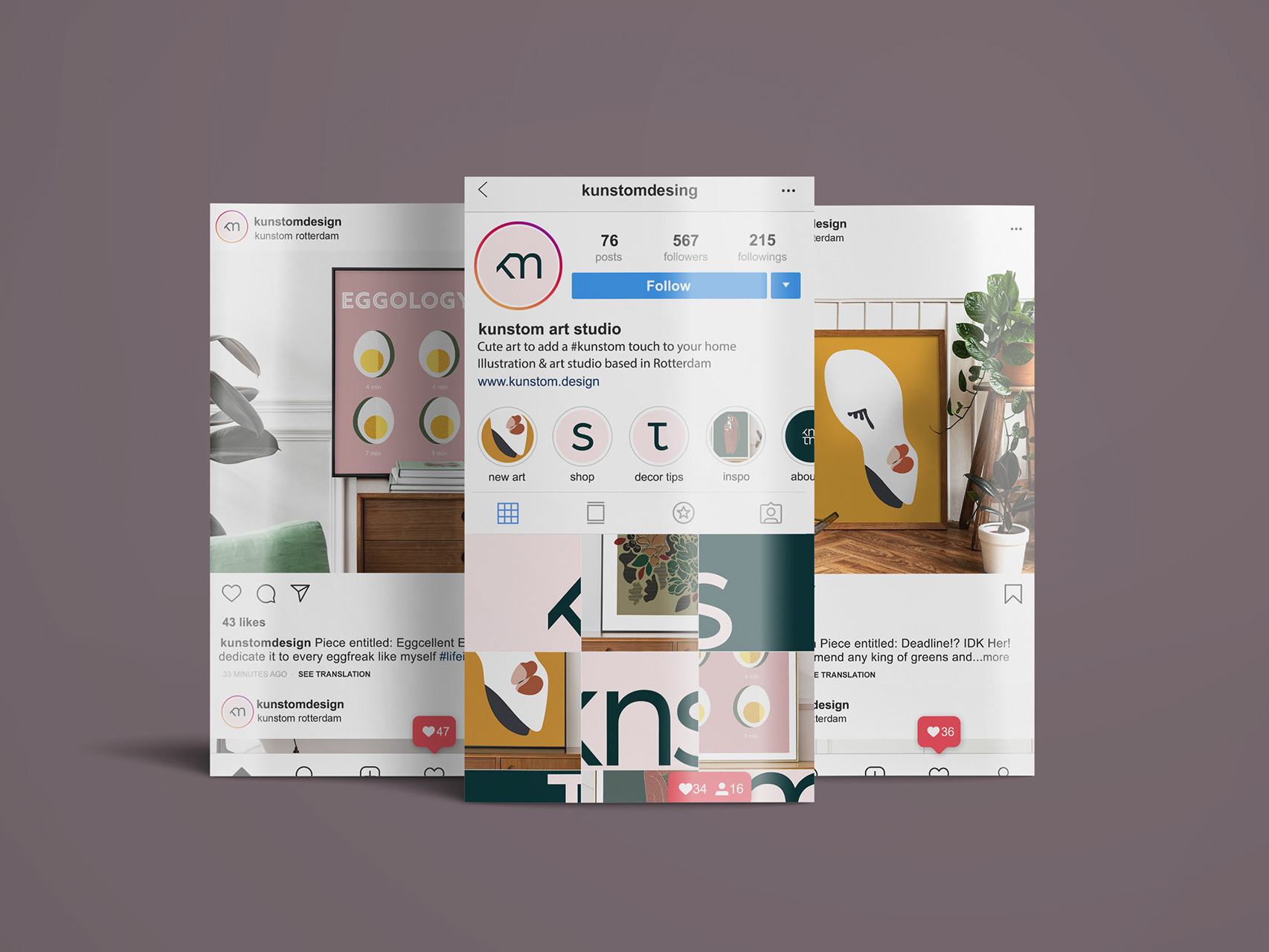
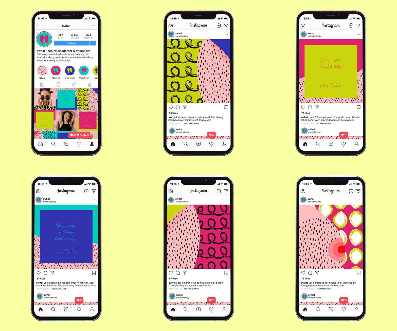
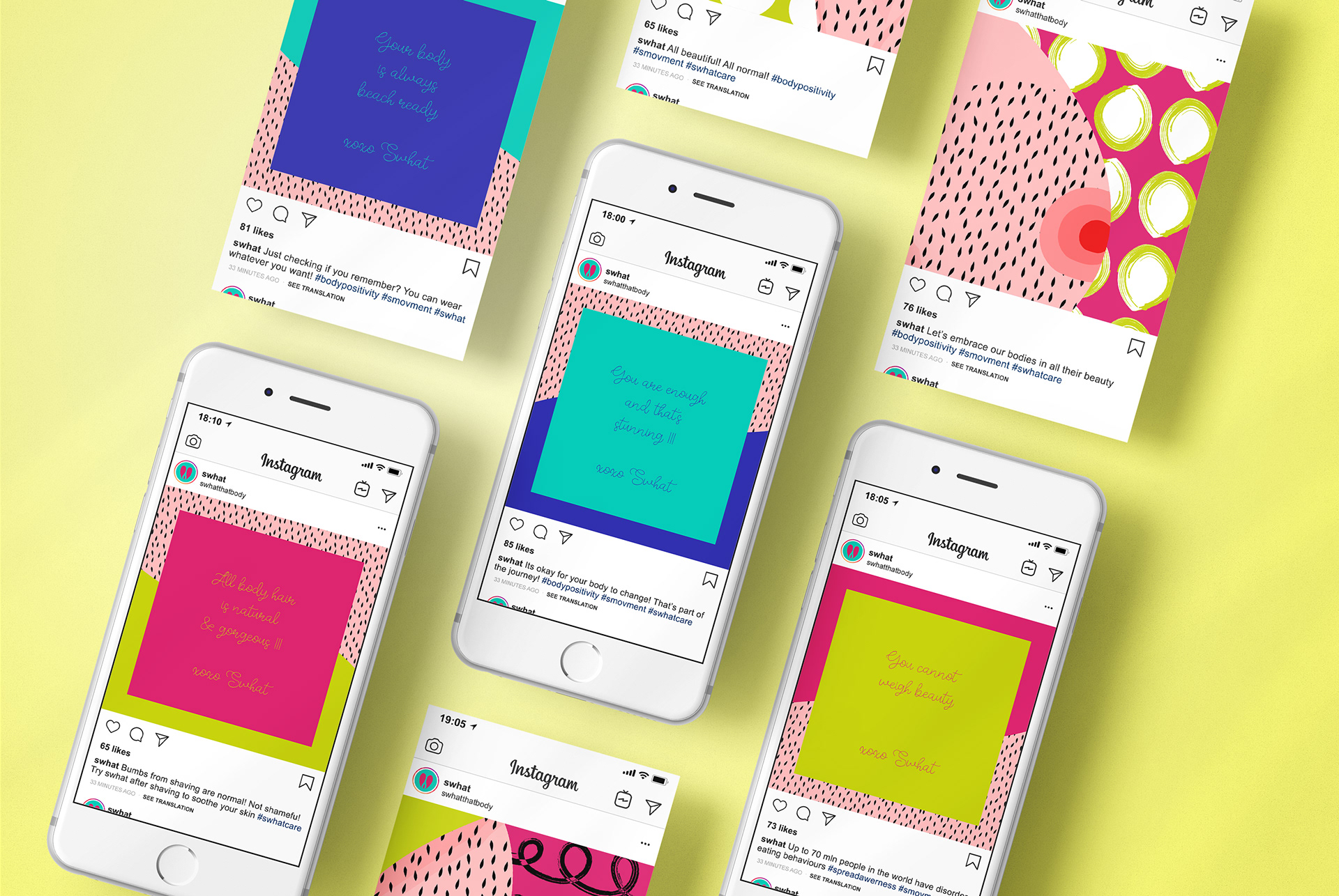
The social media approach is built around a clear imagery and art direction framework that translates the brand’s personality and values into expressive visual storytelling. Striking graphic compositions and curated photography are guided by a deep understanding of SWHAT’s audience, resulting in content that feels authentic, engaging and culturally relevant across platforms.
The social media approach is built around a clear imagery and art direction framework that translates the brand’s personality and values into expressive visual storytelling. Striking graphic compositions and curated photography are guided by a deep understanding of SWHAT’s audience, resulting in content that feels authentic, engaging and culturally relevant across platforms.

✦ Appreciate you checking out my work
✦ Inspirational Quote of the day ↓

