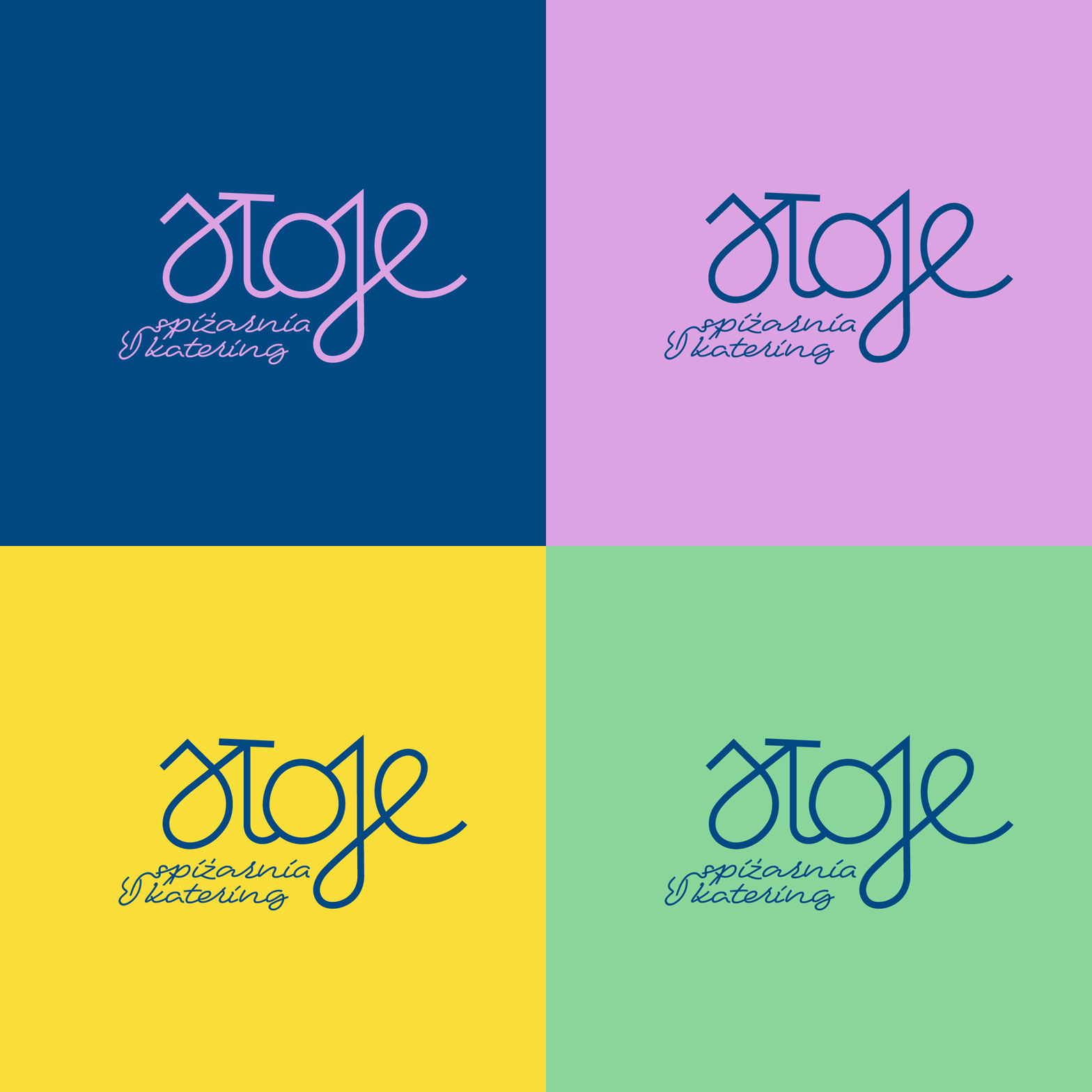
From Pantry to Brand Experience
Brand Strategy, Identity System & Experience-Led Design
Sloje
Brand strategy, Identity System and experience-Led Design
Role & Scope: Brand strategy & positioning · Visual identity system & language (logo, patterns, illustration, iconography) · Modular brand communication system · Packaging system · Social media framework · Print & production
A food brand developed from strategy into a cohesive identity system, expressed through a tactile, illustration-led visual language across packaging, retail and digital touchpoints.
From Ingredients to Identity
Starting with self-grown ingredients and locally sourced produce, Sloje’s brand identity was shaped through defining core values, positioning and a seasonal brand logic. These foundations informed a cohesive visual and verbal system designed to grow and adapt across touchpoints.
Locality and Seasonality in Brand Expression
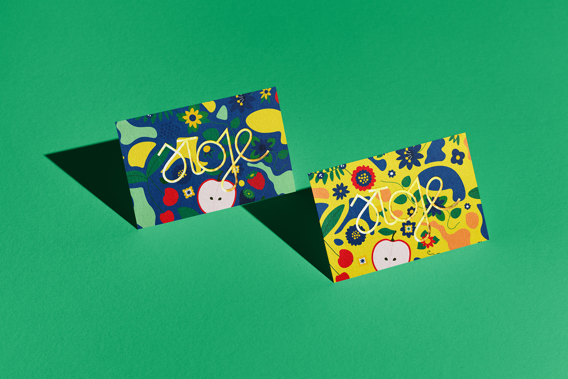
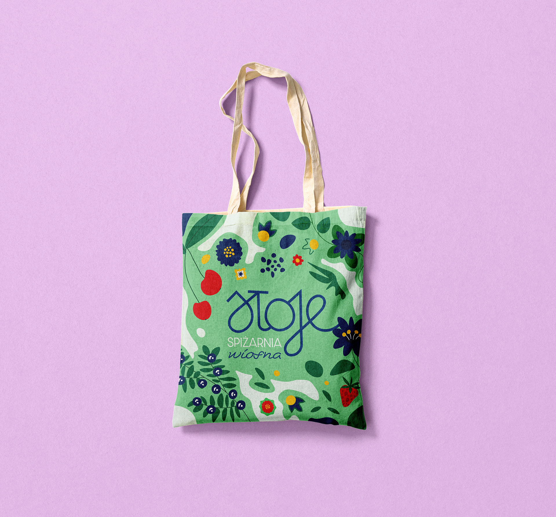
Building on this strategy, Sloje’s identity translates locality and seasonality into a warm, expressive visual language. Vibrant colours and hand-drawn illustrations reflect the handmade nature of the offer, creating an emotional connection from first glance to final taste.
Building on this strategy, Sloje’s identity translates locality and seasonality into a warm, expressive visual language. Vibrant colours and hand-drawn illustrations reflect the handmade nature of the offer, creating an emotional connection from first glance to final taste.
Art Direction Rooted in Folklore
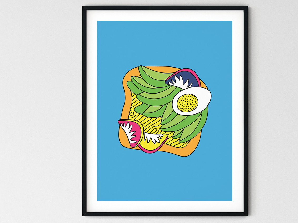
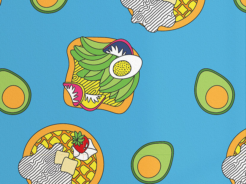
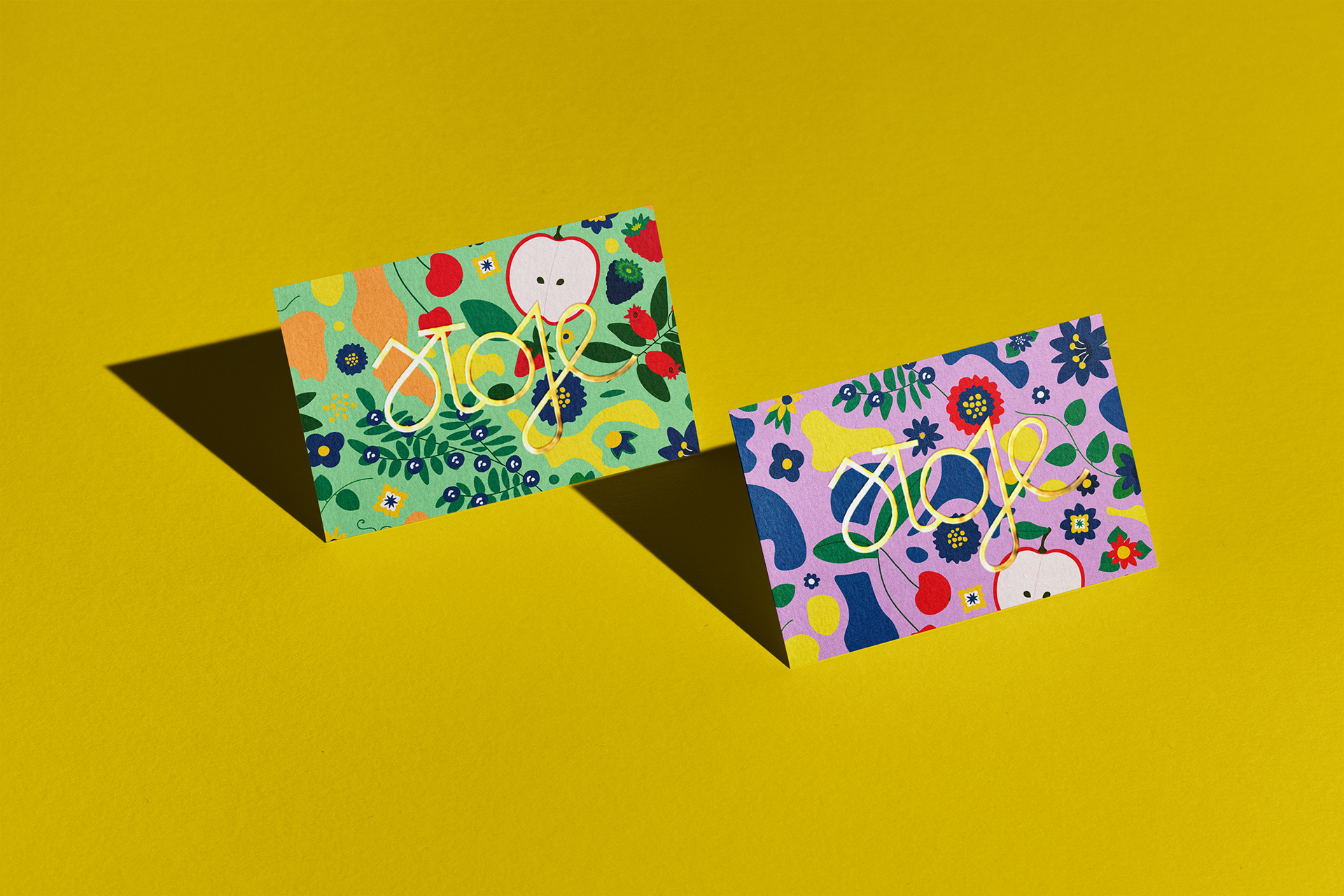
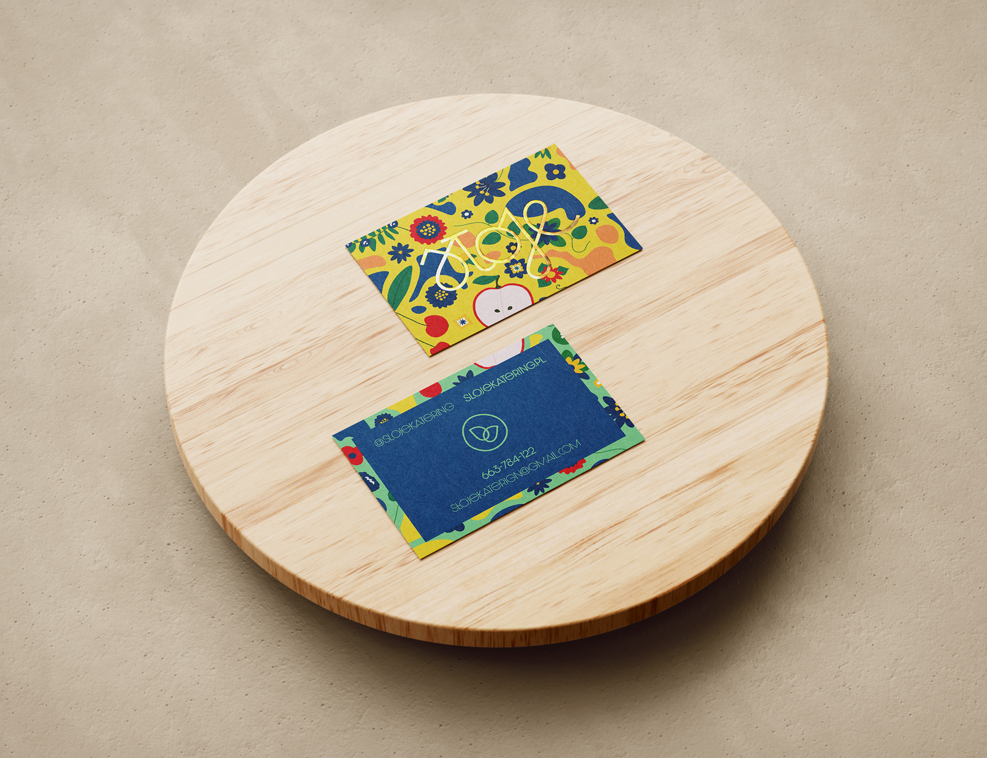
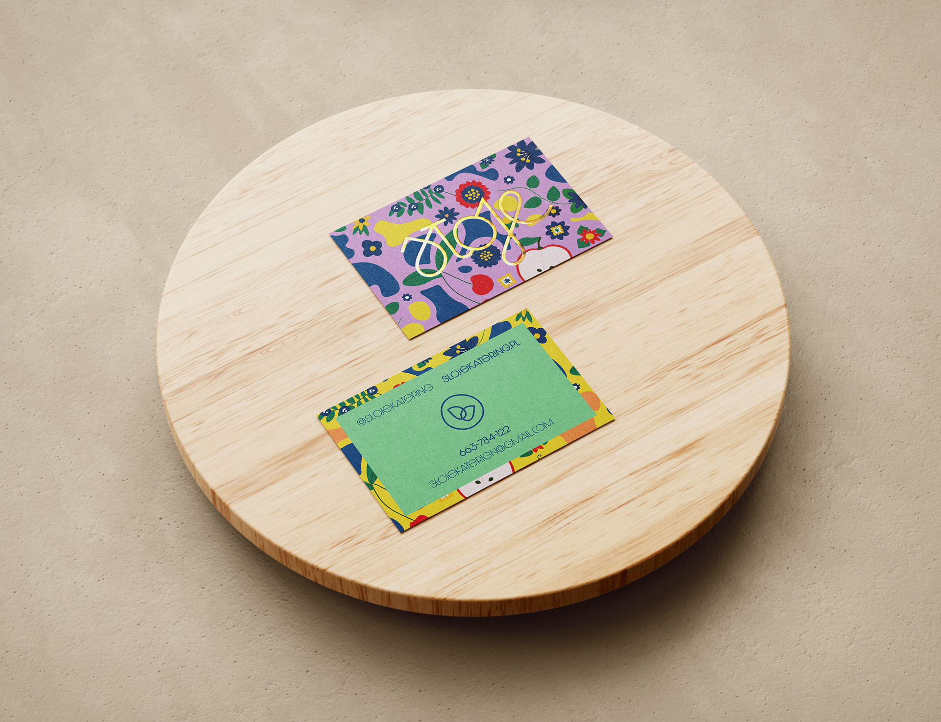
Sloje's visual design boasts an extensive system of illustrations, patterns, and graphics, showcases whimsical depictions of fresh produce and intricate patterns inspired by Polish folklore.
Developing the Visual Language
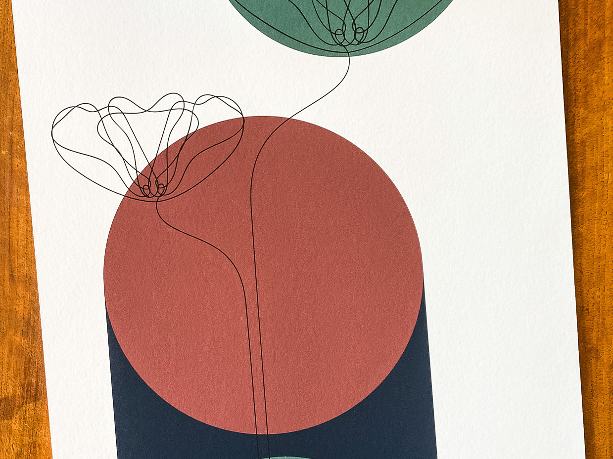
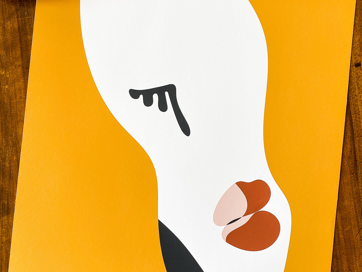
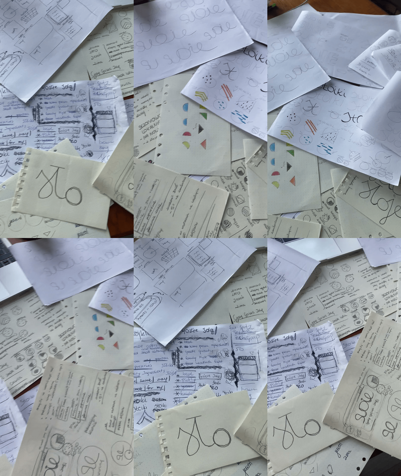
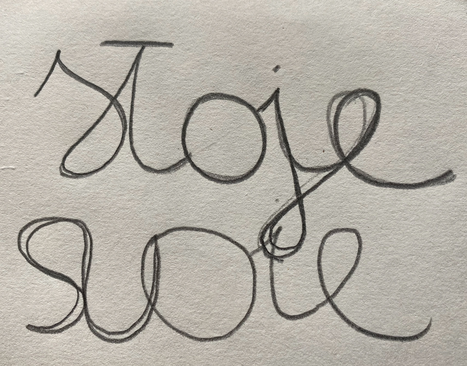
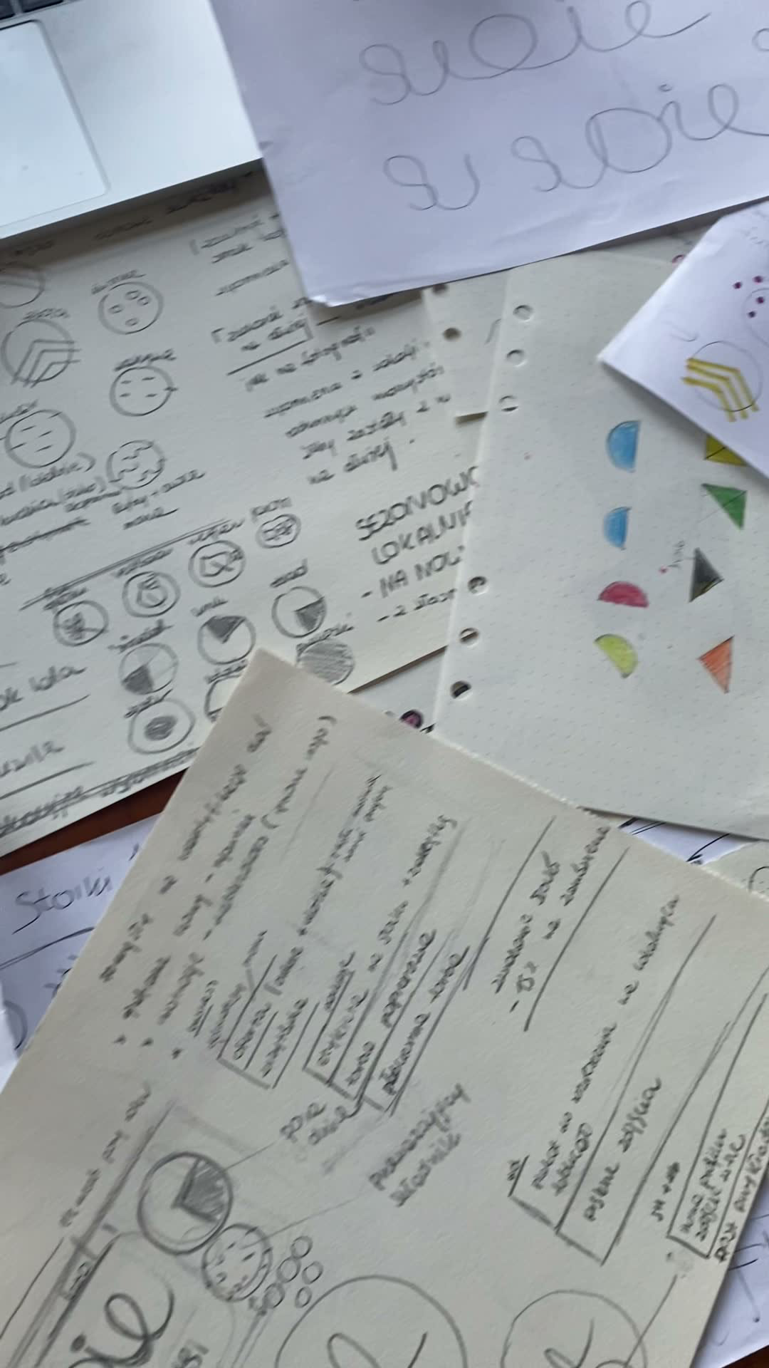
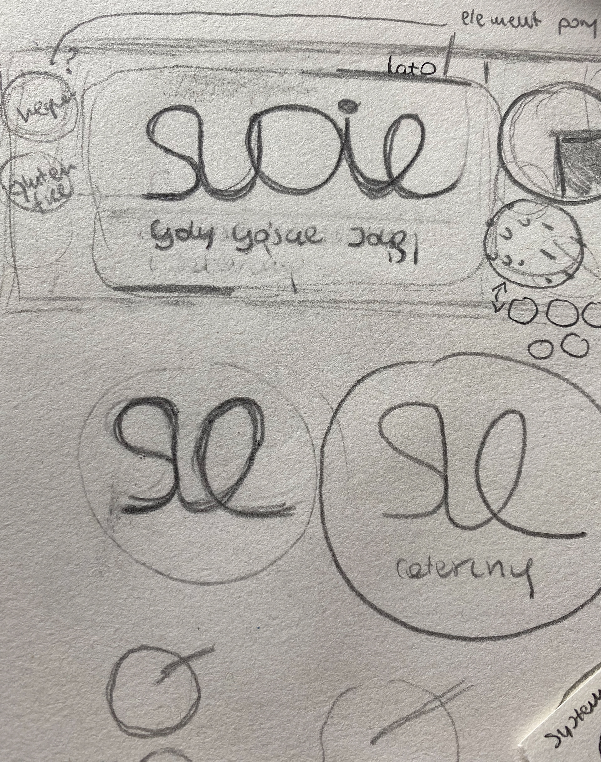
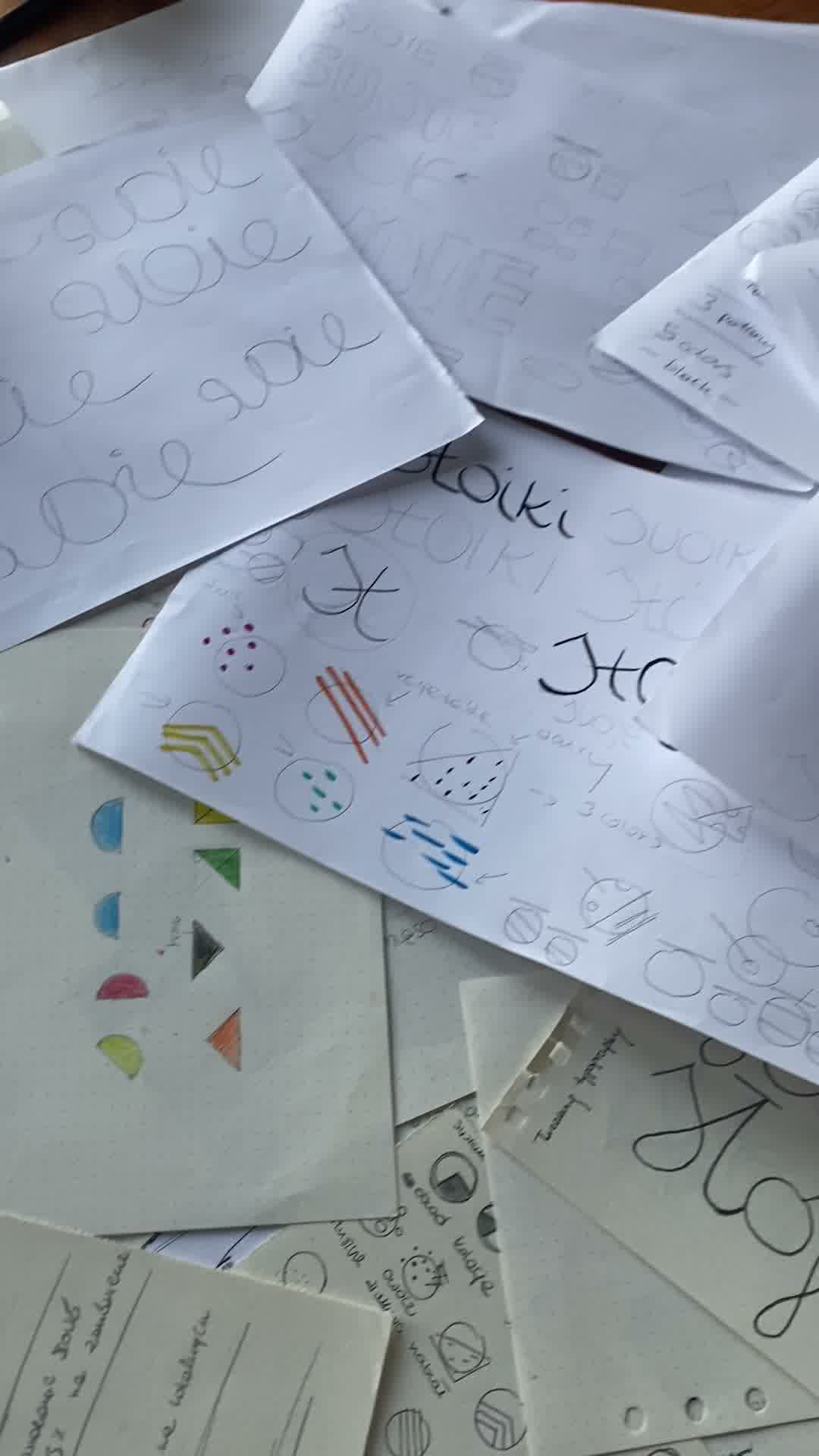
The identity began with hand-drawn explorations of lettering, marks, and graphic motifs.
These early studies shaped the tone, rhythm, and materiality of the brand system, grounding it in craft, authorship, and contemporary relevance.
Creative Exploration
Creative Exploration
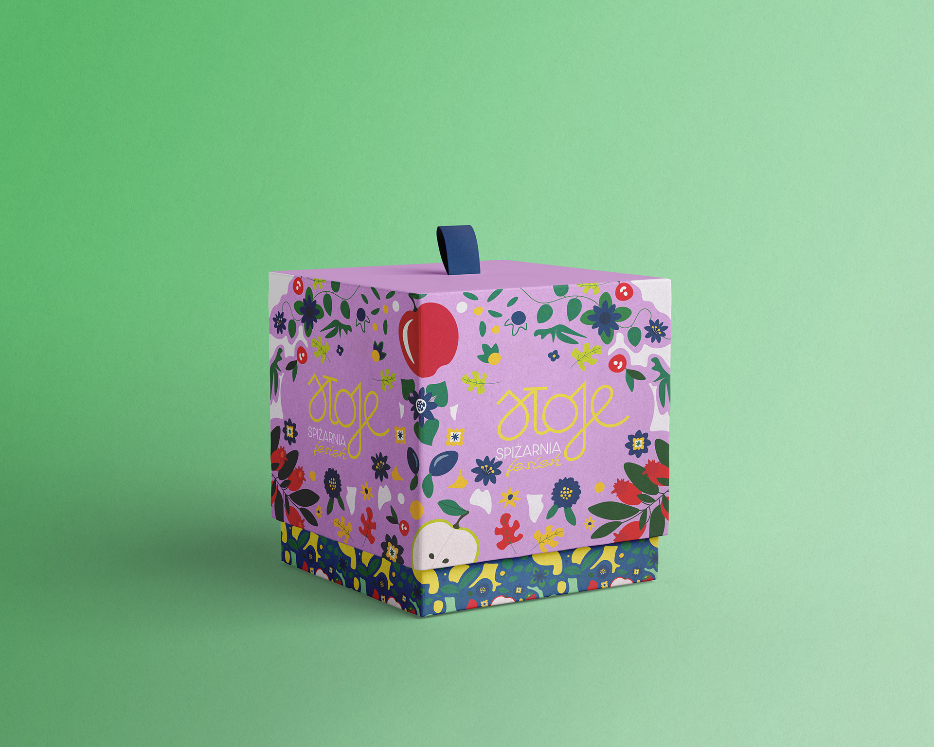
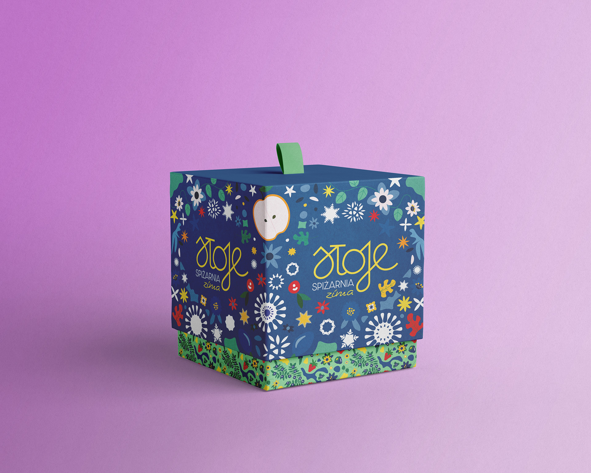
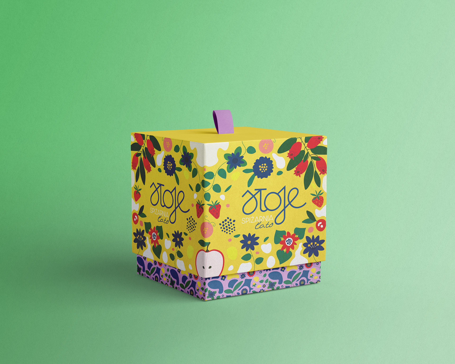
Manifold of Charmingly Wrapped Up Solutions
Each packaging design serves a distinct purpose, crafted with a specific occasion in mind, and tells a unique story. Charming illustrations enhance each package, guiding the customer's shopping experience.

Playful Unboxing Experience
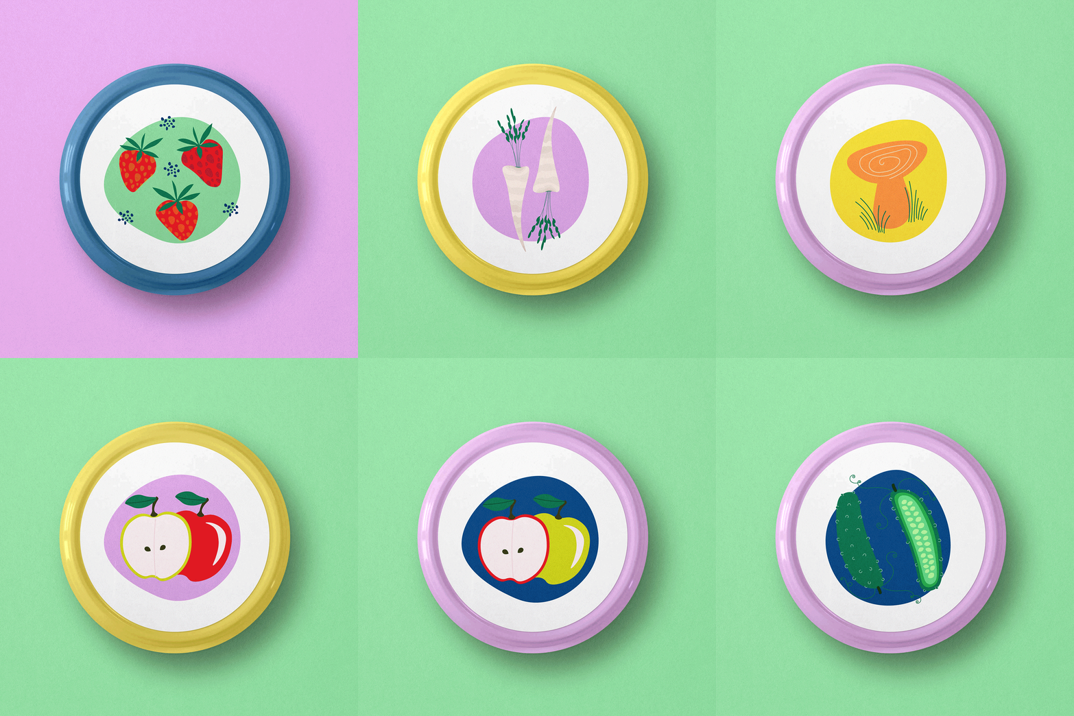
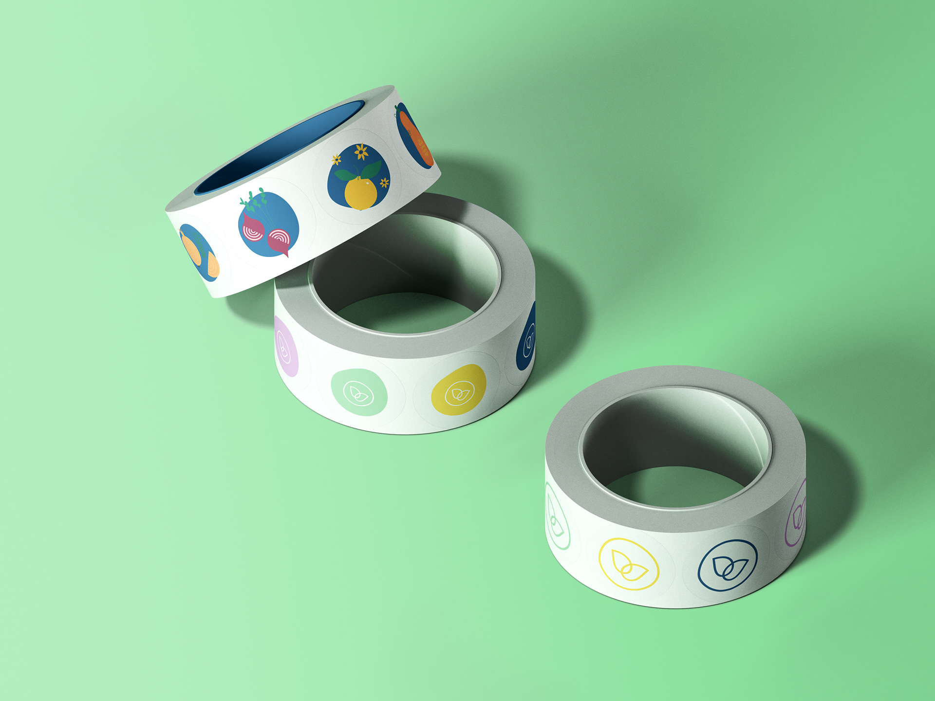
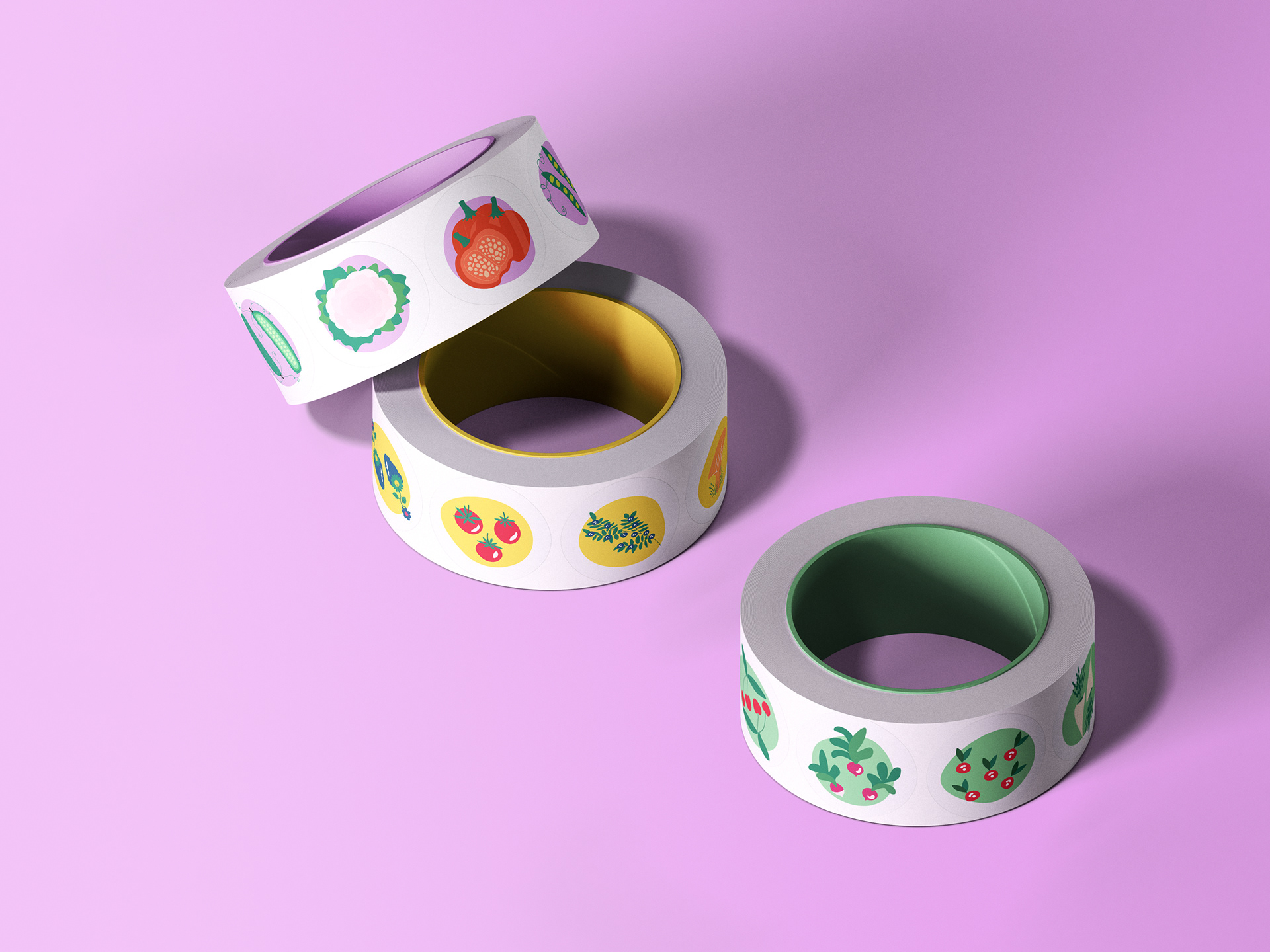
Every jar and container features signature lid stickers and seals, adding a playful touch while preserving freshness. These elements make for functional boxing and visually appealing unboxing experience, perfect for a Pinterest-worthy fridge.
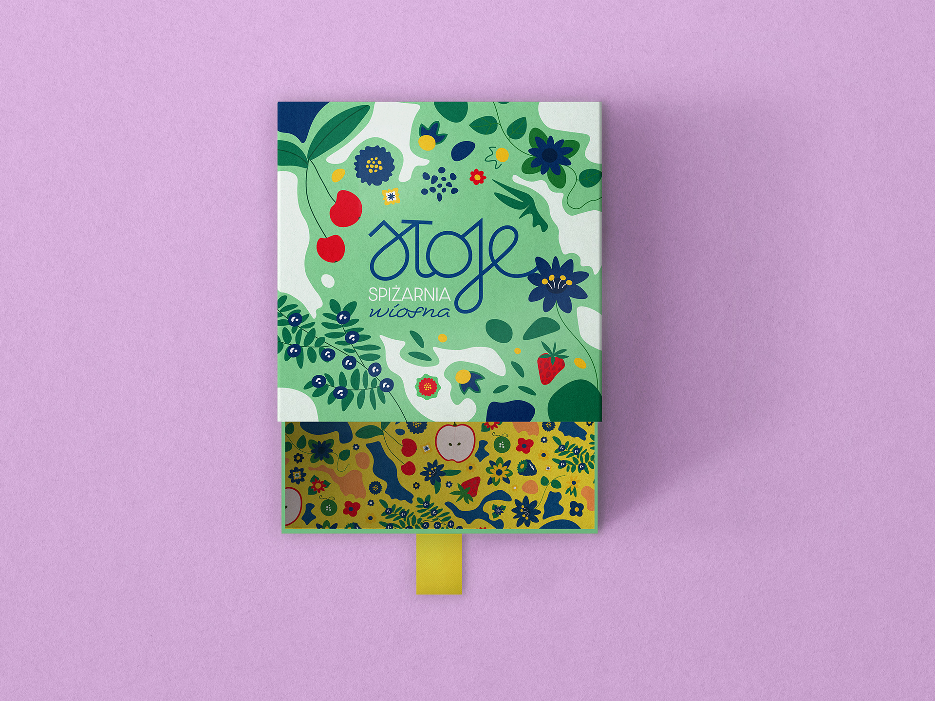
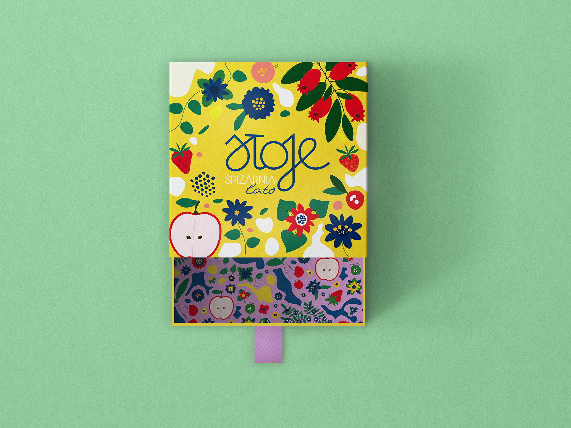
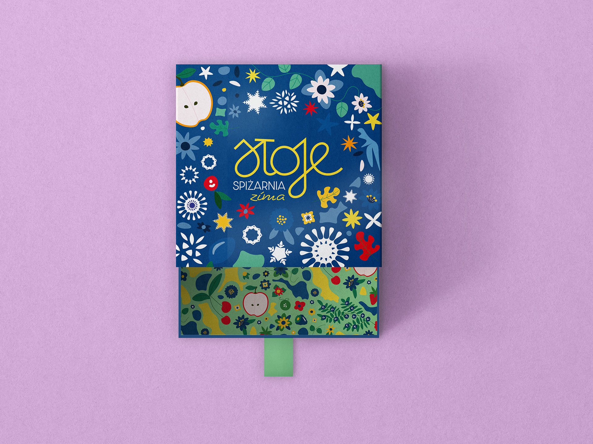
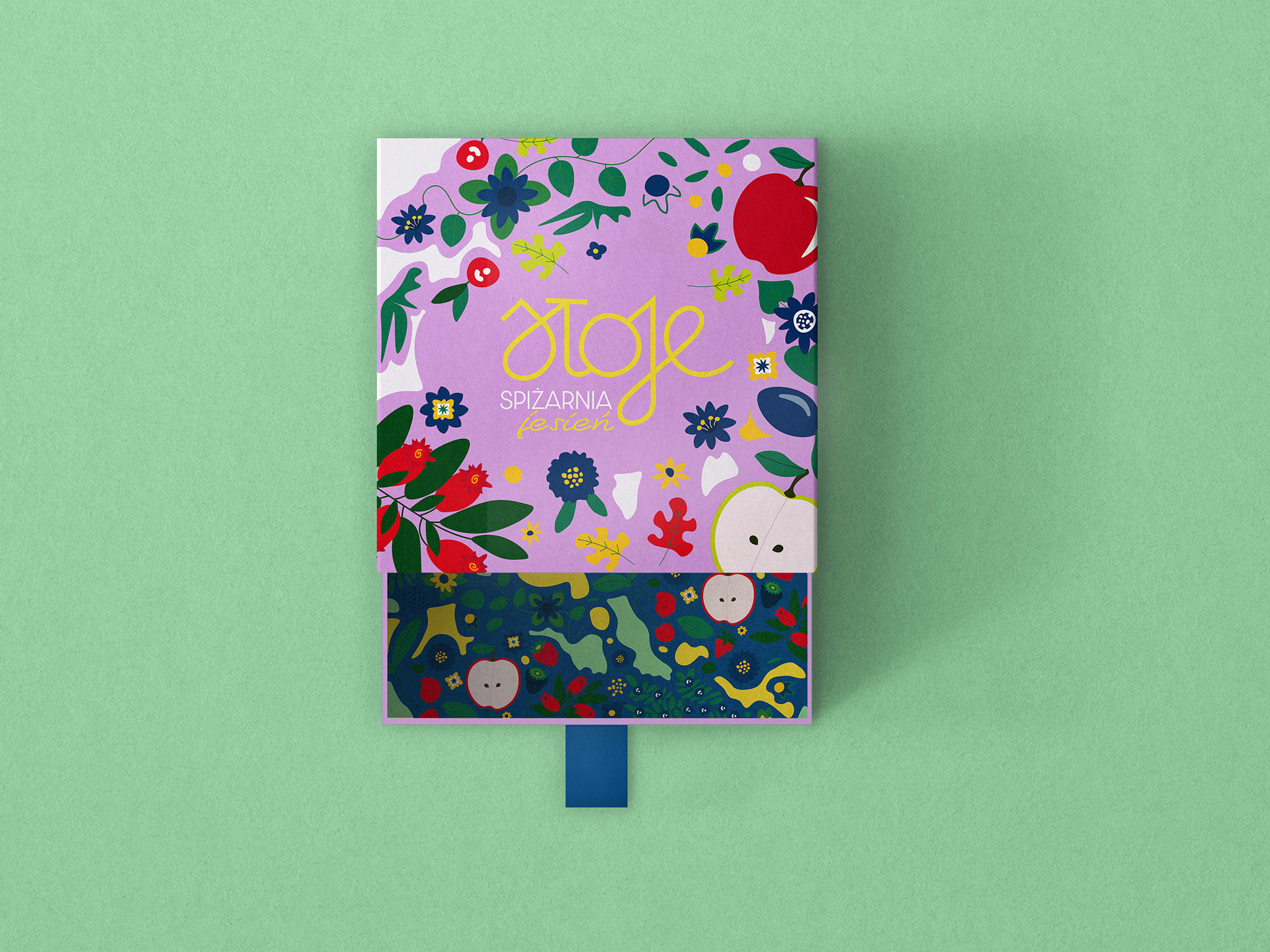
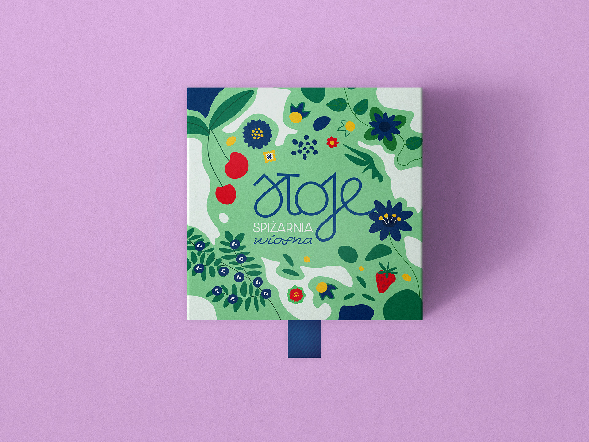
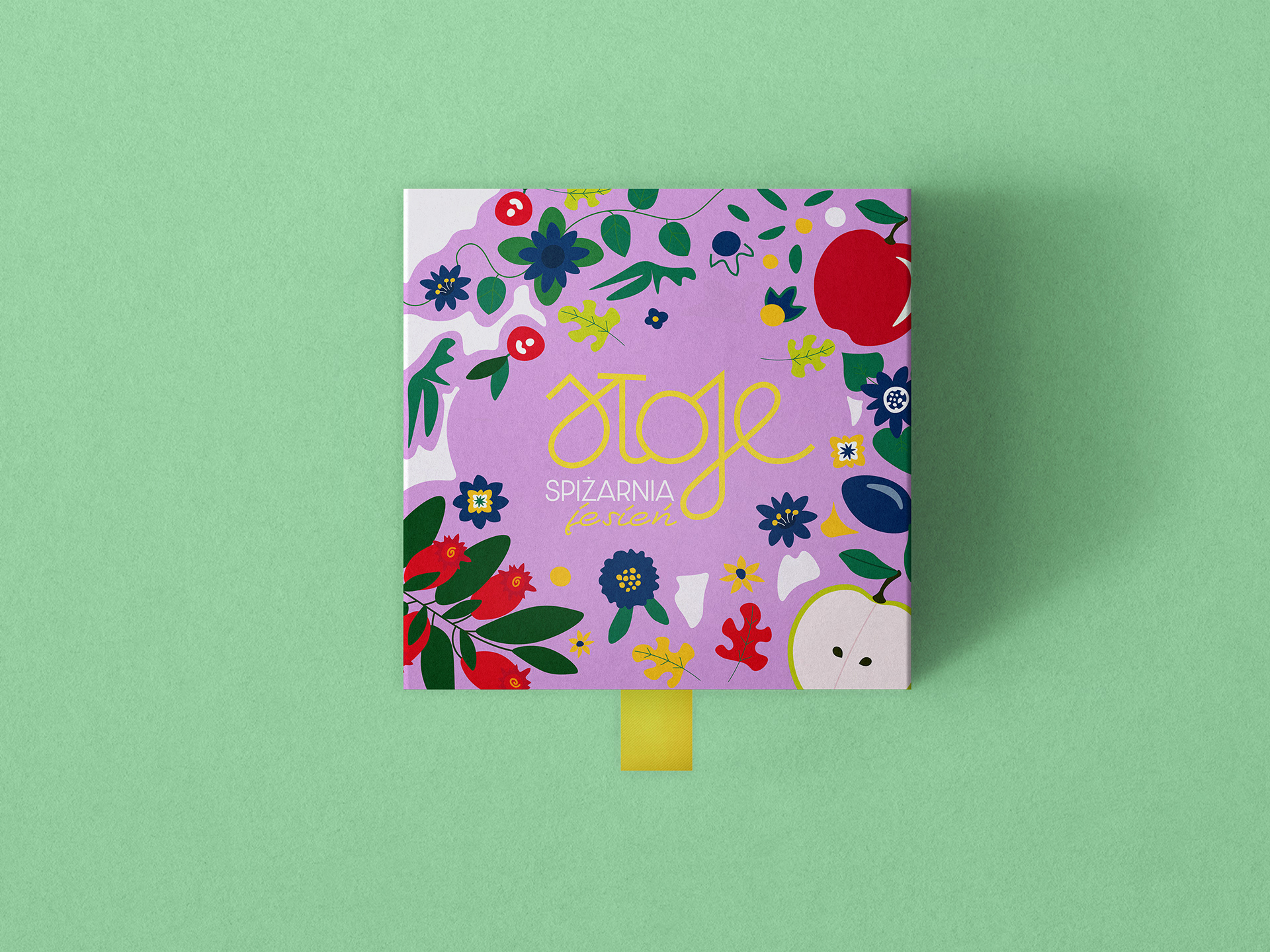
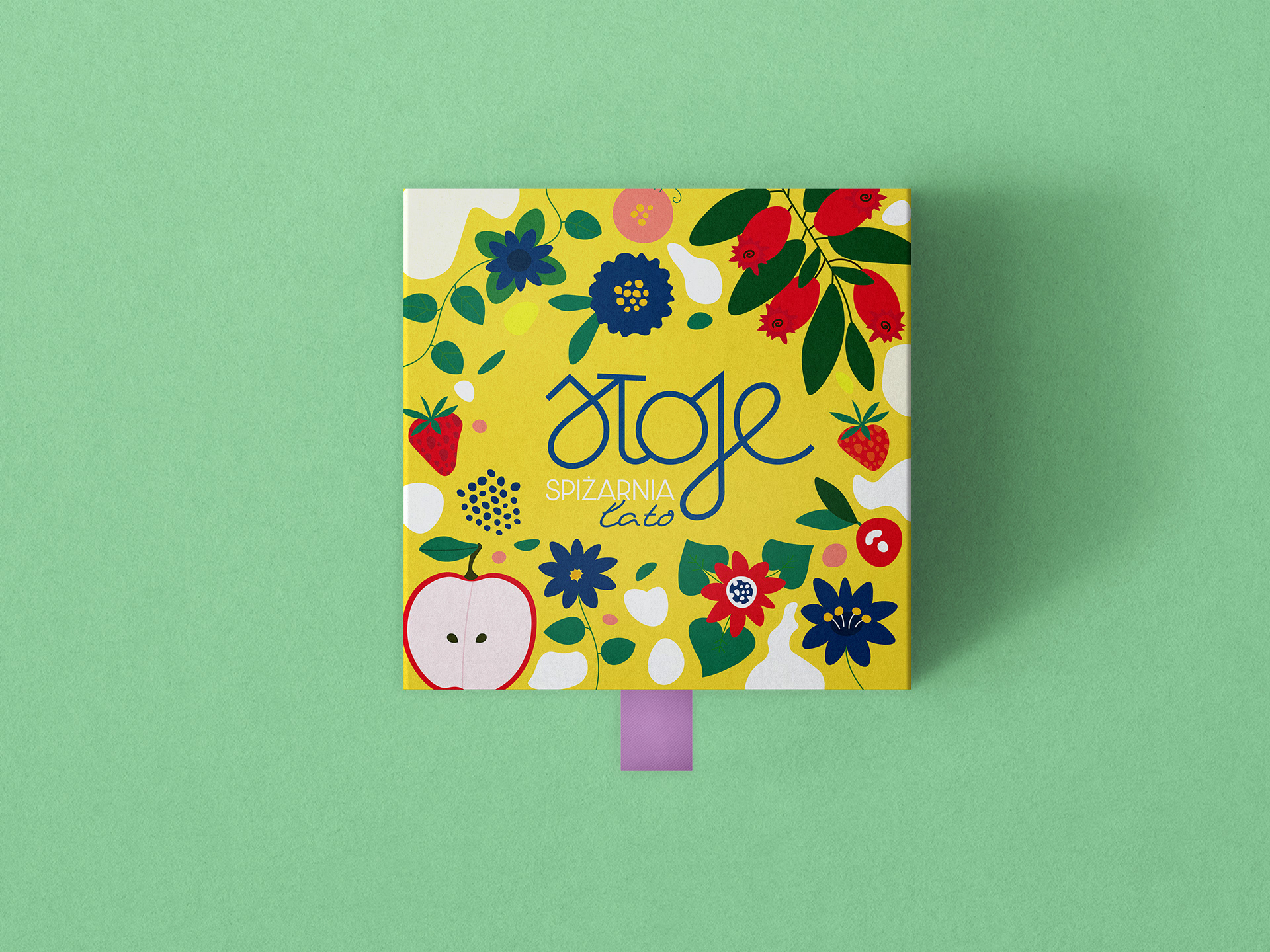
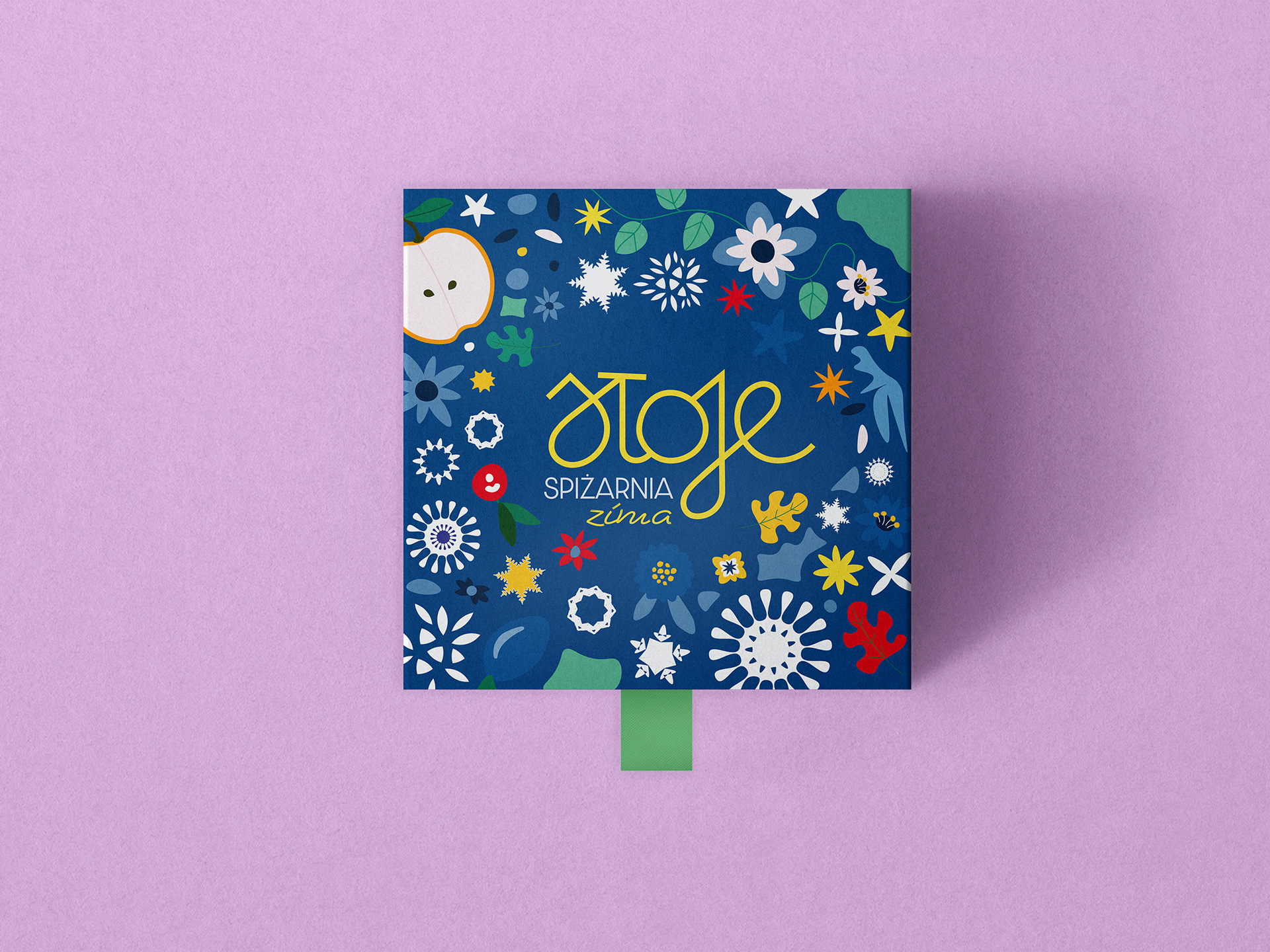
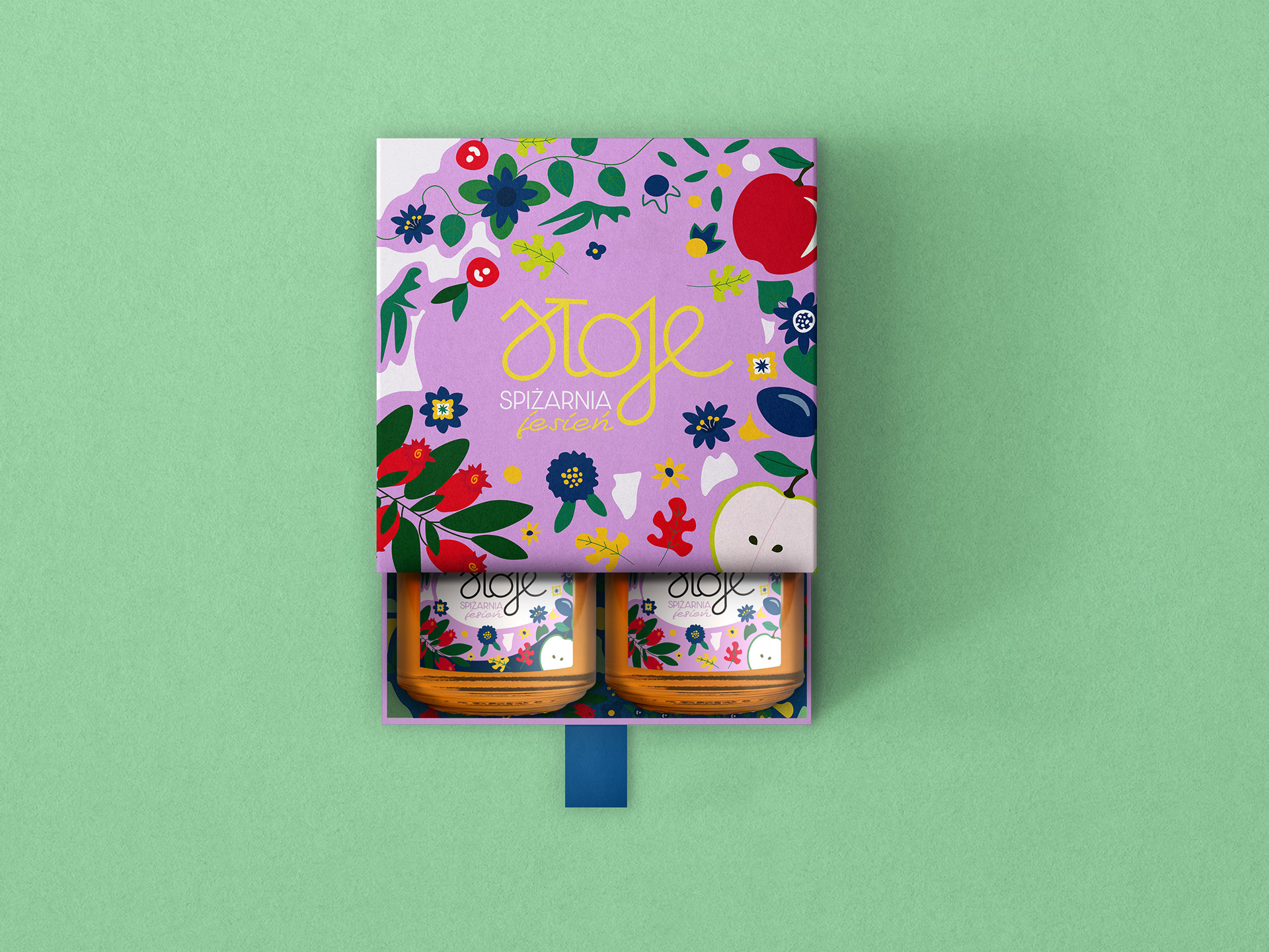
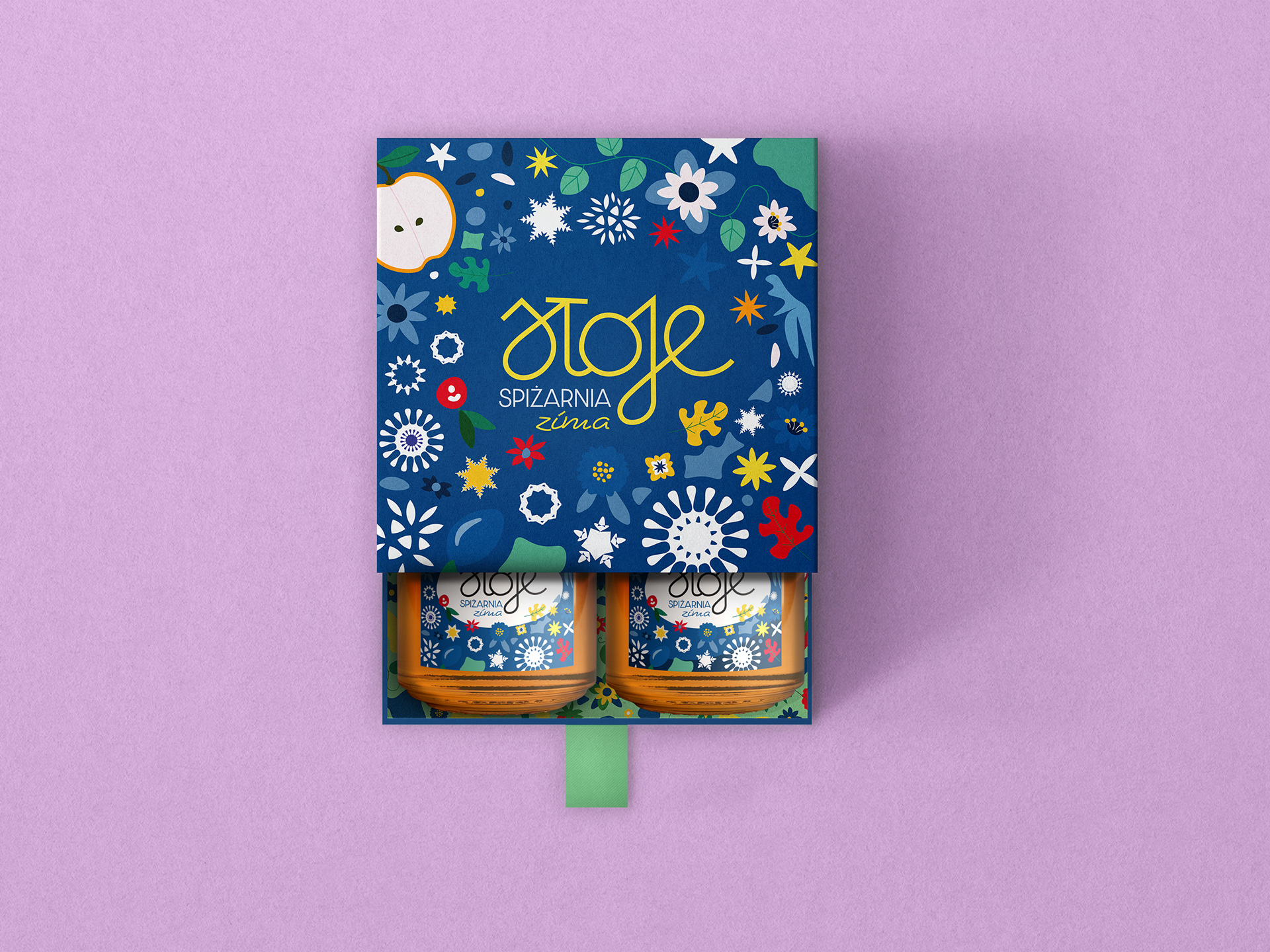
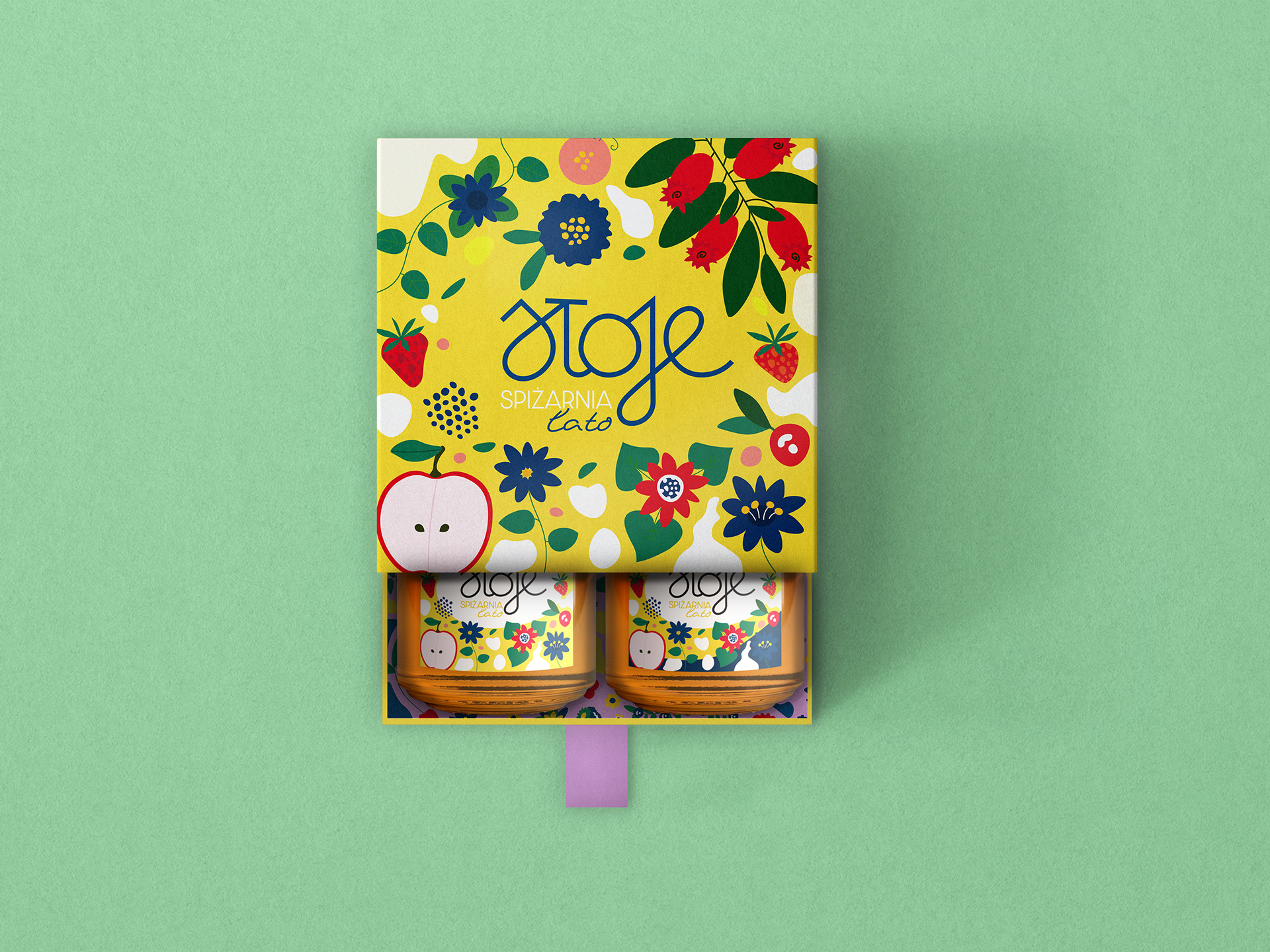
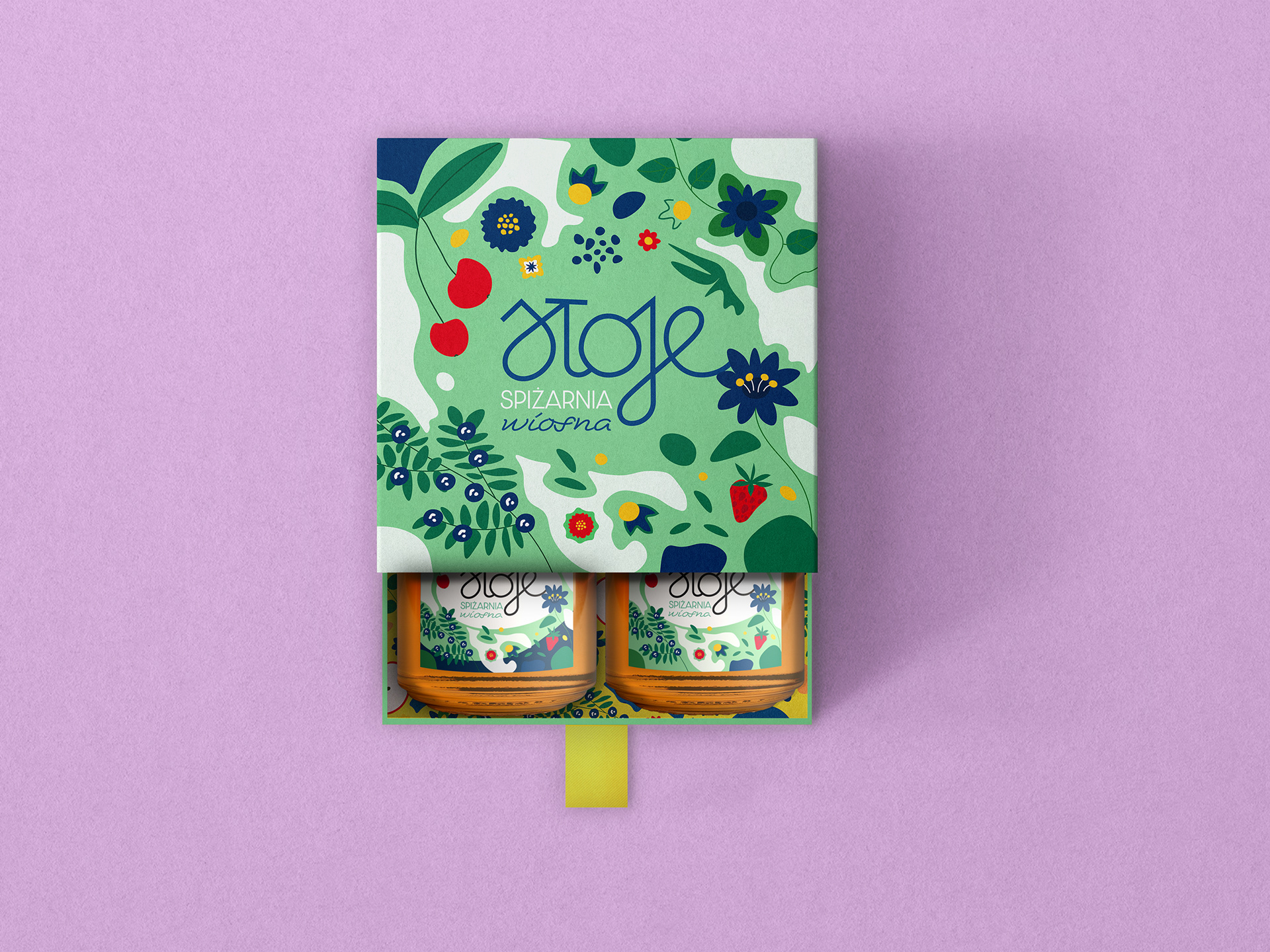
Illustration as a Navigation System
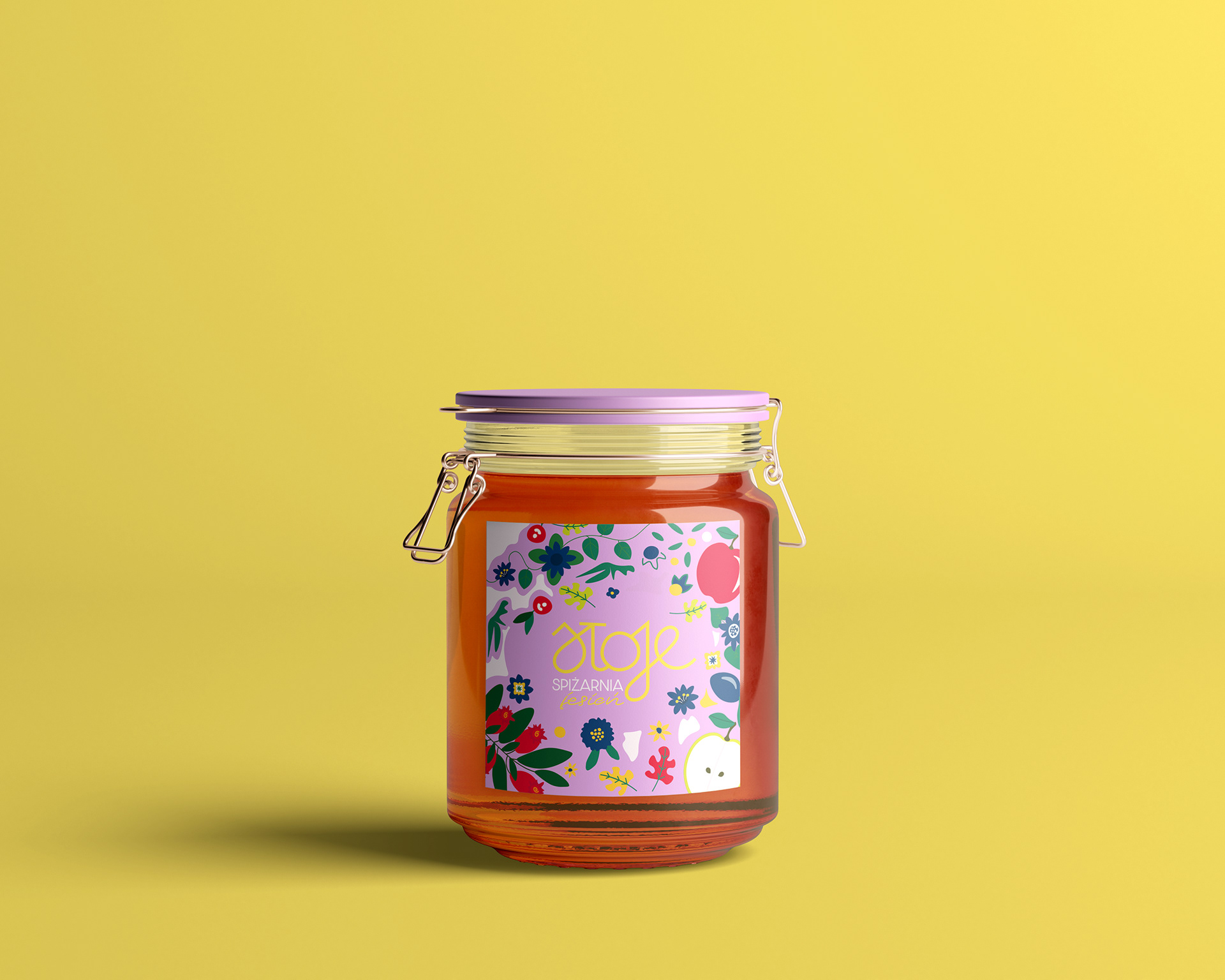
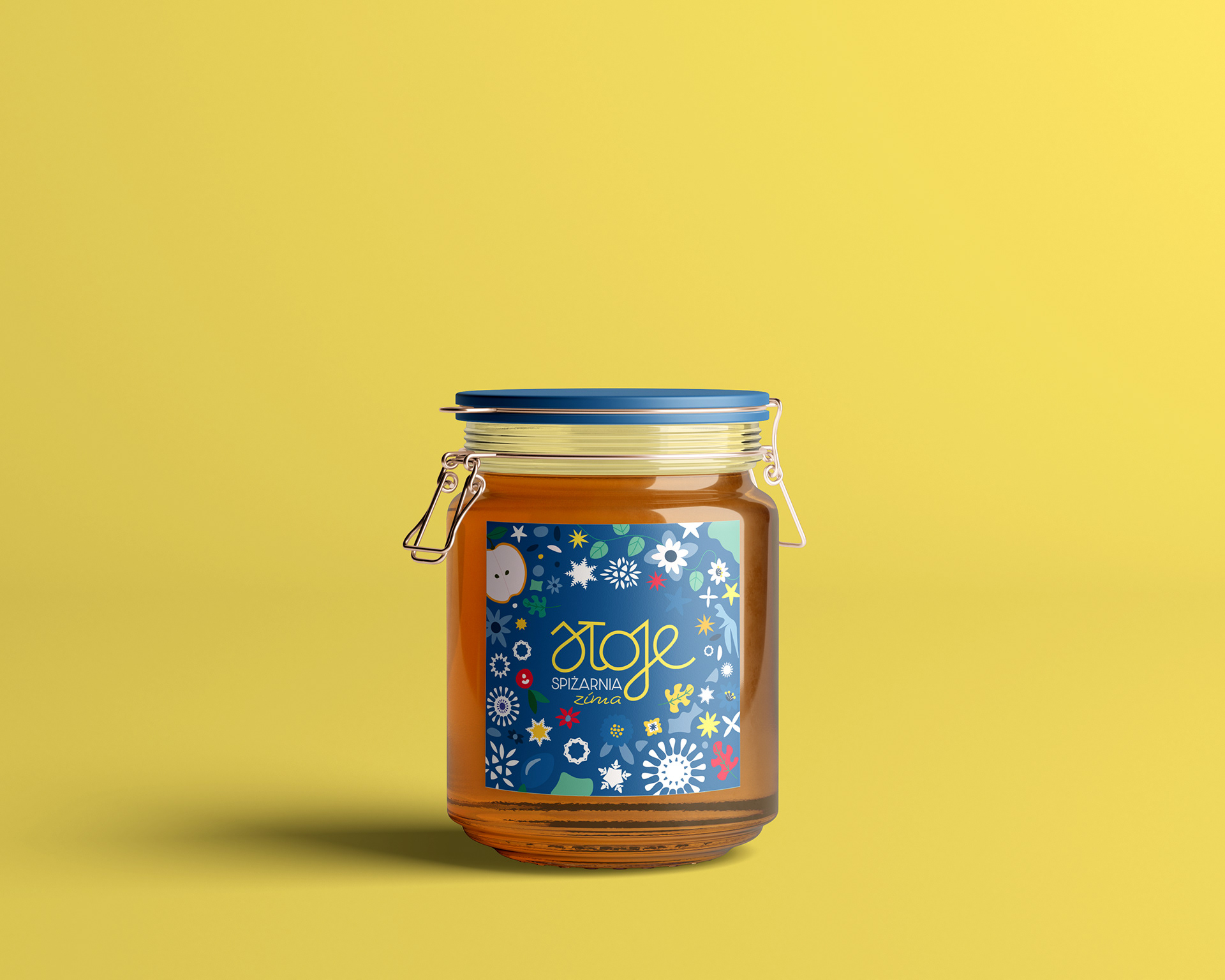
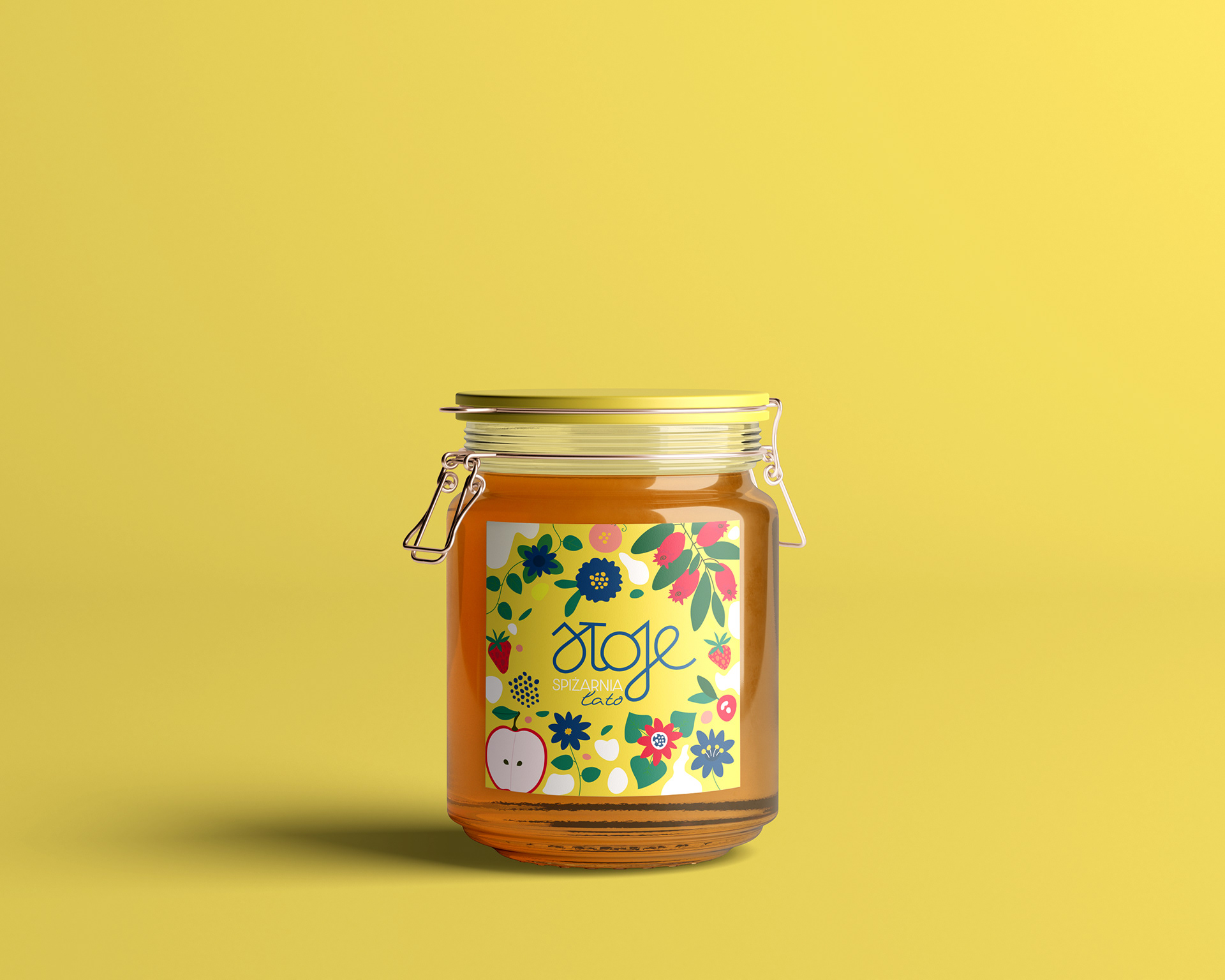
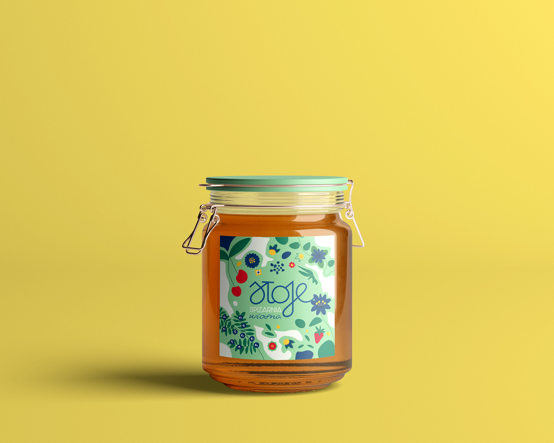
Labels design features charming illustrations that guide customers through Sloje's line of products, while adding visual appeal to the whole shopping experience.

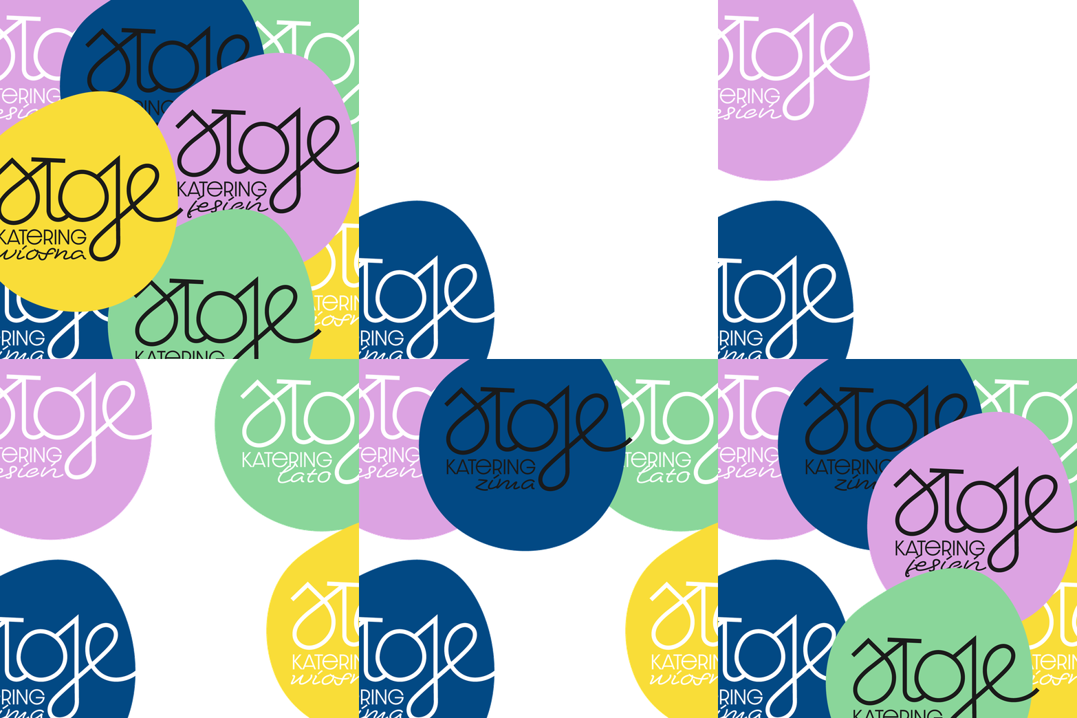
System Rooted in Seasons
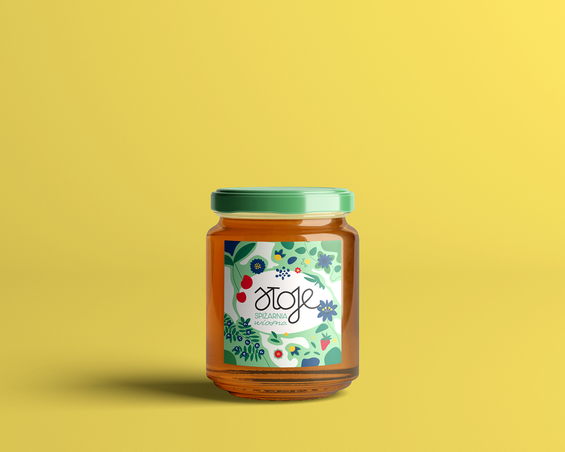
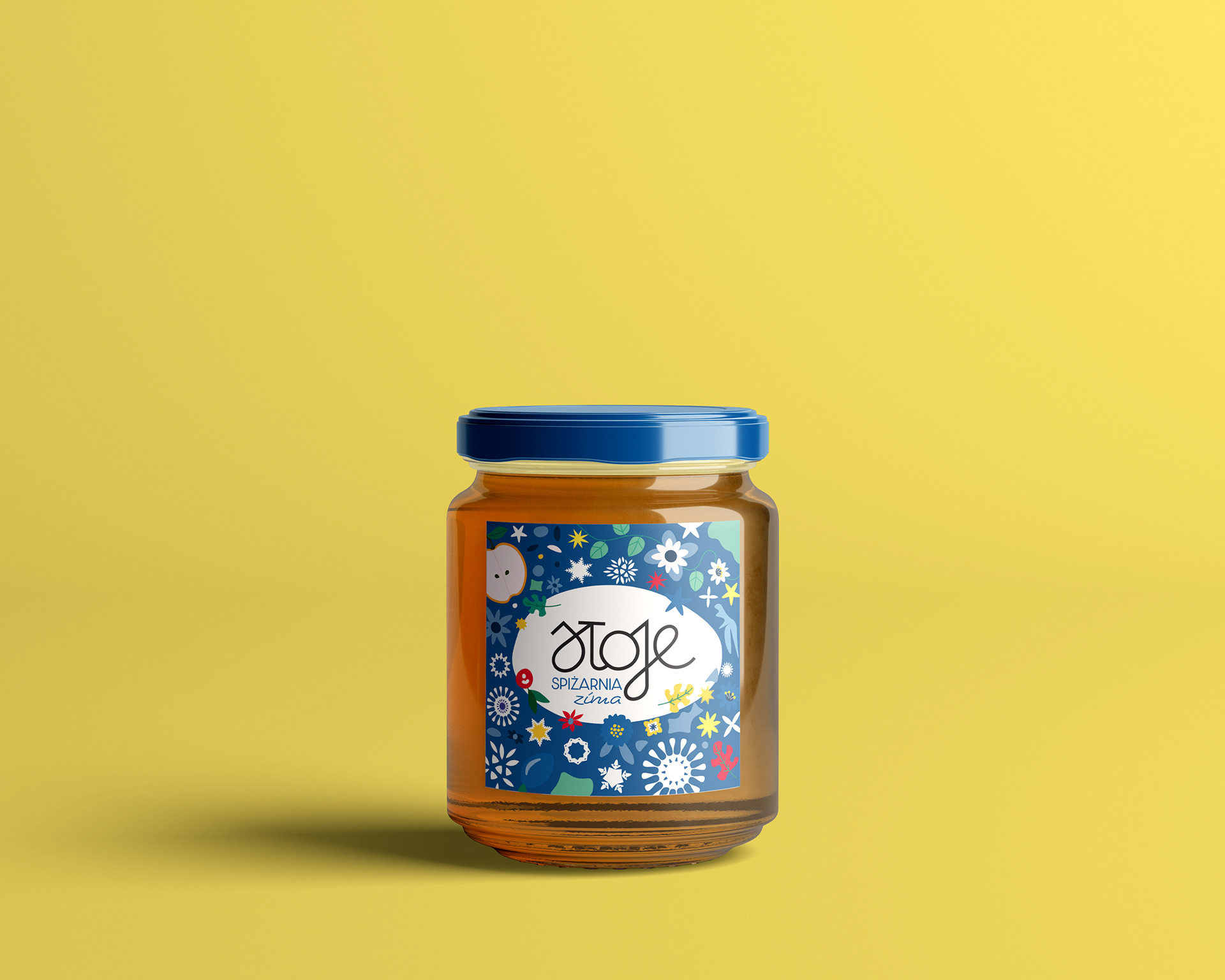
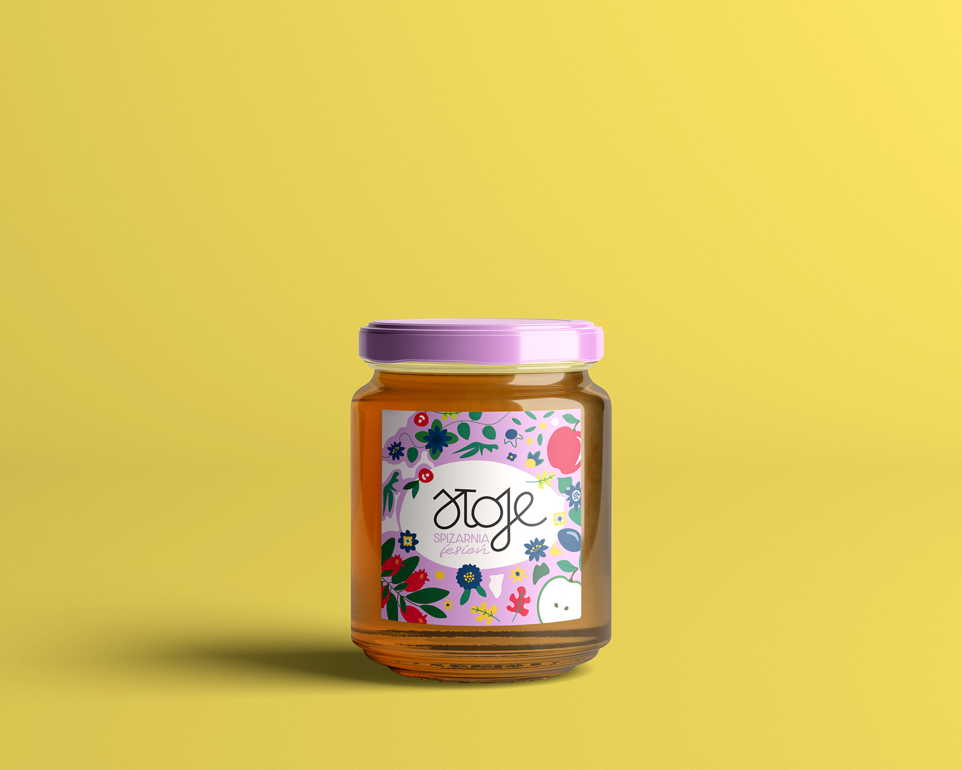
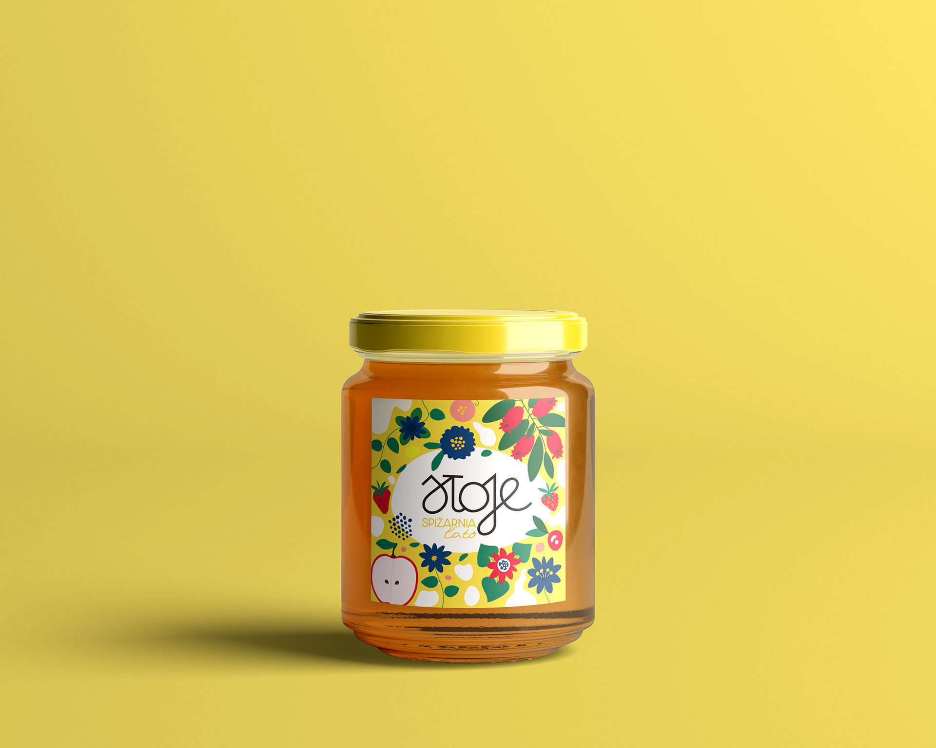
Back-of-Pack Information Design
The label system uses intuitive symbols and a clear information hierarchy to communicate key details such as ingredients, production dates, allergens, and dietary markers. This approach prioritises transparency, safety and accessibility across the full product range.
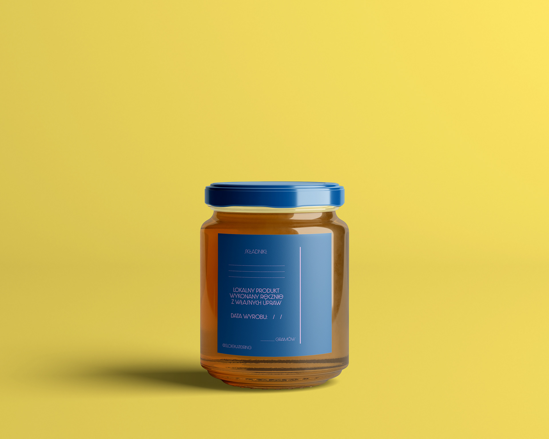
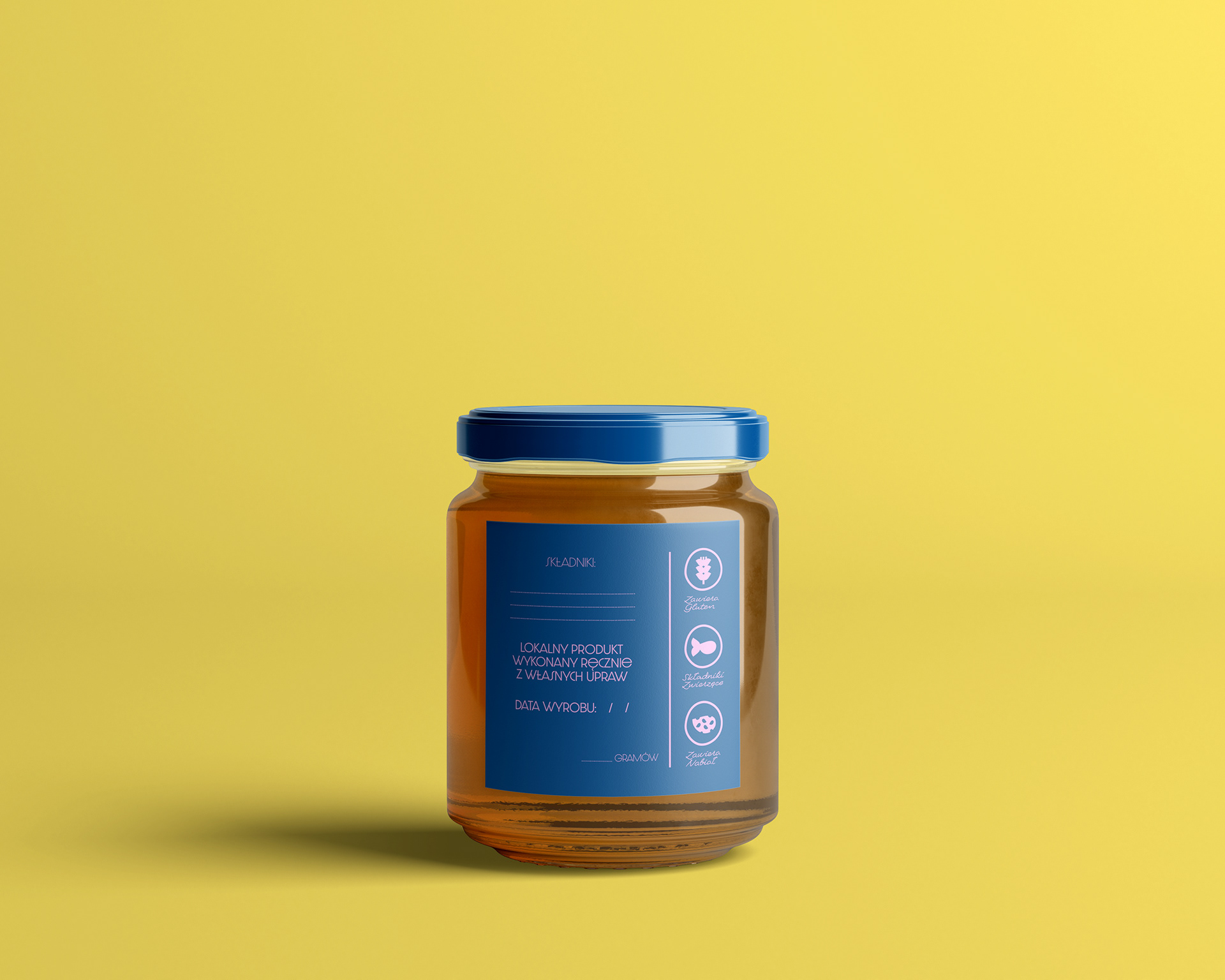
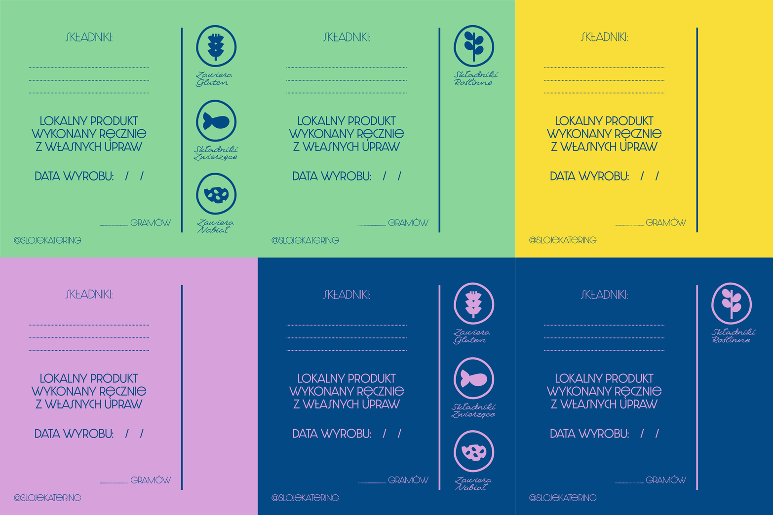
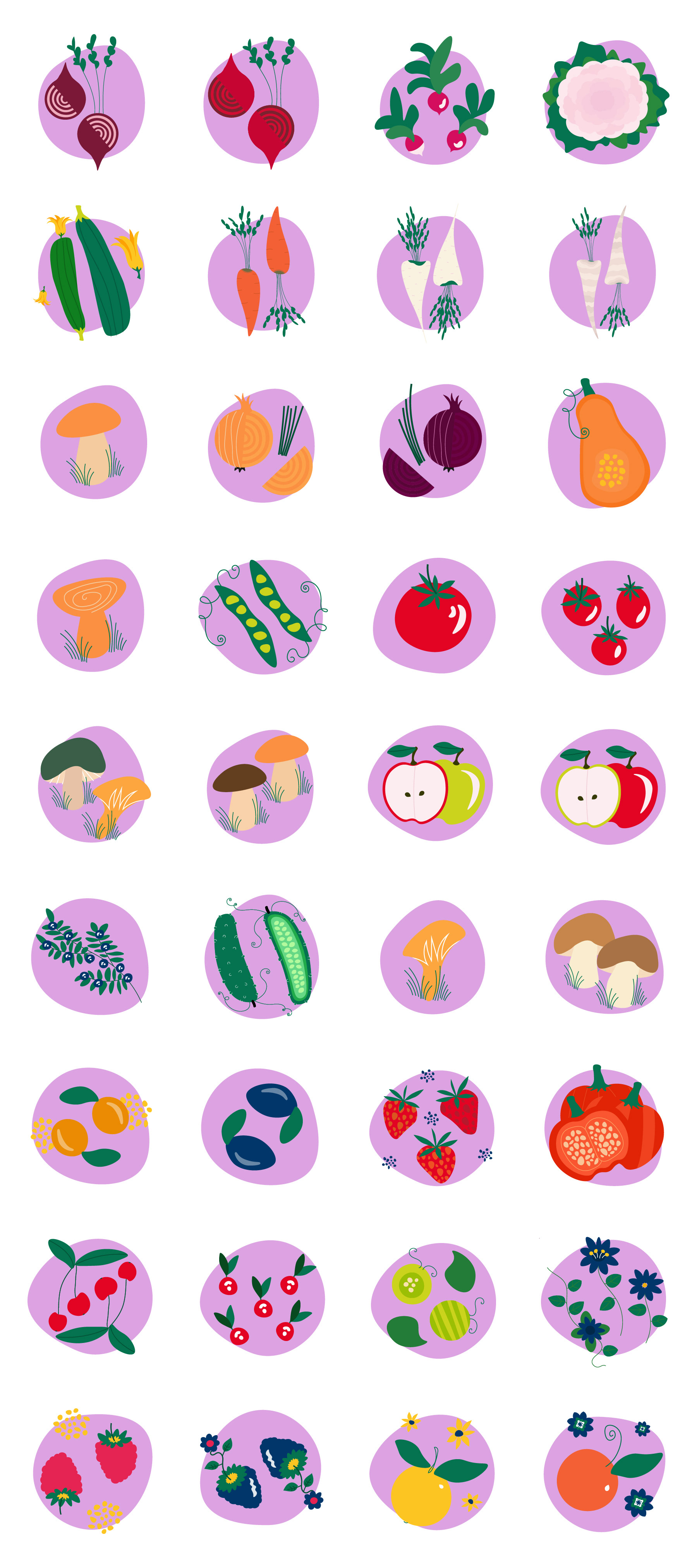
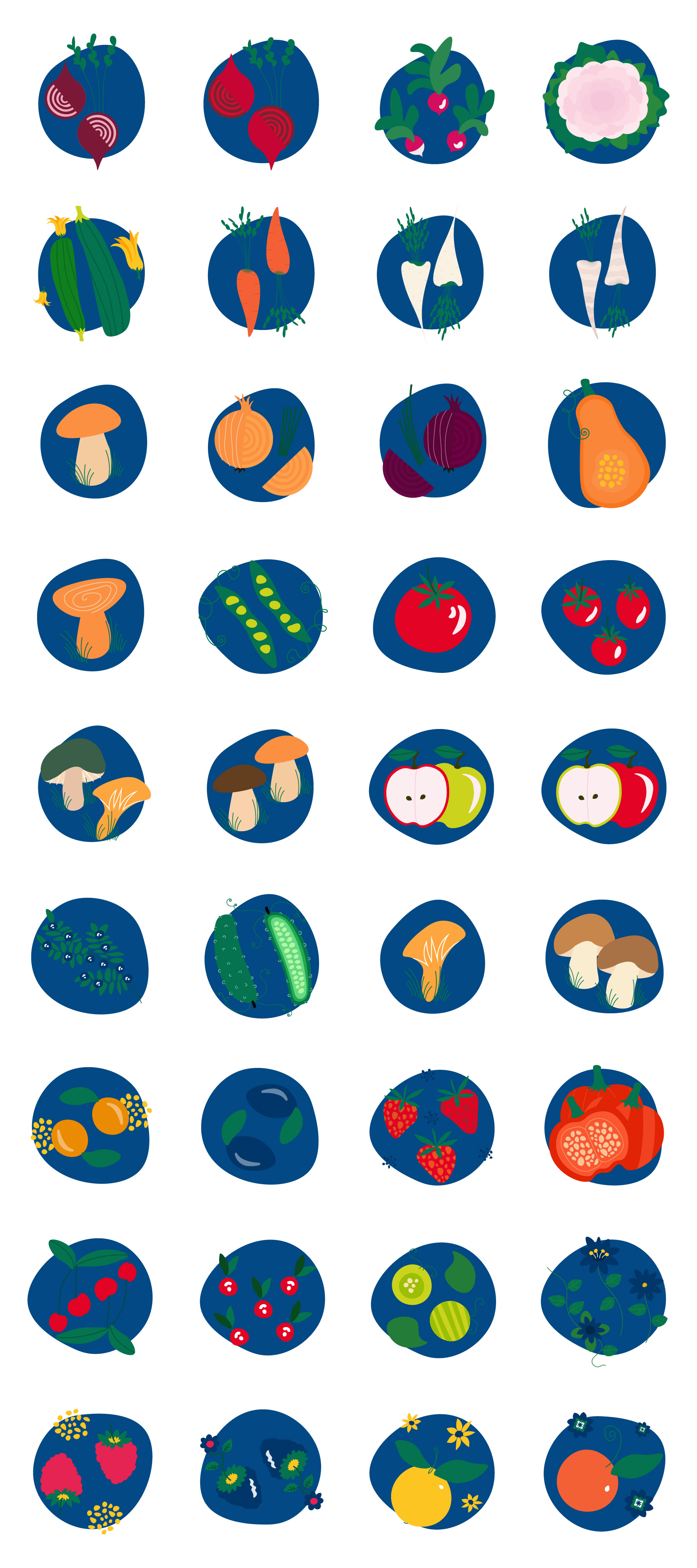
Illustration-Based Information Layer
Building on the core information system, custom illustrations were designed to extend beyond the label, supporting rapid visual recognition of allergens, dietary preferences and key product attributes. The system reinforces clarity from point of sale through preparation and in-use.


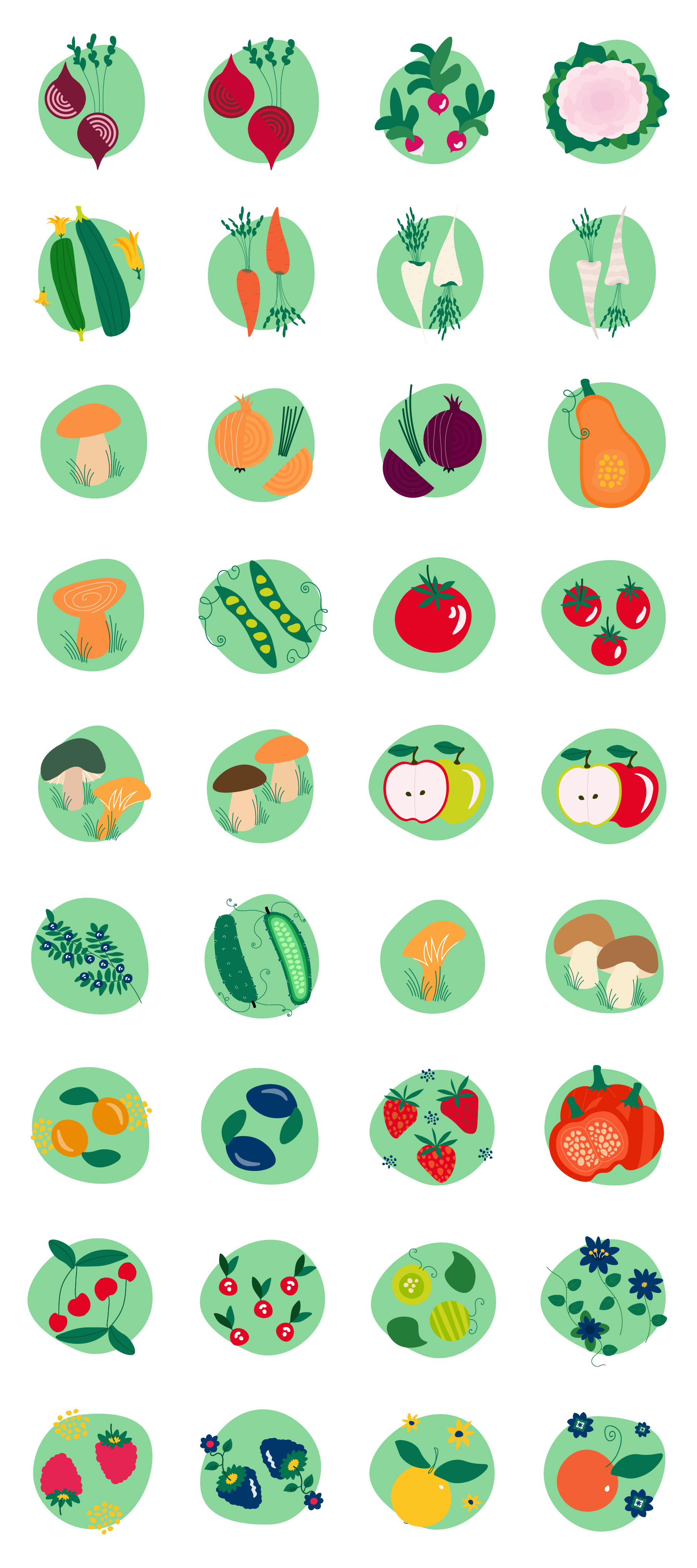
Integrated Illustration System
A cohesive illustration system designed as a flexible visual framework for use across digital, print, packaging, and spatial touchpoints. Elements can be used individually or combined within clear brand guidelines, allowing the brand to express warmth and personality while remaining consistent at scale.

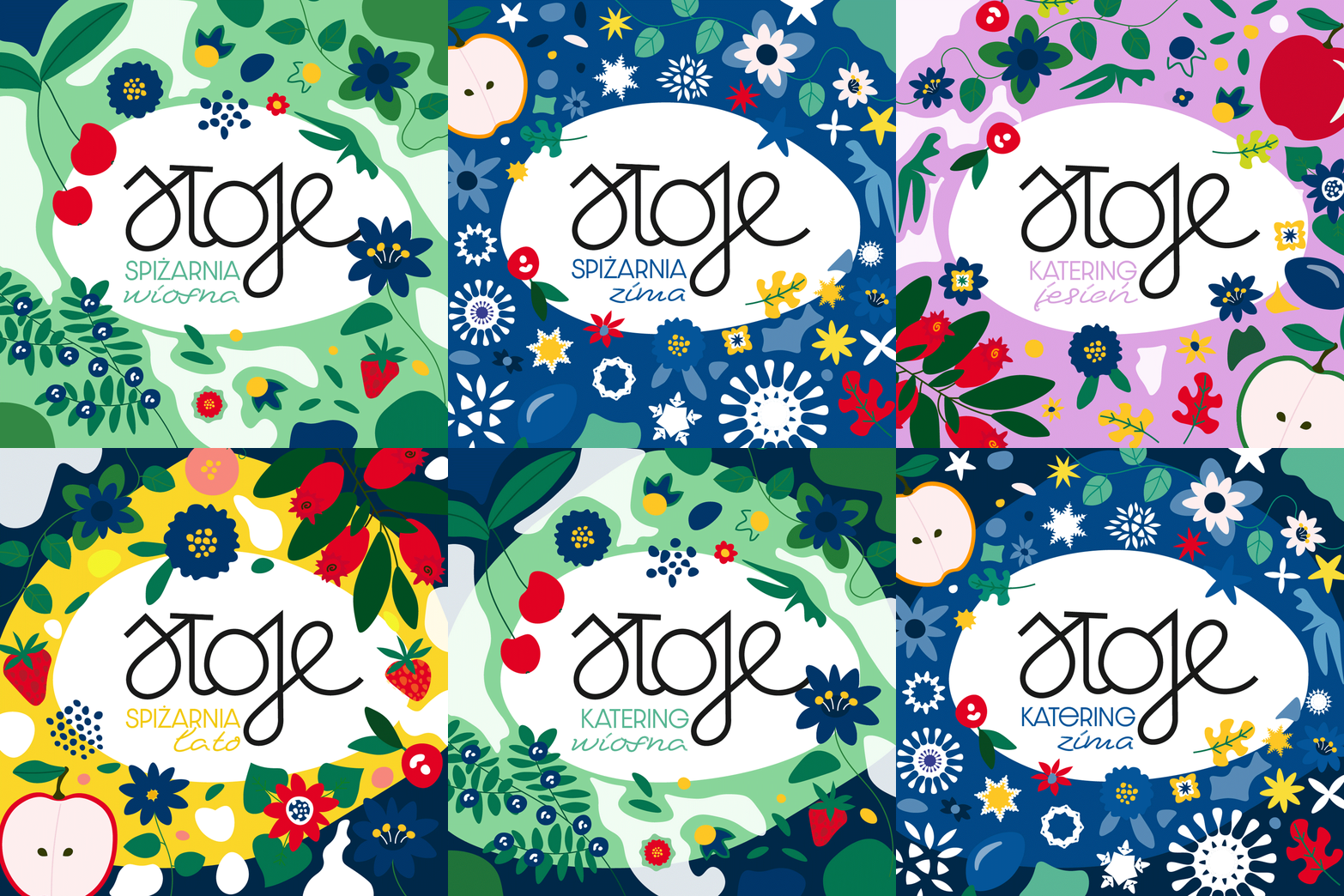
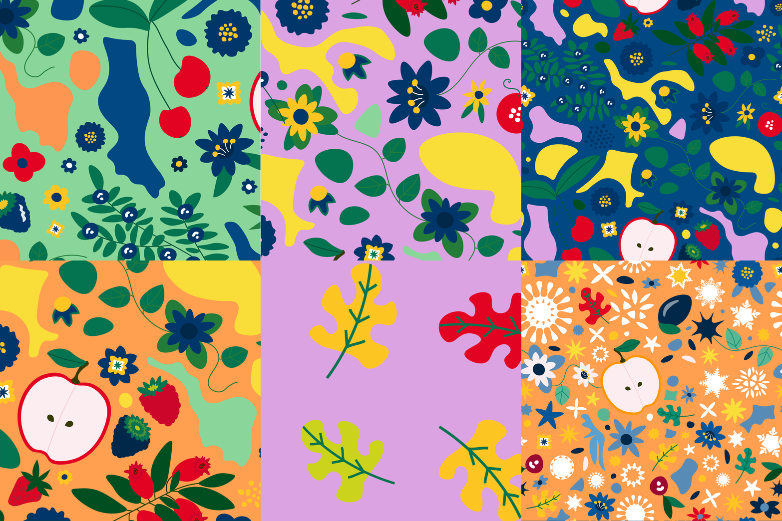
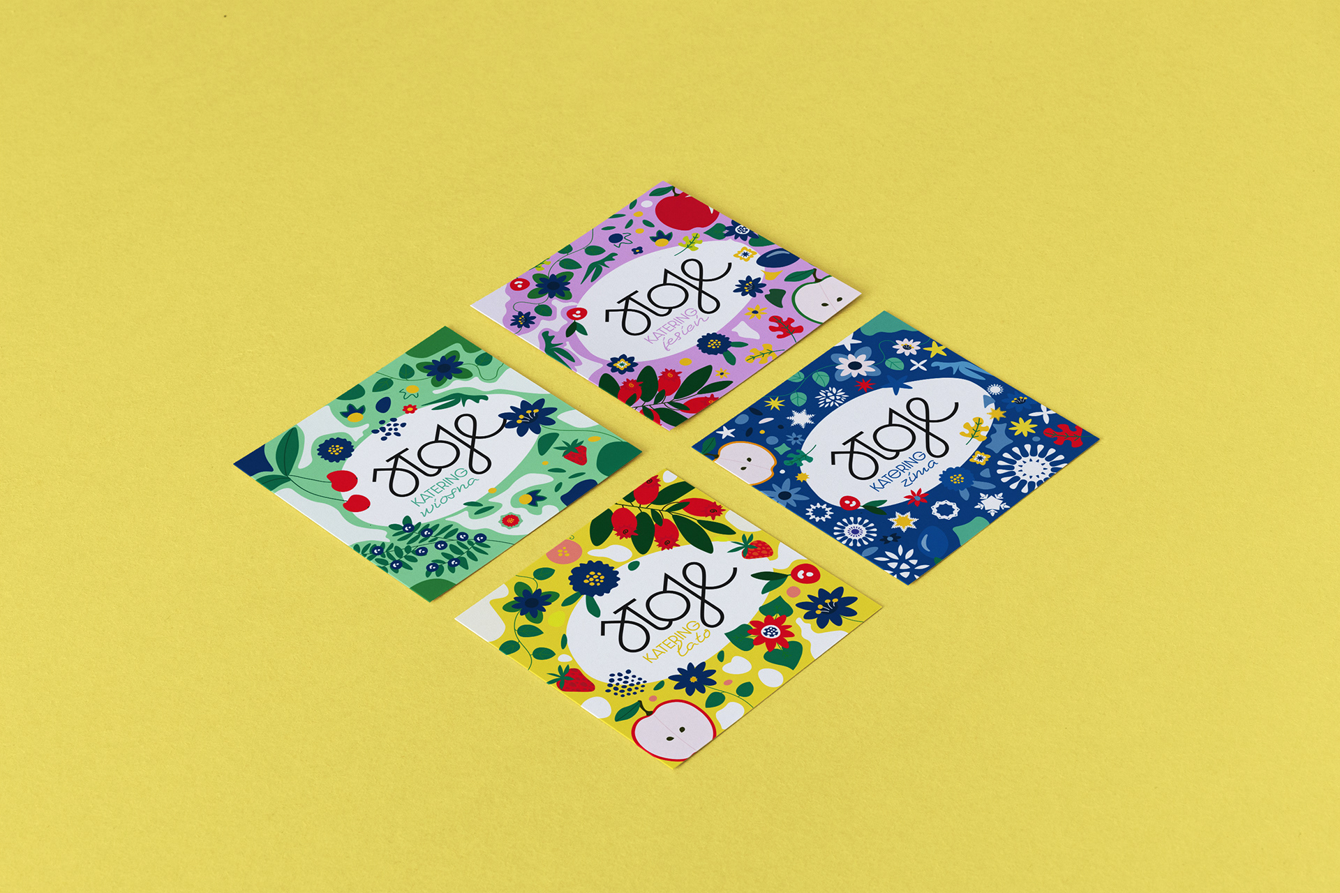
Seasonal Patterns
Versatile patterns for multiple applications, from tissue paper to tags, signal each new season, collectively creating a cohesive and memorable brand experience.
Scalable Structure and Personalisation
Labels were designed as a scalable system used across multiple packaging ranges for both delicatessen products and catering formats. The structure supports clear product variation, while blank label versions enable easy personalisation and handwritten notes when needed.
Labels were designed as a scalable system used across multiple packaging ranges for both delicatessen products and catering formats. The structure supports clear product variation, while blank label versions enable easy personalisation and handwritten notes when needed.

Distinctive Brand Merchandise
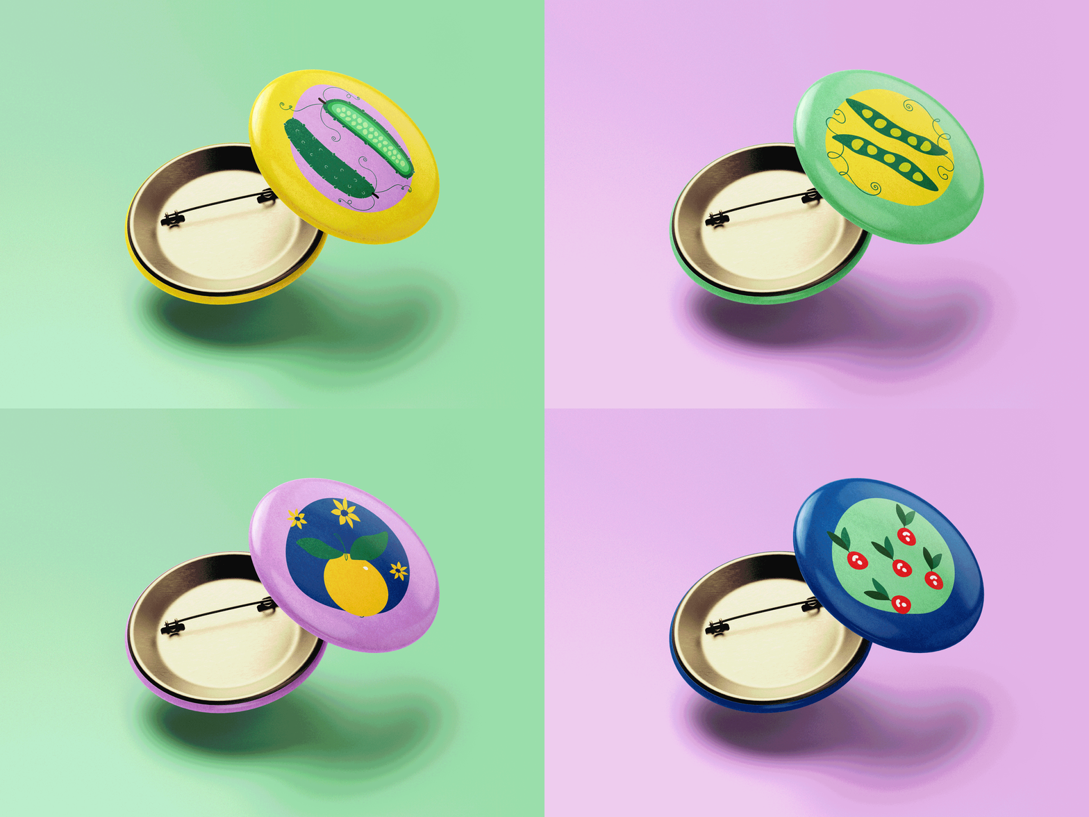
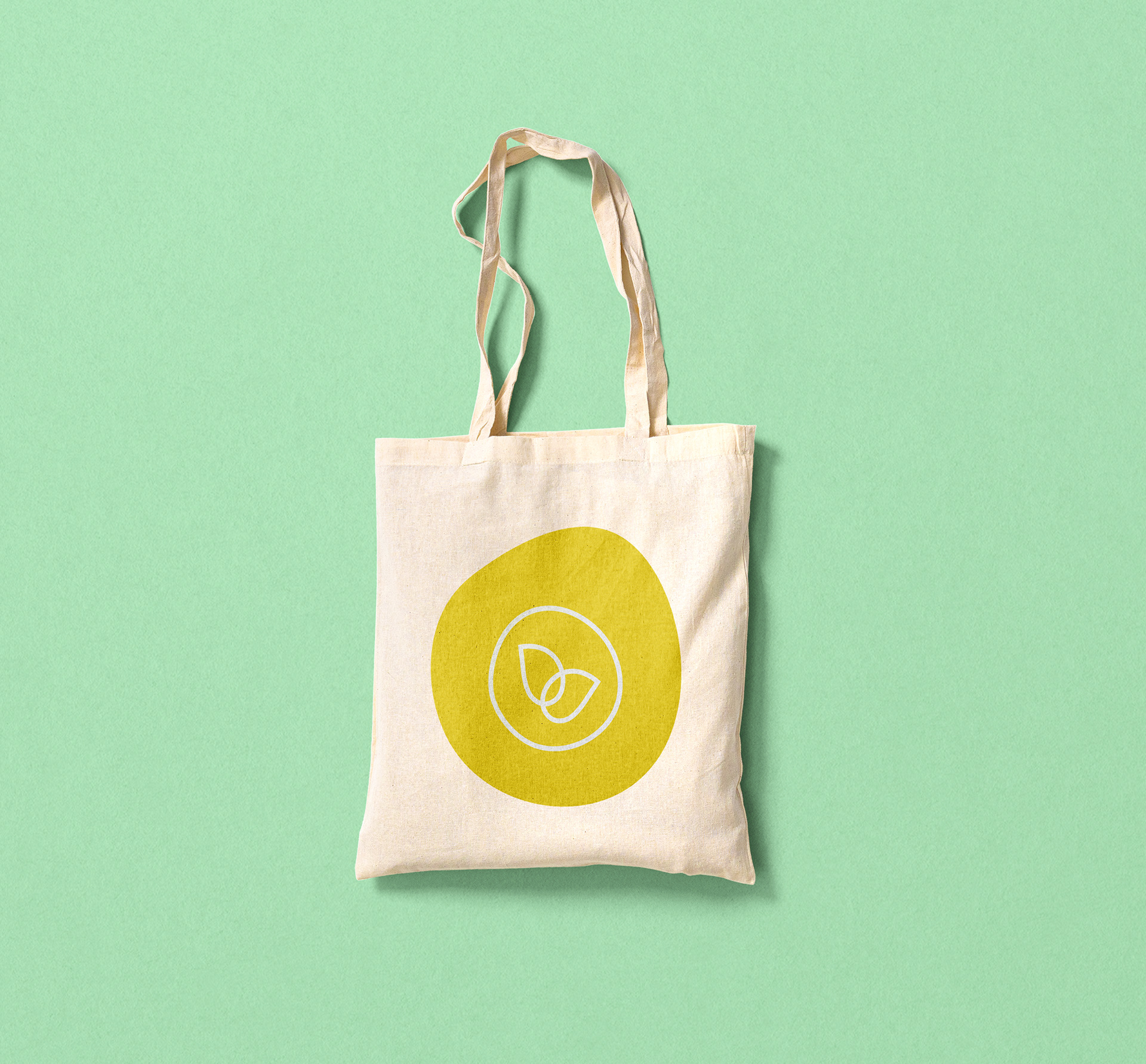
Brand design extends across merchandise such as tote bags, stickers, pins and tags. Designed as part of the wider brand system, these elements reinforce recognition and add character across products and occasions.
Brand design extends across merchandise such as tote bags, stickers, pins and tags. Designed as part of the wider brand system, these elements reinforce recognition and add character across products and occasions.

Adaptable Social Media System
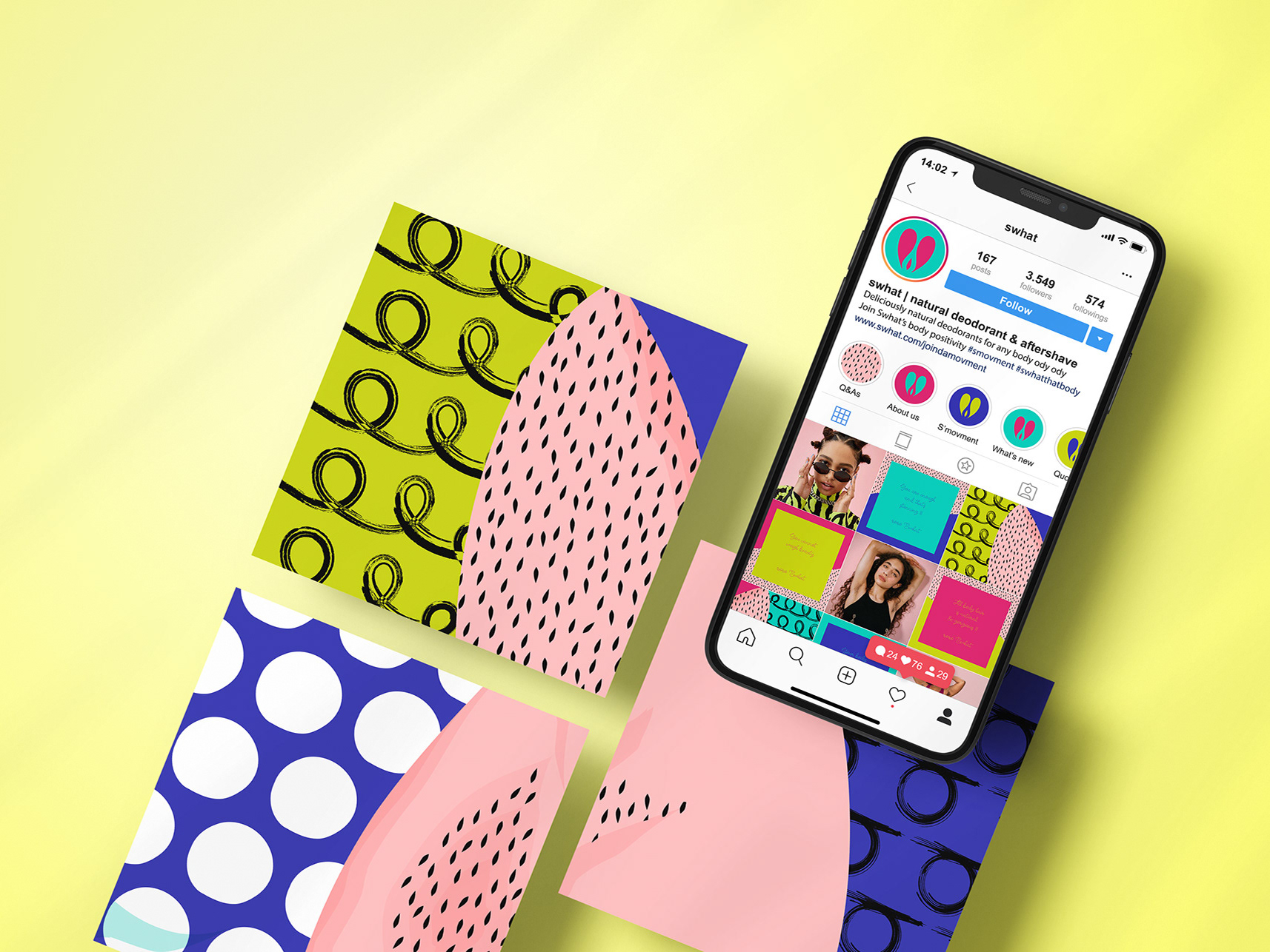
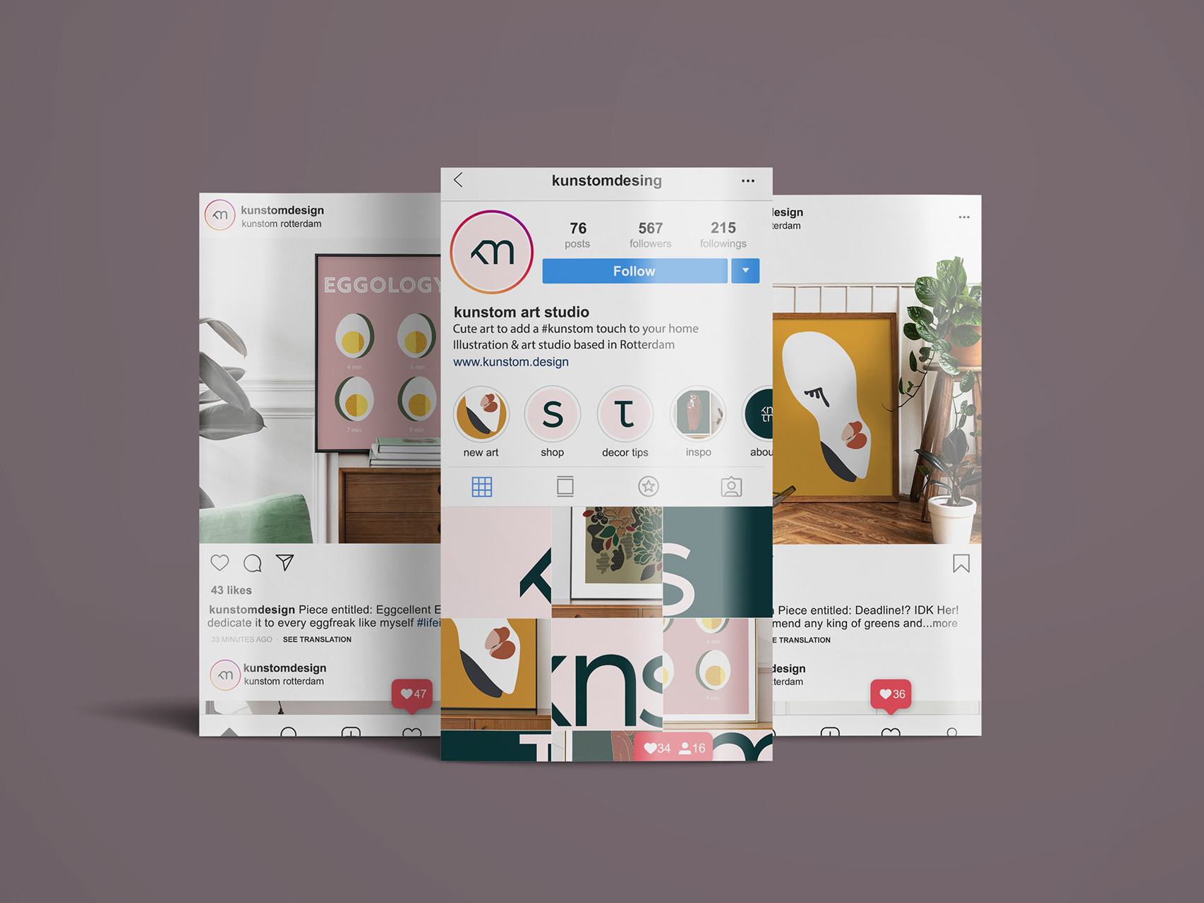
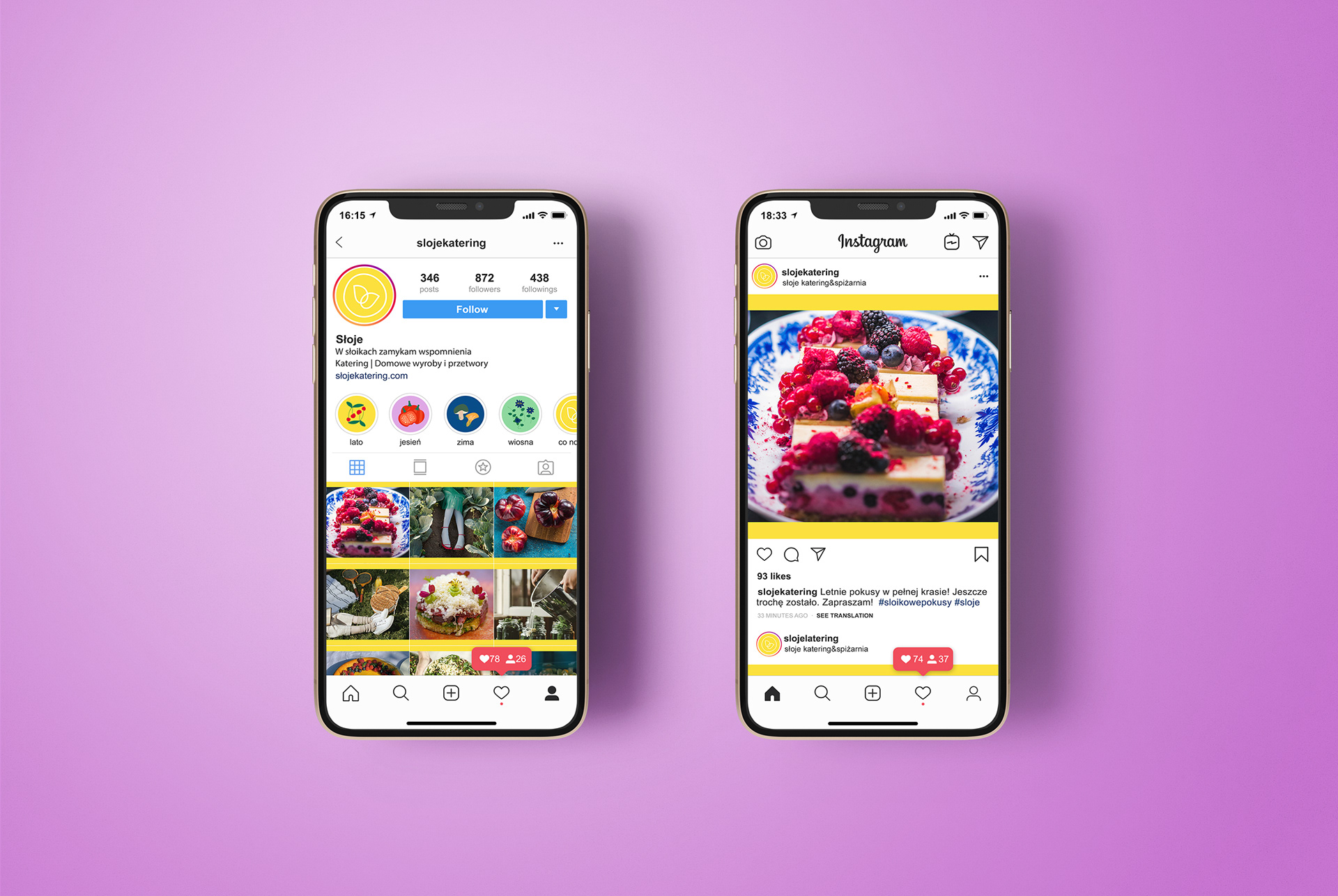
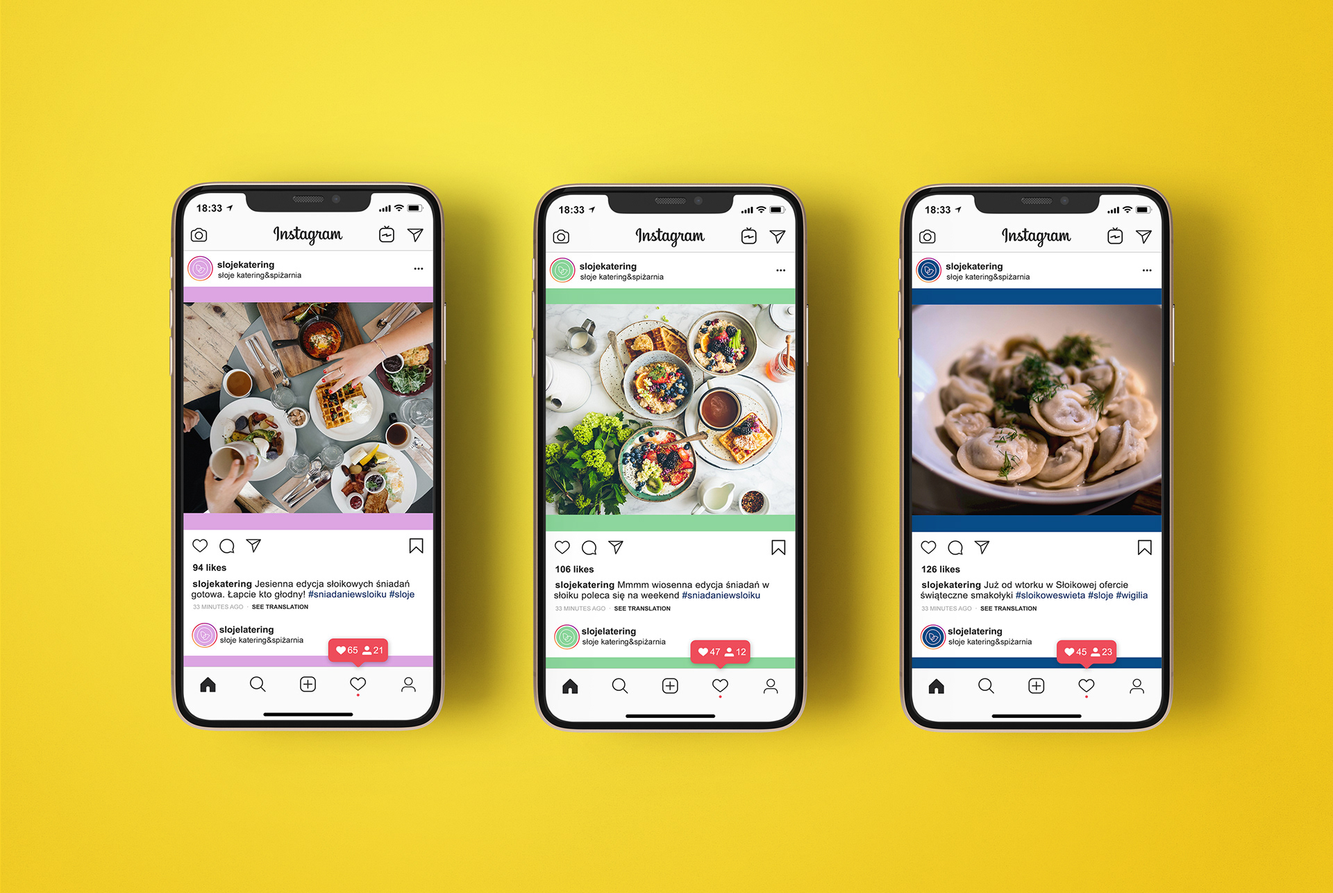
Sloje’s social media content was designed as a cohesive, seasonally colour-coded system. Recipes, behind-the-scenes moments and visual storytelling work together to consistently reflect the brand’s personality and values across platforms.
Sloje’s social media content was designed as a cohesive, seasonally colour-coded system. Recipes, behind-the-scenes moments and visual storytelling work together to consistently reflect the brand’s personality and values across platforms.
✦ Thank you, keep exploring!
